
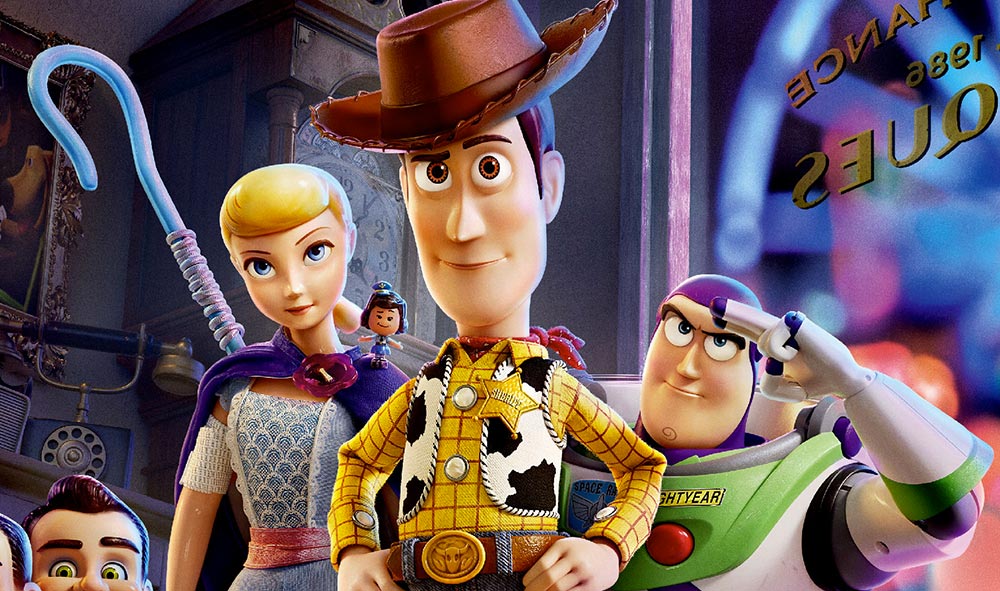
 In Toy Story 4, there’s magic in every detail, including all the graphics that appear throughout the film to support the story and help add authenticity to it.
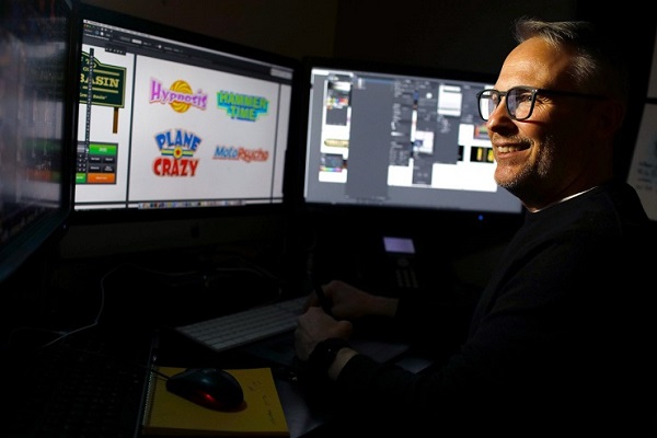
This is Craig Foster’s area. With his team, he created all the graphics of Toy Story 4, and also of many Pixar films before.
Indeed, he joined Pixar Animation Studios in July 2004 as a graphic designer on The Incredibles. He has worked on nearly every feature film since, including the Academy Award®-winning Ratatouille, WALL•E, Up, Toy Story 3, Inside Out and Coco.
He has also created graphics for multiple short film projects, including Mater And The Ghostlight, Your Friend The Rat, CarsToons, Riley’s First Date, Lava, and Sanjay’s Super Team, as well as several Pixar Co-Op short films including The Dam Keeper and Borrowed Time.
He also served as art director, graphic design for the Pixar features Toy Story 3, Monsters University, Inside Out, Finding Dory and Cars 3.

AnimatedViews: How would you explain your job as a Graphics Art Director at Pixar?
Craig Foster: Basically, I go in anything that needs graphics – textiles, T-Shirts, billboards, labels, boxes – with my team. Everything’s done from scratch, because we want it to be unique to our world. I do a lot of research to make sure it’s real, but also supports our story, characters and environments. I just love doing the research, developing that style that matches different eras, different looks, locations, making sure that graphics fit in the world and are believable.
AV: You have participated in so many Pixar masterpieces. What are your best memories from working on those films?
CF: I really enjoyed Wall•E, working on the Axiom, all the interfaces and advertising at the different levels of the ship. I think we’ve been pretty successful at making that futuristic sci-fi style.
AV: Toy Story 4 presents so many different visual styles. It must have been fun, too.
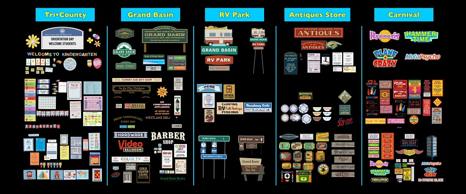
CF: Oh, yes! We had quite a few unique locations. They go on a road trip, they go to a carnival, they go into an antiques store, to preschool… I just wanted to celebrate all those locations and treat them differently. I wanted them to fit together, like they all exist in the same world, but making them unique. That was really fun!
AV: What’s really interesting about your work is the way you rely on memories in order to create an emotional connection with the audience.
CF: Exactly! For instance, for the Tri-County school, I did a lot of research on classrooms, preschools and elementary schools, and then I just went in and tried to have that emotional feeling of what we all think of any particular school, so that everyone could look at it and feel like ‘oh, I do remember being in a classroom like that!’ I tried to create an emotional attachment, to show how we care for the kids in that environment. I did that through hand-created labels like the ones teachers could make, and other things that they could buy, like educational posters, but that are unique to our world.
AV: And it seems even more personal during the road-trip.
CF: That was fun for me, because being from the Midwest and going on road trips, I just started drawing memories and then looked at reference to make sure things also look like other people would see them, like road signs and rest stops, and tried to re-create that feeling.
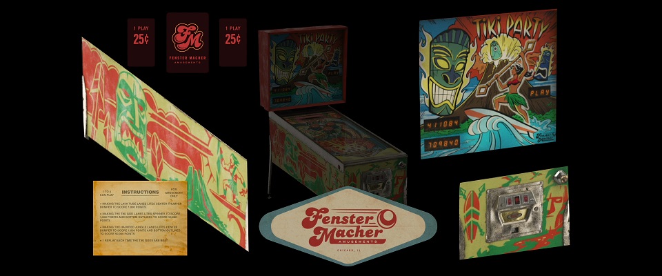
The same with Second Chance Antiques. I’ve seen a lot of them during my own road-trips and I used my memories of things I’ve seen growing up. So, I knew about painted signs, and the kind of artwork we can find in that kind of store. And then, people would also say, ‘oh, that’s something my grandmother had,’ or, ‘that’s the train station I had when I was a kid’. I’m very proud of that one because that’s a place that exists to itself without drawing the attention to it, so that the audience can focus on the characters. The pinball machine is very emblematic of our work in that regard.
AV: The Carnival is an iconic part of the film. How did you work on that one?
CF: It’s really big. We really wanted to set it apart from the antiques store, because they both have so many graphic elements; but I wanted them to be unique to themselves, so we really feel the difference from one to the other. Out of research, I went to various carnivals, looked at the way they manufactured their signage, then tried to simulate that. That was like drawing a picture with moving graphics around because carnivals want to draw attention to themselves, to have you get to the booths and play the games. That was very dynamic.
AV: You also did the toys’ packaging.
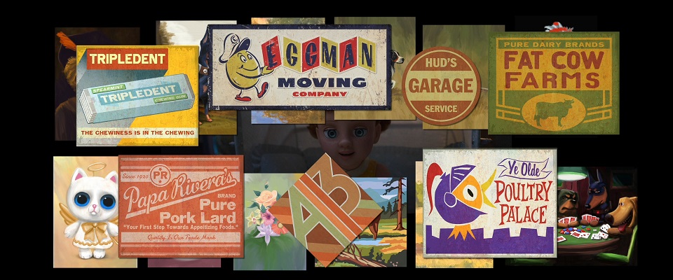
CF: I’ve always enjoyed doing that, because that’s something we don’t really see a lot of the time. We did that on Toy Story 2 with Woody’s Roundup and the gang, and it’s also important in Toy Story 4 as the toys come from different eras. The packaging just adds that level of history. I’ve done a lot of research on the different types of print and designs according to the different periods, to give a feeling of the time. I went to museums, antiques, and collectors. I took tons of photos for reference. You know, I have a habit of, when I see something cool, I want to keep it for reference in my research file. eBay was also instrumental, because you can find so many toys with their original packaging. So, I was able to study the different print processes – half-tone, offset… – in order to be true to the different manufacturing styles. That was very exciting.
AV: Were you involved in the creation of certain toys?
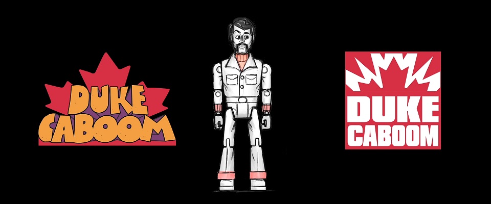
CF: By the time I started making graphics, most of them were fully realized as characters. So, with everything I created, I just tried to reinforce their role as toys. I was pretty involved in Duke Caboom. I wanted to brand him a certain way so I did a lot of research on the toys of his era, 70s action figures type of toys, like he was derived from a tv show or from a real-life character that had been translated into a toy.
For Gabby, I did her instructions book and her packaging. We put the « let’s be friends » phrase on it, which was kind of ironic!
AV: How do you integrate into the overall production?
CF: Generally, I would get together with Dan Holland, the Sets Art Director, and Bob Pauley, the Production Designer, and we talk about what they had in mind when they were designing the various elements. Then, I would be with my team and they would do the assignments that they would want to do because you always had someone whose talent lent itself toward a certain thing, like they’re particularly good at a certain time period, so I assign that to that person. Then, we generally would get together and brainstorm, come up with sketches and ideas, present them to Bob Pauley, then develop them a little more, flesh them out and show them to the Director. We’re really a team, we’re all part of the film.
AV: How do you balance the believability of the elements you create and the fictional and artistic dimension of an animated film like Toy Story 4?
CF: Generally, I go in and design and make it what I would expect to see in a real-world environment. Then I make it evolve to fit the world. For instance, in the Toy Story world, when you have a half-tone label, for instance, it’s not a real half-tone, it’s a stylized version of it. So, when you see it, you feel like, ‘oh, that’s a print process I’m familiar with.’ But if you were a print expert, you’d see that’s completely wrong, that’s not the way they would do it. If it doesn’t look real, then you don’t believe it. It has to have some level of realism to be believable. In other words, I try to make a stylized, cartoonish version of what’s in the real world, while still looking believable. That’s an interesting line to walk!
The Art Of Toy Story 4 is available to order from Amazon.com!
![]()
With very special thanks to Craig Foster, Chris Wiggum and April Whitney.