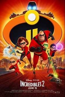
 The Incredibles are back! Almost 15 years after their first adventure, we retrieve them in The Incredibles 2 just where we left them. The film’s crew also features some of the same artists as the first one, starting with Director Brad Bird, Producer John Walker, Art Director Ralph Eggleston and Composer Michael Giacchino. It’s like no time has passed.
Well… almost.
If the family and the overall visual concept remain the same, technology has evolved since 2004, and it was up to artists like Shading Art Director Bryn Imagire to explore new paths while remaining true to the original flavor.
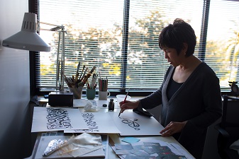
Bryn joined Pixar Animation Studios in June 1996 as a digital painter on A Bug’s Life. She worked in the art department as a designer on Monsters Inc. and Cars 2. She then went on to work as Shading Art Director on Toy Story 2, the Academy Award-winning features The Incredibles and Up, as well as The Good Dinosaur, and most recently on Coco, a winner of two Academy Awards. On Disney•Pixar’s The Incredibles 2, scheduled for release on June 15, 2018, she is credited as both Shading Art Director and Costume Designer.
As a Shading Art Director, she likes to experiment with different materials to help form the overall look of the film, through the colors and textures of characters, sets and objects. She works closely with the Director, Production Designer, and fellow Art Directors on each film to take the decided look and create that on-screen. So, her position is central to the process.
We were pleased to meet the wonderful artist and talk with her about her contribution to the film.
AnimatedViews: You took part in the first Incredibles movie. How do you feel getting back to this universe?
Bryn Imagire: I feel so happy to be able to work with Brad again. On the first Incredibles, I remember how fun it was for him. You know, it was his first movie at Pixar, and just having him here at the Studio after Iron Giant, which I loved, was so great. I do remember how many sets we had to do, and all the character simulation. Because at that time, it was our biggest movie in terms of sets and characters. We wished we had a little bit more time to be able to flesh everything out, the muscles, the articulations on the characters and the simulation of the garments. But we got it done in a good amount of time.
The difference now on this film is that the technology is so much better. I feel really proud of this one because we actually got to spend time making things work better. Character simulation, garments, articulations, everything is so much better now that I hope everyone will appreciate that. Since the second one is taking off where the first one left off, we had to continue the look, and then try to not only add things, make them look better, but doing it in a way that felt cohesive and so that you would be able to watch the first film and the second film at the same time without thinking about the difference too much.
I found myself on this film going back to a lot of the ideas that we established with Brad on the first film, especially with character art. It’s nice that no time passed between the first and the second. We knew the characters, we knew their motivations.
I also found myself looking back at those conversations that we had with Brad, you know, 15 years ago, and it was sort of nice because I had this wealth of inspiration and information in my brain, and I was able to go back to that, so that all the decisions we made were based on those first ideas that we established.
AV: Shading Art Director is a very collaborative position within the production of an animated film. Can you tell me about that particular aspect of your work?
BI: Shading Art Director is one part of the process where I see both characters and sets. I work very closely with the Production Designer and the Director, but I also work very closely with the Leads of the Character Department and the Character Shading departments, the Set Lead and the Shading Leads. I also work a lot with the Character Model Leads because, when we’re talking about things like the fabric on the costumes, we have to figure out how that’s going to stretch or interact with articulations.
This position deals with the colors and textures of the entire film. I like it because everything is kind of “in context” and can focus the eye of the viewer by just color and contrast.
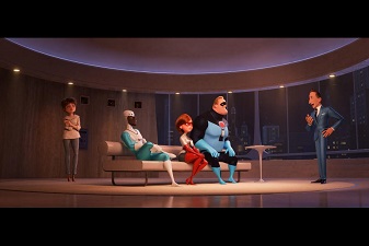
For example, in Incredibles 2, we kept the most saturated and most contrasted patterns on the main characters. The family, Evelyn Deavor and E, all have very saturated or either lighter dark or very contrasted patterns on them. And then for the secondary and background characters, we tended to let them fall back in saturation, and then patterns are very subtle on the background characters and a little bit greyed out. In any given shot, your eyes get to the family and the main characters first. Even the sets fall back.
AV: Can you tell me more specifically about your collaboration with the film’s Art Director, Ralph Eggleston?
BI: I’ve worked with Ralph and known him ever since I have been here at Pixar. I really respect him as an artist. He’s very nicely opinionated and funny. He has a really great relationship with Brad, as I do. So, it was a really nice reunion for us to get to work together again. You know, the whole Art Department is always a very small group compared to the entire crew, so we work very closely together. He trusts me a lot, and I appreciate that. He lets me bring my taste and my experience.
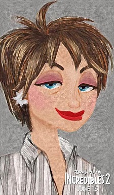
For example, when I worked on the costume for Evelyn Deavor – because I have a costume design credit on the film – he suggested to think about static on a tv. That was a very abstract but juicy idea, and it gave me a lot to work with. He also suggested looking at art and fashion from the 60s. All very good design ideas, and at the same time very large, so it was easy for me to go in and pull ideas from them.
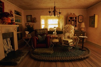
AV: Shading Art Direction is also about experimenting. I remember the exquisite model you did of Carl’s living room for Up. How was it on Incredibles 2?
BI: Shading in CG is about giving everything a tangibility and believability. In stylized projects such as Incredibles 1 and 2, whenever you do a stylized CG film – because in the computer everything could be infinite and you can just keep adding and adding details, just like a magnet – I actually like to hold back. And practical models can be very useful for that.
It’s very nice because it feels real, but because the scale could be bigger or smaller, or something you don’t usually see in real life, it allows you to see things in a very different way and I actually love to work like that. The other thing about a practical model is that you can shine a light on it. Because it’s a real thing, you can shine a real light on it and see how it acts in light. It’s a great way to be able to prove ideas outside of the computer. As I said, there’s something infinite about the computer, and by making a practical model, I’m actually making it be not infinite. It’s a finite thing. Being able to play with that is really an interesting aspect of what I do.
On Incredibles 2, we didn’t make as many practical models, but I did do a lot of collages after costume ideas and showed Brad that kind of artwork. I took a lot of photographs of practical models that I made out of snakeskin or metal. I had a basic triangular shape for E’s costume and then I put that texture into that triangular shape and it was a really nice way of approaching her costume as sculpture and not as a dress. It gave me some really interesting ideas that I don’t think I would have had if I drew them with a pencil.
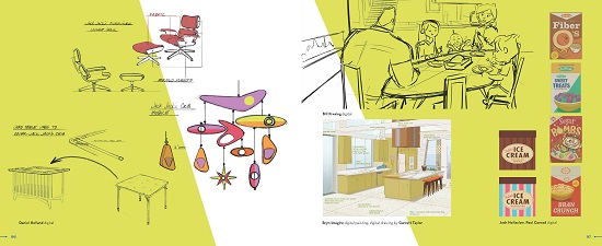
AV: The aesthetics of the film is very much inspired by mid-century modern design. Did that choice had implications on your work?
BI: As a designer, I love that period because the objects were so beautiful, the architecture so inspiring, and the fashion at that time was so interesting. So, as a time period, I love it because it’s so juicy, and there’s so many amazing things that we could draw on.
The original idea of being in that time period, I think, really relates to Brad’s aesthetic. Because we all were kind of the same age at that time, we all have that kind of nostalgia for that time period. There were things that were happening at that time, like the optimism of the 1950s, space travel, and the way they looked into the future; and because of that, I think we kind of look back at that time with longing and love.
But also the aesthetic of that period has very clean, simple lines; the textures of everything are very lush, like rosewood and other materials that sometimes we can’t use anymore because they might be extinct or issues like that. I think that the designers of that time were also looking at fabrication as a limit to the design, as fabrication was influencing the end design.
Take George Nelson’s pendant lights of the time. He was inspired by European design. He wanted to bring those ideas back, but the way they made them over there was so expensive that he was really experimenting with other materials like fiberglass and resin. So, the process was really influencing the final design, which, for me, is really interesting.
AV: Which elements of the film did you have the most fun working on?
BI: I think the highlight for this film is the costumes for Evelyn Deavor. I felt very connected in designing her costumes. Another aspect of costume design on this film was that the wardrobe (choices) for her had to carry out through the whole movie and there’s an interesting character arc for her. So, in addition to using design elements like optic art and 60s fashion, I also had to track her character arc from the beginning of the film to the end, and I loved to do that because it really enhances her motivation and her place in the movie in every scene.
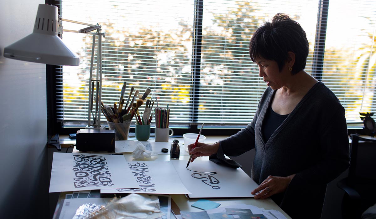
With very special thanks to Bryn Imagire and Chris Wiggum at Pixar and April Whitney at Chronicle Books. Bryn Imagire photo by Deborah Coleman/Pixar. The Paar family furniture art comes from Chronicle Books’ The Art of Incredibles 2. Used by permission.


 >
>