
 Soul is an extraordinary journey from the bustling streets of New York City to the mysteries of the cosmic planes, following middle-school band teacher and talented jazz musician Joe Gardner on an interdimensional adventure to find what makes life worth living.
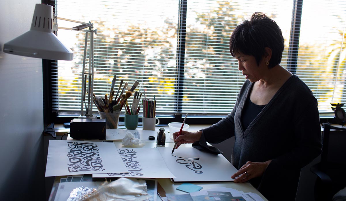
A lot of brilliant artists followed Director Pete Docter in the making of this unlikely film, passionate about participating in such an original and daring project. Among these was Sets Art Director Paul Abadilla.
Born in Manila, Philippines, Paul moved to California at the age of seven, and was raised in Milpitas and San Jose, CA. He studied Animation/Illustration at San Jose State University. Prior to joining Pixar, he was a visual development intern at Walt Disney Animation Studios.
He began his career at Pixar Animation Studios as an art intern in June 2008, and has contributed to the making of several Pixar feature films, including Monsters University, Finding Dory, Cars 3 and Incredibles 2. He has also worked on Academy Award©-winning films Brave and Inside Out. Additionally, he has worked on Pixar short films The Blue Umbrella, LAVA, Sanjay’s Super Team, and Pixar’s first television special, Toy Story Of Terror!. He was also the production designer for Pixar’s SparkShorts film Loop.
We were privileged to meet the artist and to chat with him about his own journey on Soul.

Animated Views : How did you come to be part of Soul? Was it a desire of yours or were you approached by the crew?
Paul Abadilla: A little bit of both. Initially, when I had first heard of the project, I really wanted to be a part of it. At that time, I was still working on Incredibles 2. I heard of different projects here at Pixar I’d like to be a part of, and Soul was definitely on the top of the list. I think the music aspect really attracted me. And New York City and the soul world would be fun to design. So, on that level, that’s what really piqued my interest. Then, I went on to other projects and wasn’t able to hop on to Soul at that time. It wasn’t until later that they were looking for some help in set design, so there was an opportunity that opened up, and right away, I dropped everything to join in. That’s how I got involved in the film in the beginning, as an individual contributor. I wasn’t a lead yet on the film. Then I became Sets Art Director.
AV: How did you contribute to Soul?
PA: The one thing I always say is that I’m one of the connective tissues between the art department and the sets department. As Sets Art Director, one of my main responsibilities is making sure that the ideas and the vision of our Production Designer and our Director are translated into our sets, supporting the characters. With that, as we try to find a visual language with our set designers, another huge part of my job is to make sure that those ideas are consistently translated into 3D, working with our technical team. And then another layer of the work is once we get shots approved and all the sets are built and shaded, I go through each shot, making sure that the sets are compositionally looking really good and not taking any focus away from the characters. It’s a very layered role, and very much centered around collaboration. For me, one thing that I learned immediately was I’m not drawing at my desk as much as I want to; I’m always in other people’s offices, in meetings and making sure that the team is inspired and motivated, that everyone is at their best so that we can create the best things on screen. So, a huge part of it, too, is the relationships between my colleagues and I.
AV: How’s that?
PA: This was my first role as an Art Director on a feature at Pixar and it was very intimidating at first because of all the sets involved in the movie. But then I quickly realized that I was surrounded by all these experts, and I felt really lucky to be working with these people because I knew how good they were at what they do. So, a lot of that pressure was taken off. I was like, “Hey, we’re working together. I’m gonna to rely on you. What strengths can you bring to this problem, to this design?” I really encouraged that collaboration from the beginning. I didn’t look at it like “Hey, I’m an Art Director, you do as I say!” It’s more like, “Let’s work together!” because my personal goal is making sure that the film that we’re making is the best that it can look, supporting the story. So, I kind of looked at it from that perspective, but at the same time I wanted to honor and carry through on the vision that the Director and the Production Designer had. Because they are the ones that are leading the visual language of the film. So, I worked with them as well, making sure that I really extracted all the ideas that they had in their head and then help visually translate that into our film.
AV: How would you present the visual concept of the film?
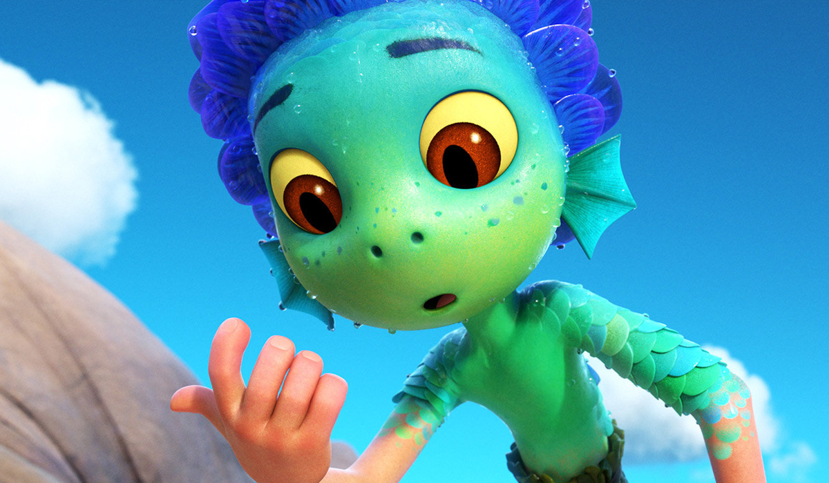
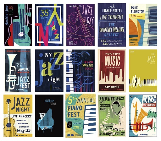
PA: The one thing that was very clear to me is that we really wanted to tell a story about a person who is reflecting on the meaning of life, on how we can make the most of that time that have to build on. So, with that in mind, we had these two worlds that we had to explore, the human world and the soul world, and it was a huge challenge to figure out what the soul world would look like. So, we started with what we know, which is what the human world was. It was very important for me to latch onto a point of view and it was very clear to me that we had to see this film through the eyes of Joe Gardner, our main character. When I got onto the film, there was already some exploration in terms of character design and influences that were present in helping design his character. So, I started from the images that were already generated there. And also, since jazz has a huge part in the design of this film, we all felt like the art form of jazz and the kind of visuals that came with it – especially jazz album covers from like the 50s and 60s – could be used as a visual cue to give us a unique perspective on how we could see this human world.
And as the film is really about what it means to be alive and appreciating the little things, we wanted to amplify the tactility of the human world. We wanted it to be as specific as we can. I really wanted to celebrate the specificity of the things that are overlooked in the human world and infuse that into the design so that, in contrast, when we go to the soul world, everything just feels more fantastic and otherworldly.
AV: Speaking of the human word, how did you approach the city of New York?
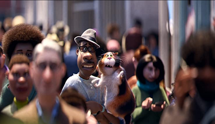
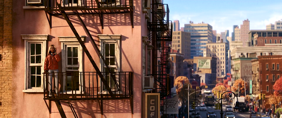
PA: New York was a great city where to tell our story because it’s a diverse city. There’s a lot of history to it, too. Also, one of the big topics about this film is that it really centers on time. So, time has always been this next central core. It is very abstract, but for me it was very informative because you have on one side a finite world where things are ephemeral, don’t last forever, and then you have the opposite with that timeless aspect of the soul world where things are infinite. So, we go from an architectural base with rectangular shapes to rounder, softer forms, on a very abstract level. For the human world, there is that tactility of things, and the way time affects things, with wear and tear on the surfaces. From the shading standpoint, things don’t look perfect. You have layers of paint on the walls, with graffiti, worn-out paintings, or peeled stickers. There’s that cat that we follow through the film and we had these really low shots, so we needed some sort of visual interest from that point of view, for the sidewalks for example, that have plenty of details.
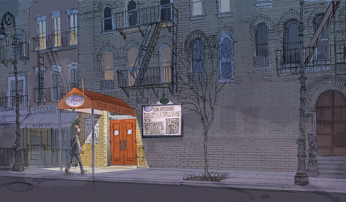
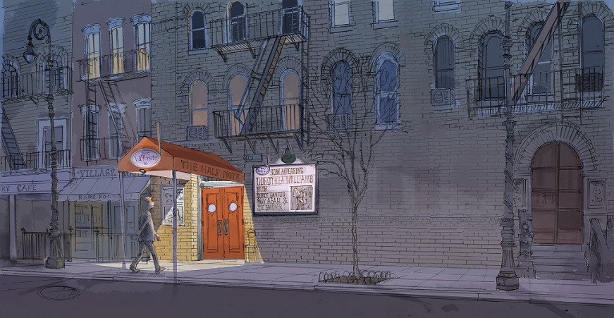
For New York, we needed three distinct neighborhoods. One, we had the jazz club, which is inspired by a lot of the jazz clubs that can be seen around Greenwich Village, in the West Village area. And then we had Queens, which is more suburban, and has certain visual elements that are separated from the jazz club area, and then we have the area around the hospital, which is Downtown, more South and Manhattan. Around there we have a lot of those tall buildings, which make you feel like the characters are in a canyon. There’s a lot of business. We wanted to visually overwhelm not just the audience emotionally, but also Joe and 22, because it’s 22’s first time in the city. We thought it was a good thing to lean on.
AV: What kind of references did you use for that part of the movie?
PA: There have been teams that went out, including the Director, the Production Designer and the Producers, but that was before my time. They had already taken photos and documented a lot of information from that trip. I’ve been to New York a number of times before myself, and I went back there late January, early February last year. It was clear to me that what we were doing in the film was very consistent with how New York looked and felt. So, for me, during production, it was a lot of watching films that were set in New York, a lot of internet searching with Google maps and drive- throughs. It was super useful because we were able to get a lot of the details and make it feel authentic.
AV: Jazz is about time, and also about rhythm. Did you integrate that parameter into the sets of New York, too?
PA: Definitely. And I’m glad you mention that aspect that is strongly connected to time. The idea of rhythm is definitely something that I wanted to translate visually to the set design, especially with the different buildings you see throughout the film. There’s also something about jazz that is very improvisational. You know, CG is very good at doing things perfect, right out of the machine. So, us being able to design and make things imperfect gave that human element similar to what jazz music is. It’s instantaneous, it’s not perfect. You might play the wrong note but the other persons playing with you will support it and make it sound right. Similarly, the way we worked is that we constantly tried to fight this perfect nature of the computer. For example, if you look at one of the buildings in New York, and focus on a façade, you might expect a row of windows that are perfectly lined up, but it was our intention to take one of those windows and just take it down a little, then take another one and change it a little bit. And that’s because of those granular, hand-crafted touches that we did that we conveyed this idea that the human world is not perfect. It’s affected by the human hand. And that’s what make the human world in Soul more believable, too. It also supports the designs of the characters as well. The one thing that we were very intentional about was that we wanted to make sure that the sets didn’t upstage the characters. Just because we wanted to carry up this idea of jazz and how playful music is, we didn’t want to caricature the world so much that it became distracting. So, the huge challenge, I would say, was modulating and finding that perfect balance between believability and caricature.
I should also add I’m a huge fan of not only jazz, but also the kind of music that kinda burst from jazz, hip hop being one of them. So, when it came to designing New York, I knew instantly there needed to be some graffiti. That’s just part of the character of the city. I’ve done graffiti for years now, and I still paint to this day. So, it was taking that personal experience as well, and infusing that into the film was a blessing. I’m glad Pete and the team was open to the idea of adding some murals out there, some tags, street art and things like that. So, to be able to weave my own personal experience into the film that way, even though it’s just like a minor kind of detail thing on the side, was really a blessing.
AV: How did you approach Joe’s apartment?
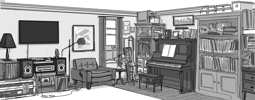
PA: That was one of my first assignments on the film. The overall apartment just had a first pass on the design so, my assignment at the time was to answer the question of how to make this music corner more specific to Joe as a musician. One thing I instantly focused on was his record collection. You know, on my own time I’ve been a DJ since 1999. I’ve been collecting records and I know that painstaking attention to details, making sure they’re in mint condition and don’t break. And there’s something about that which I experienced myself: if you want to put your records on a shelf, records weigh a ton, so there may be a bend on that shelf. You have to think about how to organize your records on the shelf without risking to have everything fall apart. So, I started from my own experience having gear around and records and things like that and infused that into the set design. And when I presented these ideas to Pete and the team, they really felt it sounded authentic.
AV: There’s an upright bass in that apartment. Is it because Pete Docter can play that instrument?
PA:He told us about that, but at that time in the writing process, Joe’s dad had played it. So, that instrument is actually a keepsake from his father. And so, with all the instruments present in the apartment, that communicates about Joe’s history, about his family’s history, and the other instruments he can play. Another thing that we wanted to tap into was all these binders and folders and boxes which show that he’s also a teacher. He’s a teacher and an aspiring musician, and through his level of life and the kind of furniture that he has, we also wanted to make sure that he didn’t feel, like, too successful – that things were kind of like, again, improvised. That added another level to his personality.
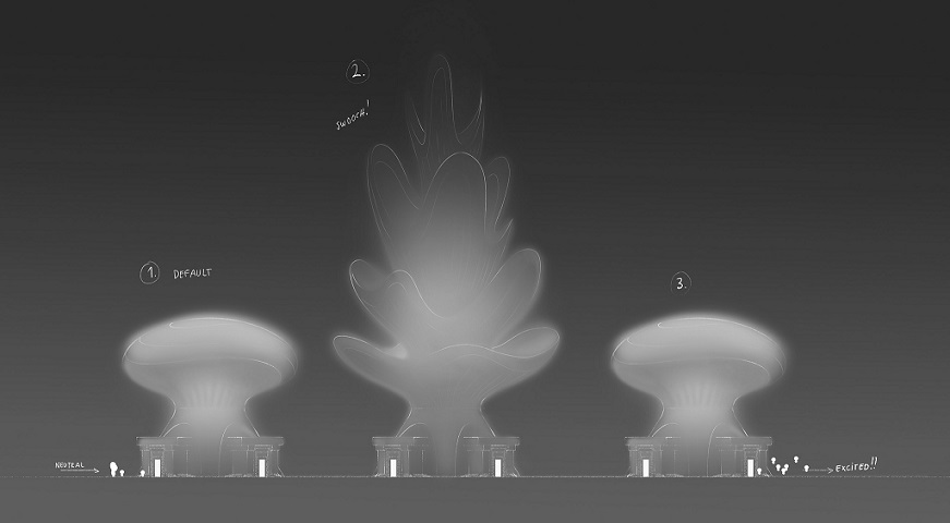
AV: In The Art Of Soul, we can see that you also took part in the design of the “Personality Pavilions” of the soul world. Can you tell us about them?
PA: The Personality Pavilions were very challenging, because they were so abstract. At the beginning, we were like, we should just be very literal about each personality and make them work like what you would expect them to be. But then the trouble with that was: 1 – they became visually distracting with all these details put together, and 2 – there were versions where we tried architectural-type designs, but they didn’t feel too soul world-like. It was too specific to a human world experience; it didn’t feel right. So, we really leaned on the abstract side of things to interpret the pavilions themselves, because our personalities are abstract by nature… with the exception of a few of them, like the Aloof Pavilion. We made it feel like a nose pointing up in the air, because that shape language kind of also reflected the way that the souls, when they exit, have their nose up in the air. So, just for clarity sake, there were certain ones that we wanted to be very intentional. But for all the other ones in the background, we wanted to approach them in a more abstract way, because they gave us a lot of freedom. You don’t have to identify each one as a certain thing. We could just rely on a couple of key things that we are going to find in the story, and let the rest be in the background.
AV: Soul is about the journey of life, be it Joe’s or 22’s or ours. What was your journey like?
PA: Oh, man, good question! On one level, it has been definitely a career highlight. I’ve always wanted to work with Pete. I respect him so much as a filmmaker. I worked with him very briefly on Inside Out, but I would consider this is my first real experience working with him full time over two years. It’s been so great!
At the same time, being a lead as an Art Director on this film, I was able to work with people I knew from the Studio, but with whom I hadn’t worked before. That was a such great experience, collaborating and building and creating with them.
And also, there’s been a lot of growth, a lot of conversations about existential questions, that have been great not only for the film, but also for ourselves. What do we do of this time that we have here on Earth? Whatever Joe is going through, and even 22, it made me think about my own things while working on this film. It’s been such a journey!
The Art Of Soul is available to order from Amazon.com!
![]()
All artwork and Paul’s headshot courtesy of Pixar Animation Studios. With all our thanks to Paul Abadilla and Chris Wiggum!