Phil Nibbelink Productions (October 27 2006), Indican Pictures (June 12 2007), single disc, 77 mins plus supplements, 1.78:1 widescreen (but disc is not anamorphically encoded), Dolby Digital 2.0 Stereo, Rated G, Retail: $21.99
ANIMATED VIEWS EXTRA! Writer-animator-director Phil Nibbelink speaks exclusively to us about his five-year mission to single-handedly bring Romeo & Juliet: Sealed With A Kiss to the screen! Read that feature here!
Storyboard:
Shakespeare’s immortal love story is signed, sealed and delivered in a delightful retelling by one man band Phil Nibbelink, the ex-Disney animator-director who literally hand-crafted the whole thing himself!
The Sweatbox Review:
In 1968, Richard Williams embarked on the long and arduous task of single-handedly creating the most amazing hand-drawn animated feature ever seen. Williams eventually brought others on board, and the production of his planned The Thief And The Cobbler has been well documented over the years, unfortunately ending with the film being taken away from its creator/director and handed to those with less critically perfectionists’ eyes to finish off. While the point of Williams’ ambitions was to create a feature with old-school traditions, what he didn’t have access too was today’s technology, which has allowed animator/director Phil Nibbelink to achieve what could never have been done before: create a full-length animated feature from the hand of one man.
Whereas Williams was eventually dumped from his own project for not meeting distributor-imposed deadlines, Nibbelink was able to stay under the radar, putting his money where his mouth was in keeping traditional animation alive by financing the film himself, drawing each and every frame by hand, and completing his film in roughly the same time it takes an entire crew from start to finish. The result is Romeo & Juliet: Sealed With A Kiss, an enchanting little film that really should be getting much more praise than it has been, if nothing else for the accomplishment itself.

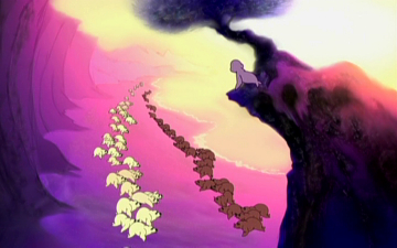
With a good story in the bag courtesy of old Bill the Bard, Nibbelink set about storyboarding the entire film first, designing his characters as sea lions and seals so as to not have to deal with the intricacies of human animation and clothing. As such, this instantly gives Sealed With A Kiss a look of its own and certainly stands it apart from the usual fairytale princess musicals that seem to be the genre most mined when others try to ape Disney, or indeed the norm to attempt when ex-Mouse House animators head off into their own pastures.
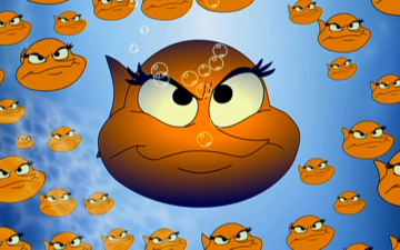
The film, perhaps surprisingly, stays faithful to Shakespeare’s text throughout, even lending the two competing families their original Capulet and Montague names and heading into some dark places once or twice. Of course, there’s some kid business in there (a little fish, Kissy – voiced by Nibbelink’s own daughter Chanelle – pops up every now and then to sooth some of the more scary or “sad” moments), but the whole thing flows well. Going back to a time when star voices were a novelty instead of the norm, and vocalists were picked because they actually matched their characters, here Nibbelink yanked in other friends and family to perform the vocals suitably, and the results are extremely pleasing, no doubt under his strong direction.
Not that the reproduced voices actually sound too hot: unfortunately (and its unknown if this is a production issue or with Indican’s handling of the material), if we’re evaluating this project against its bigger cousins, it has to be noted that the sound mix is overly aggressive. Some of the more “excitable” performances’ vocals come over as more than a little distorted; some of the heavier ones pop their words, belying the budget recording or mix, and different microphones or places of recording. A big plus on the soundtrack is the jazzy score, seemingly from stock recordings, which disguises its synthesized nature by sticking to non-orchestral, band-styled instruments and sounds.
The final mix itself also falls into that old trap, which often catches out newcomers, of bringing the vocals out too far in front, and sitting the music back too far, unless it needs to make a point, in which case everything ends up fighting each other for sound space. As such, there are no dynamics to the track – indeed the hyper opening scenes may be the film’s biggest detrimental effect – and it remains forceful throughout, becoming easily tiring. For comparison, I flipped to the Spanish track to hear that mix and found, although there was no distortion and it was a much more polished track, it was actually out of sync, wandering by a few seconds from just a couple of minutes into the picture (more on these issues below).
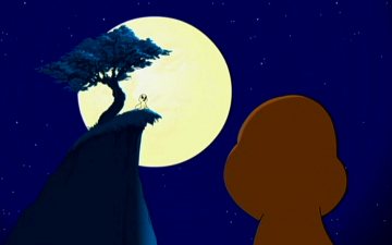
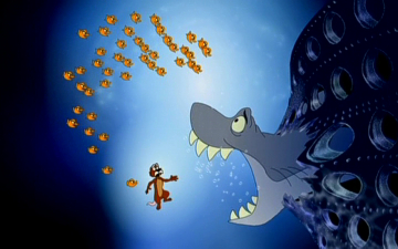
On the animation side, there are no such caveats, and just as you would expect from a former Disney animator, no matter what the technique, Phil does good work here. The characters, though naturally simple in body design, express the full range of emotions facially, matching their vocal counterparts, and there are at least a couple of moments of effects animation that are truly wonderful to look at. Nibbelink is perhaps slightly hampered by the Flash animation tools used to complete the look of the film, with the occasional odd or staccato movement but that’s down to the trappings of the technique and nothing to do with his otherwise superb draftsmanship. Sequences are often animated on ones, a touch that could have been dropped in order to create the film in less time but which shows again the attention to detail and the urge to put out a top-flight film to the best of the animator/director’s abilities.
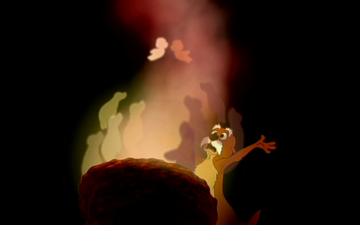
The rich, rich colors help create the twilight land where seals and sea creatures would be able to talk, sing and fall in love, and the designs do everything needed to work and, at the right moments, invest emotionally in the characters. One, Friar Lawrence, reminded me of Squirrel Merlin from The Sword In The Stone, an homage to past animation intentional or not. Despite the computer paint job, color banding isn’t really a problem (thanks to the usually flat 2D characters) but it does rear its irritating head during a Titanic-inspired highlight. However, some of the movie’s best looking background animation (aided by CG props and excitingly edited multi-layered sequences) helps overcome those limitations, and many of the other backgrounds or effects animation never expose the budget nature of this one man show.
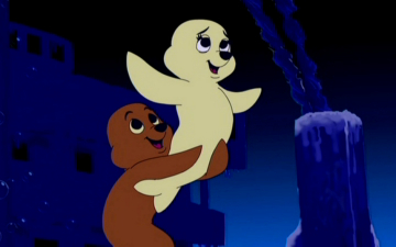
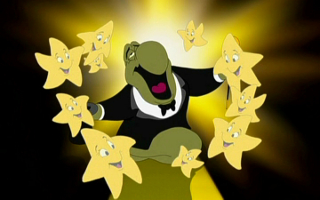
This is mainly achieved thanks to Nibbelink’s planning: the location is intentionally more limited in scope, though no less “epic”, and as such the pros outweigh the cons. There are especially neat touches throughout, such as the Elephant Seal Prince (director Nibbelink in his cameo role) bad breath problem, and Romeo’s banishment to Shark Island, where the story peaks. The screenplay (again by Phil) also has fun with a number of other Shakespeare hits – Mercutio’s catchline of choice happens to be Hamlet’s most celebrated quite, for instance.
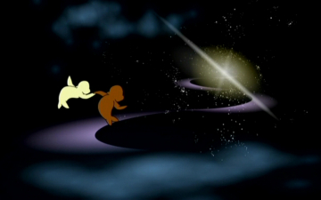
Now, it’s true that not everything works. Two scenes in particular are overly complicated, and two characters, to which the story keeps reverting to for comic relief every so often, prove themselves to be more irritating than comedic. Though the story is focused, I found it over packed with these comic asides, resulting in a movie perilously close in tone to the kind being pushed out by lesser studios in the late 1980s/early 90s. Sealed With A Kiss could have been instantly dismissible if it were not for the fact that it had ostensibly been the work of just one man. But then, did I find the breaks in dramatic tension more noticeable because I was so drawn in (no pun intended) to the rest of the story? Certainly younger viewers would not complain about these additional light moments. The songs – by Nibbelink of course – are simple, sometimes cloyingly sweet, but thankfully short, and even the sometimes flat voice of Daniel Trippett’s Romeo in “the balcony scene” is offset by some dreamily effective visuals, and the Prince’s own cue is a both genuinely catchy and amusing highpoint.
So how does Sealed With A Kiss stack up against other such fare as even Disney’s contemporary classics? Well it obviously doesn’t have the army of crew behind those epics, and sure it has elements that may not stand up to the best that a 1000-strong crew would come up with and refine to infinity (one joke-packed scene early on comes just at the wrong moment to break the dramatic direction of the plot). But considering the ratio of crew members (actually, better make that “crew member”!), Sealed With A Kiss doesn’t fare badly at all, and is significantly more entertaining than the many post-Beauty And The Beast knock-offs and bore-fests The Princess And The Pea, Princess And The Goblin (notice a theme here) or the aforementioned final release version of The Princess And The Cobbler, which is what unfortunately became of Richard Williams’ masterpiece to-be before it was completed by other hands, ruined and dumped in some territories with that generic title.
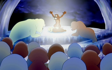
What’s great here is that while many talk and dream of this kind of achievement, Phil has really gone out there and done it, and in the process has helped keep the traditional animated feature format alive as well as both reaching the target of actually completing the project and being able to take pride in that it’s turned out as well as it has. Nibbelink’s feature is a valiant attempt to not only beat production boundaries but also those which govern the sources of “children’s entertainment” stories. While far from perfect, he’s fashioned, for the most part, a coherent animated feature on a fraction of the budget even the slimmest direct-to-video projects enjoy, though never coming too close to revealing the low cost. In fact, Romeo & Juliet: Sealed With A Kiss is eminently re-watchable, and this is in fact my second go around after I was lucky enough to catch a screening earlier this year.

It’s just a sad fact of the business when such computer generated dross as Happily N’Ever After can pick up major distribution while much better and – gasp! – old-school hand drawn animation is overlooked. Ironically, Happily’s line producer John McKenna is here thanked in the credits (along with Disney’s Tony Anselmo), proving that he does have a soul. Kudos should go to Indican Pictures, who at least rallied up a limited theatrical run and are doing their best to make sure the film finds its audience on disc. And congratulations and thanks to Phil Nibbelink, who has created a lovely little movie that deserves to be discovered and remembered.
Is This Thing Loaded?
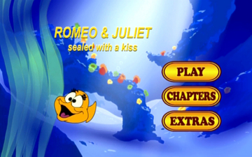
For a fully animated feature film made on such a small budget (a mere $2 million), one might not expect even the slimmest electronic press kit coverage given the time and financial constraints. So it’s a great surprise that Indican have included a small helping of bonus content that bolsters Sealed With A Kiss’ appearance on disc. The anamorphic, but non-enhanced 16:9 main menu, seemingly specially animated by Nibbelink for this release, is a little clunky (the same, non-skippable animated intro repeats whenever one returns to the front page), but fun, and lends the title an added gloss. For the purposes of this review, I’ve stretched out the intended 16:9 frames, but anamorphic enhancement is otherwise not automatically selected (a fault with Indican’s mastering, see below).
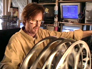
The meatiest of the extras is a The Making Of…Romeo & Juliet: Sealed With A Kiss featurette. Actually, this is less a look behind-the-scenes on the animating of the movie and more of a trip into the sound recording booth, as we see the Nibbelinks and assorted cast members vocalising with clear spirit. There isn’t really any structure to the six-minute piece, but corresponding shots from the completed movie are intercut with sometimes grainy DV and VHS footage of the cast in action. More than anything, this provides a fun look at the performers behind the characters, as well as hints on where that sound distortion might have been introduced along the way (audio tech heads will see what’s what here). There’s some footage of Phil animating the movie on a digital tablet and some informative narration on the methods it was outputted and cut on film, closing with a fun outtake of the kids performing the final line of the Prince’s signature song.

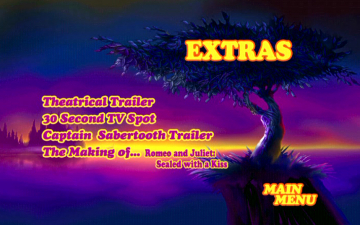
A 4:3 Theatrical Trailer reveals that the film was animated to a 1.66:1 frame, allowing for widescreen presentation in theaters. Luckily, we get the movie itself on this disc this way too, as this preview, while adding a sliver of image top and bottom, loses much more on the sides. However, it comes from a film print and one must say that this looks, scratches apart, much better – more filmic and with deeper colors – than the final, digitally clean image transfer of the main feature. Contrast is accentuated and the printing to film certainly “compresses” the digital layers into a more “rough and ready” look that wipes off the digital gloss and gives the whole thing a much more timeless and traditional feel.

A 30 second TV Spot, which plays as a cut down of the theatrical trailer, completes the Sealed With A Kiss bonuses, though there’s also another included preview, for Indican’s Captain Sabertooth (again in non-anamorphic 16:9), the kind of dreadful sub-television animation that gives cartooning a bad name, with CGI ships at sea that feel wildly out of place, and just shows what an achievement the Nibbelink family and friends have pulled off.
Case Study:
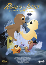
Romeo & Juliet: Sealed With A Kiss is presented on disc using a variation of its original theatrical poster art on the front of the box, a rarity these days, and another nice throwback to the time when posters were about the characters rather than the huge faces of the two leads. I wouldn’t have been adverse to a little touching up of the artwork to boost the contrast, colors and feel of the poster: as it stands this could very easily get lost on shelves and mistaken for very younger kids fare when it is so much more inside. A Spanish track is included despite the lack of info on the sleeve, but this comes with its own problems (see below). The cover doesn’t state a widescreen ratio, and this is perhaps some lack of information Indican’s way is why the menus and movie have not been encoded for 16:9 anamorphic playback, but rest assured that the image is the correct 1.78:1 intended on the disc, which has a nice, fun image of Kissy – obviously a Nibbelink favorite – as the platter’s artwork. Cute!
Ink And Paint:
Created digitally in a 1.66:1 animator/director preferred ratio, Sealed With A Kiss was presented theatrically at 1.85:1 and comes to disc here in roughly the same format, at 1.78:1. As mentioned above, the unfortunately non-progressive nature of the transfer (a budget issue) means an interlaced result, which will go unnoticed by most but doesn’t show Phil’s line animation off to its best advantage. Still, it’s certainly much more pleasing than the non-drop frame PAL conversion I saw earlier this year, where movement was prevented from flowing as it should by repeating every 24th frame twice to account for the 25 frame difference.
I still have an issue with the colors that look so much deeper on the film-transferred theatrical trailer and more like direct-to-video blandness during this transfer of the feature itself, but again this was a financial constraint. Phil’s confirmed that he prefers the “100 year old, low tech and high quality” film look, but while he would have loved to go from the interneg to an HD master, it was more cost effective to convert down from a master produced from the original 2K resolution files. That being the case, the colors would then seem to be what Nibbelink was seeing when he created the film, so what can be said in its favor is that the image is spotlessly clean and presents the original art as best as possible on disc.

Causing points to drop off again is Indican’s lack of anamorphic enhancement on the menus or the main feature. While things should look okay on a widescreen display the code telling players they should be exhibiting a 16×9 image is missing, meaning a tall, stretched out image for those with fullscreen displays and no accommodation for letterboxing. The images for this review have been reformatted to their original dimensions, but this is a pretty major slip up from whoever mastered this disc (see note below).
Scratch Tracks:
I’ve already remarked on the somewhat haphazard nature of the recording and mix itself, and that the results (on the English track at least) are not quite as proficient as the usual levels you’d expect on such a production. The bonus material gives away the fact that sometimes the performers were standing just too close to the mics, not allowing for technique to pull back on those roaring words. In the final mix itself, I’ve noted above that it is overly aggressive. This could be an intentional means to make a splash with the opening of the movie, but doesn’t help the feeling that there’s too much going on (vocals, music, sfx) at one time at times, while at others the already booming vocals are placed too far out in front of the track. This English track’s distortion, like the image’s interlaced vs progressive topic, will slip past most and is more a concern for those home theater-philes who’ll simply want to adjust the volume accordingly.
The original test disc I was fortunate to look at some time ago included a “Set Up” menu option that’s missing here, leading to an alternate Spanish dub. That link has been removed and there is no mention of such a track on the packaging. It’s easy to spot why it’s suddenly “disappeared” (though is still there on a second track): while it is better mixed, with no voice distortion, the Spanish dub has a major synchronization issue mentioned above. It actually seems to be running in Europe’s PAL format, which introduces a 4% speedup that means the track slips out of sync as early as two minutes in and actually ends a full three minutes earlier than the image does! With that issue making it redundant, no wonder they don’t want to play up its inclusion!
A Note On The Image And Video: As I’ve done when reviewing other low-budget releases that want to jostle for shelf space against the bigger boys, technical glitches have to be taken into account, since the paying customer has no way of knowing the differences between products that look, to all intents and purposes, the same. Therefore, the lack of true 16:9 enhancement, the slight but present distorted soundtrack issue and the fact that the Spanish track, for those who need it, might as well not be there, unfortunately loses marks for Indican’s handling of the movie and its disc-mastering process…all problems that could have been caught early on and indeed things that I notified the company about based on the test disc preview of the title that Animated Views received. That these issues were not addressed or independently caught and corrected should be appropriately made clear to the consumer.
Those who’ll use the disc as a babysitter will find no source of quarrel, but those adults who end up appreciating Phil’s film, and collectors who insist on disc basics being adhered to, may find more than a little to grumble about. That the movie was completed to a budget – including mixes and transfers – is one thing, but to slip up on the kinds of fundamental disc requirements as those implemented by novices in their bedrooms is a clear, but unfortunate, set back on the distributor’s ability to position the title to its maximum advantage. While the movie escapes the potential pigeonholing of its origins, this final disc does not, and as a consequence comes off being just this side of being unprofessional. If this was a major company release there would be an outcry. That it is the potential jewel in an independent’s crown is just a crying shame.
Final Cut:
I often start these wrap-ups by declaring “it’s no masterpiece but…” when a film is more than adequately made though misses the mark enough in various respects as to degrade its intended impact. Here I find myself really wanting to help push this unique and quality-conscious modest movie even though the disc doesn’t help itself with several hitches that place it below big studio fare. With such an important achievement in the bag, I’d have loved for Indican to position this better in the marketplace and shell out on a few collectors’ features. A commentary is always a wish-list inclusion, but I’m sure Phil would have been amenable to providing the details of making your own movie quite literally with your own bare hands, a unique selling asset that goes without mention. But while the disc falters just a bit, the movie certainly does stand up to such scrutiny, and whatever else one might hear about Romeo & Juliet: Sealed With A Kiss in reviews, I would seriously suggest checking out the film’s clips online and, if you’re tempted, picking it up. At under twenty bucks online, you can’t go wrong, and for everyone else a recommended rental is at least essential. Phil Nibbelink set out and completed what many others have failed to do, and just getting to the finish line deserves our support. It’s no masterpiece but that he created a sweet little movie is a terrific bonus.
ANIMATED VIEWS EXTRA! Writer-animator-director Phil Nibbelink speaks exclusively to us about his five-year mission to single-handedly bring Romeo & Juliet: Sealed With A Kiss to the screen! Read that feature here!
 | ||
 |


