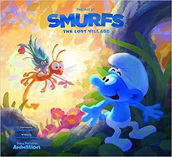
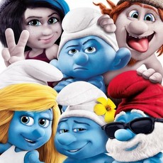
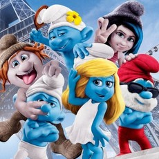
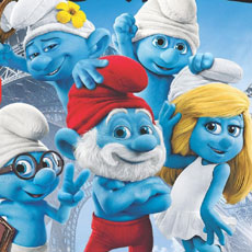
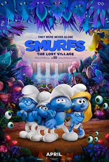
 One remembers that Sony Pictures Animation’s previous two Smurfs movies were live action films in which real humans interacted with more realistically designed and animated Smurfs, and the stories centered as much around the human characters’ issues as those of the Smurfs.
Well, Smurfs: The Lost Village has nothing to do with those. It is a radically different take on the Smurfs and their imaginary world, fully computer animated, and much closer to the tone and style that creator Peyo initially envisioned. And that’s what is particularly exciting in this new movie. It is as if Peyo’s world were real!
To work on this sort of “re-creation” (in all senses of the word!) of the Smurfs, director Kelly Asbury (Gnomeo & Juliet) appealed to Production Designer Noëlle Triaureau and Character Designer Patrick Maté, who have known the Smurfs since their childhood, as they both come from France, next to Peyo’s Belgium.
Noëlle Triaureau’s first training was in business and management, but when she came to work in Los Angeles she happened to meet with artists who created art for a living and she realized it was possible to make a living from that. As she’s always wanted to become an artist, Noëlle came back to France to study Art for four years at ENSAD in Paris.
Then, back in L.A., she met people at Sony who liked her work and hired her on Surf’s Up as a Visual Development Artist. When it came to the production, they asked her to go on working on the project as a background and matte painting artist. She then came back to Visual Development on Cloudy With A Chance of Meatballs, until they asked her to join the crew of Hotel Transylvania as Art Director.
Patrick Maté is affectionately called “The Smurfs specialist” by Kelly Asbury, as he really grew up drawing them. After his studies at the Gobelins school of animation in France, he went to London to work with Amblimation as an animator (notably on Fievel Goes West and Balto) before moving to DreamWorks. He started working as a Supervising Animator on Prince Of Egypt and after doing that on several pictures, he wanted to become a Character Designer, which he did from Shark Tale on, up to Puss In Boots. He then came to Sony to work on Smurfs, retrieving his old colleague Kelly Asbury whom he had met on Prince Of Egypt and Spirit.
We really can feel that connection and love for the Smurfs in Noëlle and Patrick’s work. It’s been a pleasure to have them share their labor of love for the film, and their own journey through the Forbidden Forest…
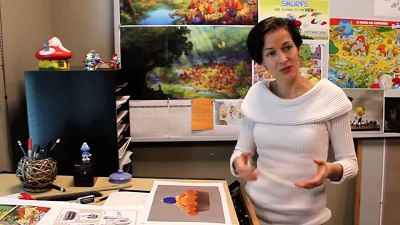
AnimatedViews: Noëlle and Patrick, can you tell me how and when you discovered the Smurfs? Was it through the albums or the animated series?
Noëlle Triaureau: Smurfs are very popular in France where I grew up. I first met the Smurfs in the early ’80s when my uncle gave me a copy of The Smurfs And The Egg album. It was love at first sight. Akin to many people who prefer a book they read to its movie adaptation, I am much more attached to the albums than the animated series. There is something mesmerizing and amusing about observing a group of Smurfs interacting. It is fun to see that new Smurfs are usually identical to all the others and yet each have different skills and abilities.
My favorite album is The Smurf King because it is the one that I enjoy most as an adult. Peyo shows in a very clever way how these blue social creatures tend to get in trouble as soon as they have a chance. It is a story that is entertaining both for children who observe Smurfs being naughty when Papa Smurf leaves the village, and for adults who see the social commentary on human nature and political plans gone awry.
Patrick Maté: As far as I’m concerned, I discovered the Smurfs through a plastic figurine of a Purple Smurf and the album The AstroSmurf, which is my favorite one. Maybe because I can identify with him and I love how hard all the others are working to help him achieve his dream so no one is left behind. I like the comedy of all these Smurfs going by their business helping each other and interacting with each other. A Smurf album is like looking at an illustration of Mordillo, Calvo (“La Bête est Morte!”), Dubout or Uderzo with their village scenes, where you try to catch the humour of all the gags that are going on in every corner of every images of every page.

AV: How would personally describe Peyo’s graphic style?
NT: I find Peyo’s work very appealing and inspiring. His Smurfs have the adorable rounded shapes and proportions of a toddler. Also, there is an economy of lines which adds to their charm: it is not necessary to see nails, belly buttons, nostrils, etc. Furthermore, Peyo’s characters are posed in strong silhouettes which makes for an easy visual read.
PM: To me, the Peyo style is very much inspired by animation but uses a lot of graphic elements more adapted to 2d. In the Smurf design for example the hat, the nose, the legs (bent in standing position) are drawn to be seen from profile or 3/4, like Mickey Mouse Asterix or Lucky Luke, etc. I particularly like the Smurfs albums drawn by Peyo himself in the 60’s when their head shape was more egg-shaped and not too round. These albums are full of energy and scream to be animated.
AV: When working on the movie, how did you immerse yourself in this universe in order to appropriate it?
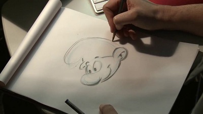
PM: I immersed myself by looking at prints of Peyo’s pencil drawings and prints of original inked pages with no color. Then I drew them and studied their shapes, silhouettes and graphic details. I also did some 2D animation of the characters.
NT: For the movie, we analyzed Peyo’s work closely and endeavored to expand on the direction established in his work overall instead of focusing on one period. For example, the Smurf village, with its round mushroom-shaped houses, is reminiscent of the curvy Smurf body shape. Therefore, we emphasized this by designing village props, winding roads, and the overall environment with friendly ovals, curves, and soft corners. By contrast, we took the liberty to exaggerate sharp lines and triangular shapes for Gargamel’s lair.
AV: How did you work with Véronique Culliford, Peyo’s daughter and co-producer of the movie?
PM: Véronique and the Lafig studio were extremely helpful to help director Kelly Asbury, art directors Noelle Triaureau, Marcelo Vignali and Dean Gordon and I, protect and bring back the story and the characters into the universe Peyo created. Veronique was very supportive of our work with the design of this movie.
Veronique and the Lafig Studio also were instrumental in the choice and approval of the hair color for the Smurf girls which I believe was the best choice!
NT: We were fortunate to have her input throughout the development of the film. She was very encouraging, and we were thrilled to hear that Peyo had entertained the idea of having Smurfs discover a village of Smurf girls.
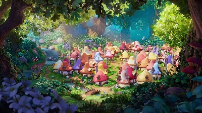
AV: How did you manage to translate Peyo’s style into 3D?
NT: Patrick Maté, as our character designer and Smurf expert, worked closely with Omar Smith, our 3D character designer to come up with a prototype of a 3D Smurf that looked appealing from different angles. Peyo would place the mouth a bit on the side, as he always drew his characters from 3/4 or profile, never straight on. For the movie, the mouth placement would change from being centered to slightly towards one cheek, depending on the angle the Smurf was seen from and the expression it had.
One question was whether to separate the Smurfs’ eyes or to merge them together. Peyo would draw an unfinished line between eyeballs. We are glad that Animation Supervisor Alan Hawkins and his team made the merging of the eyes work. They also rigged the eyebrows to ‘pop out’ of the forehead for surprise expressions, as Peyo often drew them hovering over the lip of their Phrygian cap.
Boy Smurfs are all made from the same model. Smurfette has her own model. Her head shape is rounder than that of the boys. She has a smaller nose, smaller hands and feet. Peyo would flip her hair bang to always cut out an appealing silhouette, so the Rigging team set up 3D Smurfette to do the same.
PM: I loved working with Omar Smith. He is a master at character modeling in 3D and is very collaborative. Those sessions with him were priceless in order to achieve a good-looking Smurf model.
To be sure to achieve the emotion that Kelly wanted for the movie, some animation tests were made in 3D; among these, a Smurfette really sad dialogue scene and a reproduction of a “brave little tailor” scene with a Smurf for the study of the animation style.
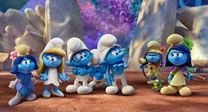
AV: Do the characteristics of the “School of Marcinelle” (Peyo’s style, part of one of the two main schools of comics in Belgium) easily translate into 3D?
PM: The Marcinelle style with those big noses is tricky to achieve from a front view, and the relax bended position for the legs again in a front view are also difficult. I looked at how Franquin, another Belgian artist, solved the problem. The Phrygian hat also look better in profile. The eyes positions and the mouth compared to the nose on the face are very important. The shape of Papa Smurf’s mouth under his beard was something I wanted to get right. The only difference maybe are the Smurf shoes that I tried to pull away from looking too much like a brick.
NT: Overall, the “school of Marcinelle” makes for very appealing characters in volume, whether for 3D CG or as a collectible toy. However, one of the biggest challenges with these characters is that they tend to have a large nose which hides part of their eyes when seen from the front. To get around this, either the camera is raised slightly, the head bent down, or the nose is rigged to be slightly moved down for a specific shot.
AV: Design-wise, how different did you want this film from the two previous ones?
PM: The difference from the Smurfs from the last two movies was that we tried to be as close to the original design as we could get. No more muscles, fingernails, or Gollum googly eyes. Hands, ears, eyes, noses, mouths and hats were shaped like in Peyo’s albums. We even shaped some hair and beard like a brush stroke similar to the original drawing by Peyo. The eyes are joined together and the eyebrows can detach over the hat rim in a surprise expression or other. We also added some 2D effects for Gargamel and Azrael.
NT: For due diligence and with budgetary concerns in mind, we also tried to adapt models and sets from the two previous films but we promptly realized that it was a lot more cost effective to build them from scratch rather than simplify and stylize existing assets.
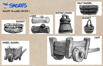
AV: Starting from Peyo’s work, how did you create the new characters and the new environments ?
PM:To keep Peyo’s style in the Forbidden Forest and Smurfy Grove with the animals and the Smurf girls, I first looked at the comics and carried on with my imagination. By then I “owned” the style, like they say in animation, and could improvise and create freely. For the girls, I really wanted them to feel like they came from an album. I did not want to add more details than necessary and did not try to out-stage Smurfette or the Smurfs but rather tried to make them sisters from the same family with maybe an even bigger connection to nature. In spite of the fact that the Smurf girls can be fierce to their enemies, I kept the gentleness of their nature by putting a cushion at the end of their arrow.
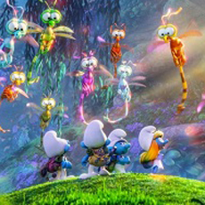
NT: Director Kelly Asbury encouraged us to create new environments that were exciting and enchanting. We had quite a lot of freedom to explore unusual locations and develop new characters. Wendell Dalit, Lizzie Nichols, Aurora Jimenez and Naveen Selvanathan came up with a number of unusual plants that could interact with Smurfs.
For the Smurf girls, Patrick designed many variations of hairdos, dresses and accessories. He also came up with a lot of fun activities for them. Choosing their hair and clothes colors required research and a number of tests.
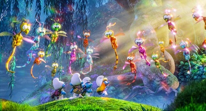
Regarding animal characters, some were variations on original Peyo designs, like Monty and the glowing bunnies; and others were whole new designs, like the cute and deadly dragonflies. These were originally meant to look like translucent, shiny gems when curled up, to support an earlier version of the story. We kept these designs as they were everyone’s favorite.
AV: Noëlle, how did you decide and manage to integrate fine art influence such as Monet’s, and German expressionism into the naive universe of the Smurfs?
NT: We looked at Impressionists for colorful and festive palettes as well as blue and lavender shadows to lift up the overall mood.
As for German expressionism, it inspired us to use angular, abstract shapes carved by lighting in Gargamel’s lair. We wanted to make our villain’s environment threatening without having to use too many scary props. Also, the artificial, angular lighting emphasizes the obsessive, slightly deranged side of Gargamel’s personality.
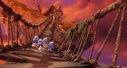
AV: Can you tell me more specifically about the way you see the role of light and color in the film?
NT: Color can be a powerful tool to support story. It can reinforce oppositions between characters and support certain personality traits.
For example, given that Smurfs have happy primary colors (blue, papa’s red hat and Smurfette’s yellow hair) I associated a combination of secondary colors – violet and green – to Gargamel to use as his evil ‘signature colors.’ These are very present in his lair and in his magic. They become stronger when Gargamel has the upper hand.
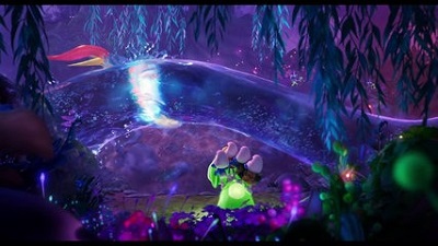
In a movie that takes place mainly in a forest, color choices can greatly help distinguish different locations. The yellow-green forest around the Smurf village is very different from the blue-green and indigo Forbidden Forest.
After the main characters and locations color attributes are determined comes the color script. Jotting simple color bar codes to reflect the mood of each sequence is very helpful as it forces us to synthesize a sequence with only a few color lines and skew dominant colors to let them tell the story. Is the sequence high key or low key, saturated or grey, warm or cold, high or low contrast, etc.?
For example, the film is very colorful except for the sad sequence when Smurfette loses her friends and the one where she has become a lump of clay. These two sequences are desaturated and muted to convey sadness. Another example is when the Smurfs are chased out of Gargamel’s lair by Monty. We took advantage of the sunset to use vivid oranges and dark long shadows to emphasize the sense of danger.
The color script provides the overall direction for painting lighting keys that will inform major shots.
AV: How did you anticipate the animation to come after the development phase?
NT: With Art Director Marcelo Vignali and the Visual Development team, we designed environmental assets with two scales in mind: the wider human scale for Gargamel and the ‘close to the ground’ Smurf scale. For example, plants were drawn to create an appealing silhouette from afar, and to provide interesting compositional elements up close. Throughout the film, assets were designed to remind the spectator of how small Smurfs are. We all have a notion of how large a clover or a daisy can be. Placing a Smurf next to it immediately tells us how small he is.
When designing Forbidden Forest assets, we thought of grouping smaller, very colorful plants together and placing them in front of larger, simple bushes or boulders to create small areas of visual activity, and larger, quiet elements so that the eye could concentrate in some places and have room to wander. Because the story was still evolving while these assets were being built, we provided Production with examples of modular groupings of plants. These modular groups could be reused from different angles and in various combinations, thus becoming flexible assets tailored to Layout’s compositional needs.
AV: What will you retain from this overall experience?
PM: What I discovered working on this movie is the joy, happiness and peace these characters brought to me drawing them day after day.
NT: As Patrick puts it, working on Smurfs makes one happy. Smurfs are buoyant and charming: there is an intrinsic happiness and ‘joie de vivre’ that exudes from their design and it becomes contagious. I find that this is a great gift.
With very special thanks to Noëlle Triaureau, Patrick Maté and Olivier Mouroux at Sony Pictures Animation.


