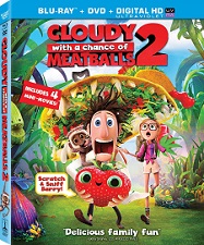
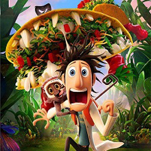
 In The Art Of Sony Pictures Animation’s Cloudy With A Chance Of Meatball 2, author Tracey Miller-Zarneke described the studio as “a group of talented artists who really know how to play with their food.”
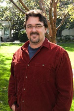
And so let it be said of Visual Effects Supervisor Pete Travers, who helped bring to life those improbable creatures that the “foodimals” are, and all of the incredible universe that Flint and his friends come to discover throughout the movie, now released on video!
Pete Travers joined Imageworks in 1999 to supervise effects animation on Hollow Man, which went on to earn an Academy Award nomination for Best Visual Effects.
His credits include Zathura, The Aviator, The Haunted Mansion, The Matrix Reloaded, The Lord Of The Rings: The Two Towers, Stuart Little 2 and Harry Potter And The Sorcerer’s Stone, to mention only a few.
He also supervised the Sony Pictures Imageworks team who helped bring Warner Bros.’ complex, multi-layered mystery adventure Watchmen to life. In addition to working on the fully-digital human character, Doctor Manhattan, Travers and team worked on hundreds of shots including major CG environments such as a digital visualization of Mars and a 3D model of New York for the time-shifting epic.
He holds a degree in Mechanical Engineering from Worcester Polytechnic Institute.
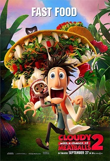 AnimatedViews: At SPI, you’ve been working on both live action and animated films. Do you see any difference in the approach of both mediums ?
Pete Travers: Yes, there is definitely a difference, but they are closer to each other than you might think. Most of the skill sets on the CG side are equally represented. You still need color and lighters, compositers, effects animators and character animators, of course, on an animated feature. The difference lies mainly in how the work is managed or organized, and in the magnitude. In the animated feature, you are making every pixel, so it’s just a bigger task.
AV: As a Visual Effects Supervisor, what was your attitude regarding the first Cloudy movie?
PT: A lot of the work centered around resurrecting as much data as we could from the first film and altering it as little as possible, so that it would fit into our current pipeline. Almost all of the resurrection that occurred with the characters, models and textures was easy; but the trickier stuff was the character rigging and hair, which had to be updated quite a bit because they had advanced considerably since the last go around.
AV: In the movie, we discover the “foodimals”. How did you give life to those creatures?
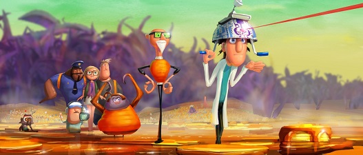
PT: The design of foodimals was seemingly simplistic looking, but the mechanics underneath were oftentimes more complex. We spent weeks trying to figure out Barry’s mouth because we wanted him to have a wide range of facial movement, but we didn’t want the seeds on his surface to stretch. That was tricky. Also some characters like the Tacodile were very complicated due to the effects simulation of her taco toppings. Every shot you see of her had to be run through the physics simulation so that her toppings bounce, ooze or fall off.
AV: The design of the overall movie has a kind of a children’s book look to it. Can you tell me about that aspect?
PT: Czech children’s book art Miroslav Sasek is probably the primary influence for shape in the movie, for both characters and environment. Production designer Justin Thompson made sure that that influence was consistent throughout the film.
AV: There seems to be a touch of Mary Blair, no?
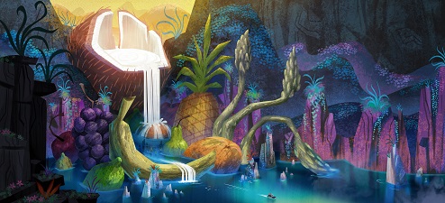
PT: A wonderful artist, and her style heavily influenced the production design team. I would describe her style as whimsical, where shape and light are implied by simple shapes and textures. It’s brilliant really, but it’s difficult to translate into a 3d CG world. That’s where the “depth styling” came in.
AV: Indeed, it’s largely used in the movie. But what is this process, exactly?
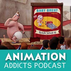
PT:“Depth styling” is changing the look of the scene or objects in the scene based on distance to camera. The farther an object was from camera, the more impressionistic it became. This was very effective in the wide shots where we could smoothly blend the environment into a very stylized matte painting. The opening shot in Sardine Circle shows this off quite well.
AV: From Jurassic Park or Island Of Dr. Moreau for the overall experience, to Tron, for the lines inside Big Rock Candy Mountain, the film is filled with cinematographic references.
PT: Not all of the references are explicit to one source, but rather a collage of things. I found that the Mountain was definitely referential to V-ger from Start Trek, but that’s just my point of view.
AV: How closely did you work with the design team to create that universe, that “living painting”?
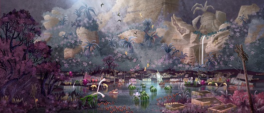
PT: From the beginning of production. The design team had been making beautiful concept art for a while before I got on board. It was inspirational. Justin Thompson and I would have conversations about how we wished that the whole film could look like the artwork and not get “translated” into CG. We had to start breaking down the artwork and talk about how it was created and could those constructs be replicated in CG.
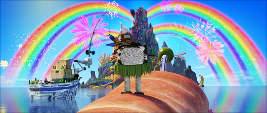
AV: I particularly loved the bioluminescence effect of the forest and also the rainbow effect.
PT: This was an effect of a textural reveal complete with fireworks and sparkles, with saturation set to eleven.
AV: How can environments, such as the ones you’ve been creating, help to tell a story, and even move it forward?
PT: Cloudy 2 is a journey metaphor movie. The environments quite simply could reinforce the mood of that point of the movie. It was a sticky situation for Flint in the Breakfast Bog. Flint finds clarity within the crystals and reflection pools of Rock Candy Mountain. See what I did there?
Our juiciest thanks to Olivier Mouroux and Pete Travers!


