
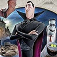
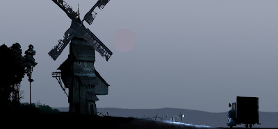
 Of course, Dracula runs Hotel Transylvania, the lavish five-stake resort where monsters and their families can live it up, free to be the monsters they are without humans to bother them. But he obviously needed someone to design this luxurious and romanesque retreat for monsters. And that someone happens to be a human…
His name’s Marcelo Vignali. He was born in Baltimore, Maryland, to Argentine immigrant parents. In 1976 his family moved to Southern California, where his father started an auto repair shop. Marcelo graduated from West Covina high school in 1983, and that same year began his formal art education at Otis Art Institute of Parson’s School of Design.
He began working as a commercial artist in 1985 doing black and white illustrations for the Los Angeles Times Syndicate; his illustrations were featured in 56 newspapers across the United States. Two years later Marcelo embarked on a career in television animation, as a storyboard clean up artist and character designer.
In 1989, he would establish a relationship with the Walt Disney Company that would span well over a decade, both in feature animated films and theme park design. During which, some of that time he was working as a freelancer while living in St. George, Utah.
In 2003, he returned to Southern California to join the creative team at Sony Picture Animation. Since then he has worked on a variety of Sony projects. In addition to Surf’s Up, Marcelo has also worked on Open Season (2006), Cloudy with a Chance of Meatballs (2009), and now Hotel Transylvania.
For over 25 years Marcelo Vignali has carved out a name for himself in various industries, from commercial illustration, television animation, computer gaming, theme park design to feature animation, enjoying the reputation of being one of the entertainment industry’s top talents.
As the Production Designer of Hotel Transylvania, he not only designed Dracula’s place, but the whole world of the movie – a monstrous achievement, no doubt about it!
![]()
Animated Views: You started out as an Imagineer, designing the Toon Town attraction Roger Rabbit’s Car Toon Spin, that is creating a cartoon environment in 3D. That’s not that far from Production Designer in animation.
Marcelo Vignali: What’s interesting is the tracks that my career ended up having. When I was younger, one of the things I wanted to do is I wanted to work in animation. That was something that I felt inside of me when I saw my first animated movie. That was something I was mesmerized by. When I got older and I started going to art school, at that point it was sort of the low point for animation. That was a period of time when a lot of the studios were going under. Disney was still in business but they were talking about breaking the studio up, right after they did The Black Cauldron. So, it seemed like there was no opportunity to work in animation. So I went ahead studying illustration. I trained as an illustrator but I still loved animation. So, I wanted to do illustrations that looked like they came from an animated movie. In a way, I was still kind of doing animation work even though there seemed to be no industry for it at the time. So, that was my training.
I didn’t really get a formal training in animation because the industry was so depleted then. Those things just weren’t available to me. When I got out of art school, I started doing some storyboard work for DIC Entertainment. They were a Saturday morning company doing things like Alf Tales and I joined them. That was fantastic. I got to work in doing some Saturday morning animation, something I didn’t expect to do, and then one thing just sort of led to another and I had a variety of shows that I was working on. Then, American Tail came out and got people excited about animation again, and then Who Framed Roger Rabbit?, and the whole thing exploded. The industry seemed to really come alive because the audience was interested in animation again. And then Little Mermaid came out, and again, this was the second Golden Age for animation.
It’s funny because, right at that point when the animation was taking off, I got an opportunity to work over at Walt Disney Imagineering, to do theme park design. I thought, well, this is great because I can take what I’ve been learning in animation and apply it to theme park work. I didn’t think it was going to last as long as it did. I just kind of thought that I was going to be coming in doing some illustration work for them and then I was going to go back to animation. And as it turned out, I ended up working five and a half years at the studio. Ironically, one of the first project they gave me was the Roger Rabbit ride. So, it was sort of the perfect combination. I was able to take my animation experience and take my illustration experience and then learn a whole other craft which was to take all those designs and put them in a 3D space.
There was a wonderful progression for me that allowed me to do that. About ten years later, I came here to Sony. At that point, the industry had CG, that allowed them to create virtual environments. That was perfect for me because I was able to take my experience that I learned in theme park in terms of three dimensional environments and I applied that to my CG environments. I have been very fortunate in terms of how the industry has progressed and I’ve been able to keep pace with it as an illustrator working in animation working in theme and then coming back to the industry working in 2D on films like Mulan and Atlantis: The Lost Empire and now working in the CG world.
AV: At Disney, you were a character designer. How different was it from creating environments like you did now with Hotel Transylvania?
MV: One of the things that’s interesting is, when I first started in animation, I started as a character designer. That was one of the things that really interested me. I wanted to be a 2D animator and character design was something that could get you into that. But when I worked in theme park design, I wasn’t doing character design. I was doing a lot of environments. When I came back to animation, now that my skills were such that I could do characters but I could also do environments, I found that my environments had a unique look to them because they had a sense of character that I think is missing from a lot of other artists that do environmental work. I have to attribute that to my sensibility in design characters. I think of my environments in very much the same way. So, it was a little easier for me to go from character design to backgrounds than if I had gone from backgrounds to characters.
AV: Just like Mike Mignola inspired the design of Atlantis, illustrator Neil Ross inspired the one of Hotel Transylvania.
MV: Neil Ross has an unbelievably beautiful style. It’s very evocative when you look at it. The colors are very vibrant. He’s got beautiful textures and his compositions have a very epic sense about them. That was something that our director at the time Jill Culton wanted to use for our film. We had hired Neil to do a series of illustrations at the very beginning as he mapped out the different locations. Unfortunately, he didn’t come on board the project so we had to unravel the enigma of his work. We made an attempt to try and capture some of those qualities but in the end there was so many different aspects that we had to deal with that we ended up having to make adjustments and modifications in order to make some of those things work. In other words, we took a lot of his sensibilities and we tried to adapt them for the design of our picture. I’m hoping that, when he sees the movie, he can see some of his influence and that he’s not disappointed!
AV: So, how would you personally describe the visual identity of Hotel Transylvania?
MV: The visual identity of Hotel Transylvania has to be the Neil Ross influence, for one. One other thing that he did and that we tried to work out was that he has a wonderful way of creating areas where you have a lot of textures and patterns. And he complements that with very open spaces. That was a combination that we tried to use in the film because we understood that if we put too much details into things, too much texture or too many patterns into the walls, it becomes almost like noise, it becomes very distracting. We realized that in order to get these textures to work, we had to balance them with areas that would allow those textures to breathe. That’s one of the things that we really pushed for in the film. I have to say that, in essence, our film tries to capture a certain elegance. An elegance to the hotel, an elegance to the design, more so than trying to do something that was wacky.
When we think of comedy and of this particular genre associating monsters like Dracula and Frankenstein to comedy, there’s a temptation to want to make things very wacky. But we were very adamant about trying to create something that had a sophistication to it, and a believability and elegance to it, so that we could play the comedy against that. When you think of a comedy duo, be it Jerry Lewis and Dean Martin or Abbott and Costello, what plays off together is that the comedian seems all that much more funny when he’s in contrast with a person who is strict. And in a way, the elegance of our hotel and the strictness of our hotel allow us to play our comedy off of that. I think that they make a wonderful comedy duo. A lot of the audience will focus on the characters, but I think that what make those characters work is that we have a really beautiful balance that is taking place, and audience is responding to that.
AV: Speaking of contrasts, how did you manage the difference between the monster world and the human world?
MV: The monster world and the human world was something that we wanted to make sure that they belong in the same realm, but they were very distinct. We did that with design and we did that with color. Now, pattern and texture, those things were still relevant, those things translated to both sides. That was something that we made sure that was consistent. The aspect that allowed us to create that difference was primarily the color.
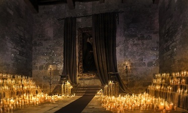
What we did was we tried to create a sense of real lighting in the human world. When you think about how light really works, light comes a source whether the sun or whatever light source, it hits the ground and it bounces around a little bit and it creates a sense of ambiance. That was the goal for the human world, to create something that was very reminiscent of the real world. When we’re in the monster world, what we tried to do was create something that was very theatrical. When you think of the monster world, there’s things like pools of light that almost create spotlights for our characters. And then we also have other opportunities where we have a bounce light that’s coming in but it’s almost like a red filtered light or a red gel on a light and it makes it very theatrical.
These were the ideas of one of the art directors that was on the project, Ron Lukas. He’s a huge fan of the opera and the theater and he thought it would be wonderful to take those ideas, those principles that are utilized in theater and adapt them for our hotel. So, when you’re looking at the hotel, it has a very theatrical look. It feels like you’re watching an opera or something in terms of its richness and color and spotlit characters in dramatic lighting. When we go to the human world, you see that the lighting becomes more ambientic, more diffused, more naturalistic. I think that was the best way our two worlds were distinguished.
The other aspect was design. When we’re in the hotel, we have a lot of vertical lines, it’s stretched upward. When we’re in the human world, we have a very horizontal world where the houses are wider than they are tall. They’re shorter whereas in the hotel, you have all these arches and columns, and everything aspiring upwards.
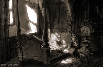
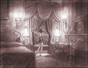
AV: Between those two worlds is the character of Mavis. How did you approach her environment?
MV: Character design and background design, all those things reflect where the character is at in terms of the story. For Mavis, when you look at her room, you can see that she still has toys. That’s indicative of how Dracula his daughter. He sees her as a little girl and he’s not willing to allow her to grow up. The design of her room reinforces that idea that he sees her as a little girl. Her design doesn’t necessarily change but you can see that she’s already a young woman and she’s waiting to sort of step out, to be her own person. So, the audience gets a sense of this girl being sort of trapped. One other things that we did is, whenever you see the hotel, whenever you see Mavis, whenever she’s outside, the mountains in this valley that the castle is located in are really high.
We see only a sliver of the sky, to allow us to see that these are mountains. But we really pushed those up because all of that creates a sense of claustrophobia almost, and is representative of the way that her father controls her and tries to keep her trapped and closed in. At the point where she goes on top of the roof and she’s talking with Jonathan and Jonathan is showing her the sunrise, you notice that the horizon line now is lower and we can actually look past the mountains. The symbolism there is that she’s able to breathe now, she’s getting outside of the influence of her father, she feels like she can step out. That’s one of the different ways that we tried to convey where Mavis is in terms of her development as a young woman.
AV:When thinking of Frankenstein or Dracula, we all have the same references taken from the horror films of the 1930s, yet Hotel Transylvania seems much more Romanesque than Gothic.
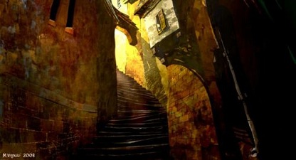
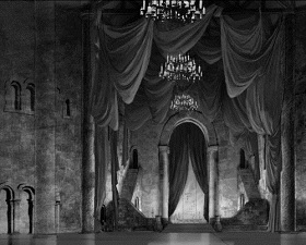
MV: I have to attribute that to Luc Desmarchelier. He was the first Production Designer, working with Jill. I was the Art Director at the time. Jill and Luc were looking at different approaches with the hotel. A trip was made to Transylvania and what they came away with was the influence of the Romanesque rather Gothic in that particular area. That was a really good choice. If you look at Gothic architecture, it is taller and has a lot of windows. That’s the essence of the Gothic style. But if you are a vampire, the idea of allowing more light to come into the castle is not a good one! So, that was a logical choice that a vampire wouldn’t use something that is Gothic. He would use something that is more Romanesque because that supports the idea that would want to minimize as much light as possible.
AV: What environment are you the proudest of?
MV: I have to say I’m very proud of the lobby. When I was given that task, I was still thinking about it in terms of a single space, one environment. And as I began to develop it, the space was so big and there was so much happening in individual elements of it, the colonnades, arches, the organ, the fireplace, the elevators or the front desk, that I realized the lobby was more than just one location. It was a myriad of different locations all combined into one. And the feel was such that it was like trying to design a city block.
I also had to know where all the doors went, how to access the elevators, and all the logical aspects of how these characters would interact in this environment. If I was getting the bags and I was taking these bags to the hotel, where would the bellhop pick them up? How to access the elevators from the front desk? Where is the bathroom? All of these things, I had to lay them out. That’s why I am most proud of that place. Because it was a very difficult puzzle to solve, and to solve effectively in a way that was also very interesting to see and beautiful.
AV: You’re known for being attached to pencil and paper. How do you combine that approach with CG animation?
MV: It’s interesting because I do a lot of my design work on paper, and this allows me to think of what the big idea is without any distraction. Then, I’m not thinking of the color or the texture, only design. That’s a time that I like to work with pencil. Once the design is done, I take those designs and translated them into color. That’s when the computer comes in. For me, I feel like I become a hybrid of both the traditional medium and the digital medium. So, I begin my design traditionally, as I understand it, and then I translate those into the digital medium. The computer is an absolutely incredible tool and what’s wonderful about it is that it allows you to make adjustments to the images. You can change the colors very quickly, you can edit things very quickly. If we were doing artwork for ourselves, we would be gallery painters where working in a traditional medium makes sense.
But in a medium like animation, where there are so many different aspects that you’re trying to take into consideration and where the story may also change and need a change of location (you do a design and then the director would come back to you and say: “no, we need a door, here” or “we need to change the window into a balcony”), those things would be very difficult to do in the traditional medium, and it’s a lot more effective to make those changes when you’re on the computer. So, I absolutely respect the computer and really enjoy working with the computer. But at the same time, you must work to your strengths. At least for me, working with the pencil and putting my ideas on the paper is really vital. I believe it makes my work stronger to be able to take the strengths of both and combine them in order to do my work.
AV: Now that the production is completed, what do you think you will keep from the experience?
MV: That’s an interesting question. I think it is the tenacity. Part of the problem on this project was there was a lot of changes for our company at the time. That’s what ended up affecting why the project took as long as it did in order to put out in the theaters. I’ve been working on this project for six years. It’s the longest I’ve worked on any one project. There were moments when I was thinking I should probably move on or I should probably go and do another project. But there was something about this particular project. Not only did I have a wonderful crew to work with, and the work was very engaging, but there was something that I made me want to complete this project. I wanted to be able to say “I finished the project”. I think that is probably the strongest aspect to come away with. I made a commitment to the project, I stuck with the project and I completed the project. And I am very proud of it!
available to order now from Amazon.com
![]()
![]()
Our thanks to Marcelo Vignali, Olivier Mouroux and Kyle Rapone at SPA!