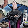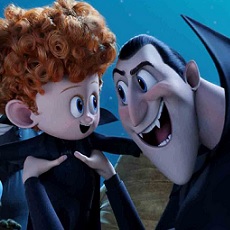

![]() In Sony Pictures Animation’s Hotel Transylvania 3: Monster Vacation, our favorite monster family embarks on a vacation on a luxury monster cruise ship so Drac can take a summer vacation from providing everyone else’s vacation at the hotel.
In Sony Pictures Animation’s Hotel Transylvania 3: Monster Vacation, our favorite monster family embarks on a vacation on a luxury monster cruise ship so Drac can take a summer vacation from providing everyone else’s vacation at the hotel.
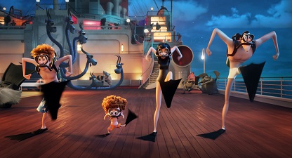
It’s smooth sailing for Drac’s Pack as the monsters indulge in all of the shipboard fun the cruise has to offer, from monster volleyball to exotic excursions, and catching up on their moon tans.
But the dream vacation takes a dangerous turn when Mavis realizes Drac has fallen for the human captain of the ship, Ericka, who holds a mysterious secret that threatens them all.
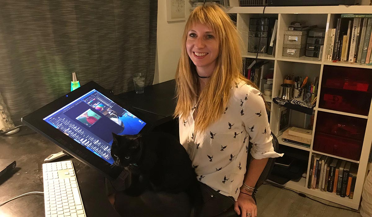
Part of the crew who worked on this spectacular and hilarious film was visual development artist Lizzie Nichols.
After working for British television, she came to Sony Pictures Animation where she worked on Smurfs: The Lost Village, The Emoji Movie and Hotel Transylvania 2.
So, though a mortal, she was no stranger to that macabre and funny universe when getting on the third episode of the franchise that was just released, a franchise that has had great success so far!
We were pleased to meet the talented artist to talk about her brilliant contribution to the film.
AnimatedViews: How would you describe your role in the production of the film?
Lizzie Nichols: As a Visual Development artist, I was in the Art Department along with about twenty-five or so other artists. I designed sets, painted characters, and helped with various other art tasks as needed. I started working on Hotel Transylvania 3 in early 2017. I also worked on Hotel Transylvania 2, so that background knowledge of the franchise helped me keep the art style consistent. The visual approach had been determined long before I started work on the franchise, so in my job of painting characters and designing environments and props, I worked to help keep the visual style consistent.
AV: How would you describe the visual style of HT3?
LN: The Hotel Transylvania franchise has always looked a lot like our world but with a monster-y twist, which is always really fun to design. The film’s shape language tends to be long, pointy and spiky. The hotel itself is very tall, and that is reflected in the very tall design of the ship.
For this movie, we had to deal with the challenge of the time of day. Since vampires can’t go outside in sunlight, almost all of the movie takes place at night. However, we had to keep the lighting and color palette appealing to kids. This gave us a lot of opportunity to create areas of warm local light for our characters to act in, and it gave the movie a pleasant warm versus cool contrast lighting effect.
AV: The film has less dialog than the two previous ones. Does it mean that the visual aspect is more instrumental to the storytelling?
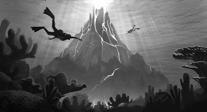
LN: I don’t know if there’s a direct correlation, but as an environment designer I like that there seems to be a lot of space in this movie for the environments to shine. The underwater volcano scene, for example, has very little dialogue, so it makes for a very dreamlike, fun sequence. Also, there are similar low levels of dialogue in some sequences on the ship and in Atlantis, so we get to watch our characters interact with each other and with the environment in new and interesting ways.
AV: On what particular scenes of the film did you work?
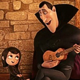
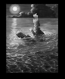
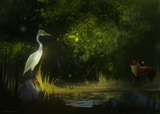
LN: I worked on the underwater volcano, the Mexican-themed bar within the ship, and the deserted island, mainly. I also did the paint for some characters, where I do the color and texture but not the design, specifically Ericka and Van Helsing. I also did one of the illustrations of Atlantis within the book that Van Helsing opens early on in the movie, and designed the wall in Van Helsing’s lair where he is trying to work out the secrets of Atlantis.
AV: So, you did some illustration, environment design and character paint. Is it difficult to go all over the plate like that?
LN: The biggest mental leap I usually have to make is between environment design and character paint. Making characters look real and alive is always a challenge, especially if I am just coming off of an environment design where I had to make a space look cool and believable. Plus, I am always painting someone else’s design when I am painting a character, as opposed to painting my own environment design, which comes up occasionally. But I am usually only ever working on one assignment at a time, so once I get my head around a new assignment I find I can pretty easily get in the zone and work on the assignment without any mental interference from other assignments that have come before.
AV: What kind of techniques did you appeal to in your concepts?
LN: I had to stick to the established visual style of the franchise, so I looked through a lot of old concept art for the first two movies, as well as any reference and inspiration given to me by my bosses. The techniques I use are pretty straightforward — I sketch a piece out in black and white in Photoshop, and once that is approved I work on a final design. When the final design is approved, I either paint it in color or pass it on to another artist to paint, depending on the needs of the production.
I use the computer for about 99% of my work, although often I sketch rough concepts in pencil and paper and scan them in. Sometimes I go back to pencil and paper; for the underwater volcano, I found myself sort of stuck at one point with the design, and I took out some pencils and paper and started sketching just to see what I could come up with. This kind of cleared my head and allowed me to see clearly what I wanted to do in the design. Occasionally just switching mediums and contexts can really help you solve a problem.
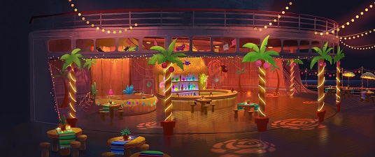
AV: For the ship’s bar, can you tell me about your approach, notably regarding the colors?
LN: This was actually a redesign of a set that had been in there originally, so I knew we wanted the colors to feel warm and romantic since it’s one of the first moments that Ericka and Drac spend time alone. I usually try to find as much real-world reference as I can, which in this case was tropical Tiki-themed bars and Mexican restaurants, and then I pay attention to what the director and production designer want in terms of color. Since most of the ambient light in the movie is a cool blue, having bright warm reds, yellows, and purples helped make the scene feel inviting and romantic.
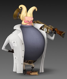
AV: How did you approach the colors of Van Helsing ?
LN: Our lead character designer did the amazing design. For the paint, since Drac wears all black, our director thought it would be cool to give him a white coat and blond hair to provide greater contrast with Drac. I did a few versions of him with various coat and sweater colors, and in the end the light blue and white sweater seemed to work the best.
AV: I was very impressed by your art for Atlantis. It’s really beautiful and inspiring. It reminded me of the prints in Jules Verne’s original books.
LN: Thank you! You’re close! That piece comes from a book on the sinking of Atlantis that Van Helsing looks through early in the film. Another artist did the other illustration in the book, and when our director launched us he told us to look at Gustave Doré for visual inspiration. We spent a lot of time pouring over Doré’s amazing wood-engraved illustrations. I think Jules Verne’s illustrations were also done as wood engravings, so that’s probably why you’re seeing a resemblance. I came up with a Photoshop brush that would help mimic the look of engravings, although eventually I had to go back in with another very skinny Photoshop brush to make it look less like a digital piece. That piece probably took me a month or so, beginning to end. It was my last project on the movie though and I really enjoyed creating it.
AV: Your approach to light is also very impressive. How do you see the role of light in visual storytelling?
LN: Thank you! Light is crucial; it’s how we see what’s happening! You can use light to set the emotional mood, to conceal some parts of the scene and reveal others, to let the audience know what we’re supposed to be feeling or expecting in the scene. I just try to make the light as appealing as possible, while keeping in mind where the action is going to take place and what kind of mood we’re trying to set.
AV: What was the most challenging piece you had to do?
LN: I think my Atlantis illustration was the most challenging, largely because it was going directly on screen – it wasn’t a set design, it was an illustration, so every pixel had to look right. But wood engravings are super challenging to mimic in Photoshop, and Doré was an absolute master so I was just trying to get something close to what he could do in terms of his lighting and value structure.
On our end in the Visual Development department, there isn’t really a lighting designer per se. But we had some amazing Visual Development artists doing lighting and color keys, as well as the artists at Imageworks whose job it is to translate our Visual Development work into what you see on the screen. I always go into a piece trusting that, if I do my job right, it will end up looking how I intended. Plus, our production designer and director stay with the project through to the end to make sure the lighting and color end up the way they want it. My job is to make the director and production designer happy with the light, to give Imageworks a target to aim for when they are building the scene.
AV: Before creating your piece, what material do you get to guide you?
LN: It depends on the piece, but for an environment design I usually have a meeting with the director and the production designer, in which they go over the script and/or storyboards for the scene, as well as any general notes and reference they would like me to use. I usually go into those meetings having done some research on my own, so I bring in reference images and occasionally some rough sketches if I had some early thoughts.
AV: You are also an artist of your own. What kind of relation do you see between your personal work and your film work? Are they connected or clearly separated?
LN: I find that my personal work and film work are always kind of influencing each other, but often in ways that I’m not totally conscious of. Sometimes I only see a resemblance between my film work and a personal piece I’ve done months later. And it tends to be more that my film work leaks into my personal work, since I am often spending all day on a film but only a few hours or so on my personal work on the evenings and weekends. But I love how working on film teaches me so much about design and storytelling, so I try to absorb as much knowledge as I can from a film and apply that knowledge to my personal work. But I also try to keep my personal work separate from my film work; I tend to do personal pieces that are radically different, at least thematically, from what I’ve been working on in a film, just to keep my brain fresh and to express other parts of my artistic personality that I don’t get to use on a film.
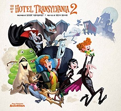
The Art Of Hotel Transylvania 2 is still available to order from Amazon.com!
![]()
With very special thanks to Lizzie Nichols, Paige Borsos and Olivier Mouroux at SPA.