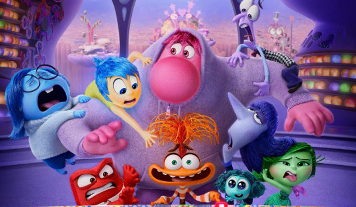
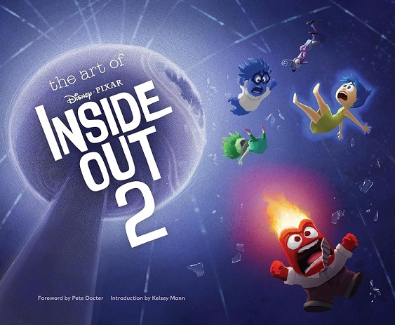
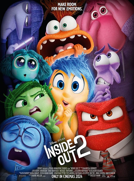
 Disney and Pixar’s biggest hit ever, Inside Out 2, returns to the mind of newly minted teenager Riley just as headquarters is undergoing a sudden demolition to make room for something entirely unexpected: new Emotions! Joy, Sadness, Anger, Fear and Disgust – who’ve long been running a successful operation by all accounts – aren’t sure how to feel when Anxiety shows up. And it looks like she’s not alone…
For the occasion, we were so glad to talk with Inside Out 2 Production Designer Jason Deamer. Jason started out as a freelance editorial illustrator. He began his career at Pixar Animation Studios in 1998 as a sketch artist on Monsters, Inc. He has worked as a character designer and art director on a number of Pixar films, including Academy Award®-winning Finding Nemo, Ratatouille, WALL•E, Brave, and Soul, as well as the short films One Man Band, Lifted, and the Academy Award®-winning Bao. In addition to these, he also worked as the production designer on the Academy Award®-winning short film Piper.
Here’s our conversation…
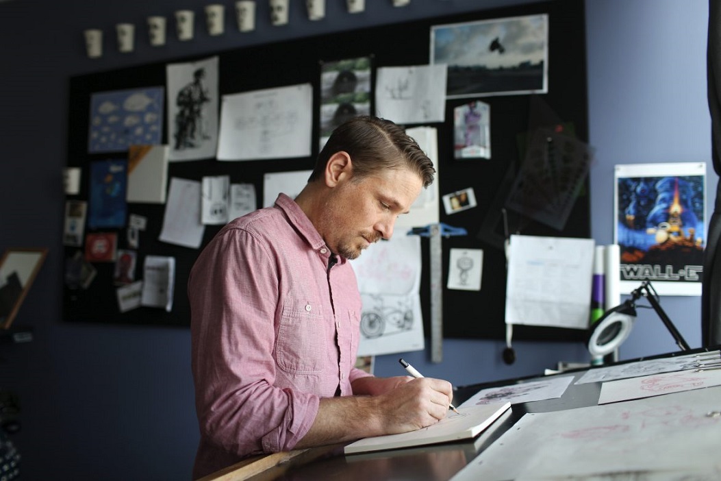
Animated Views: Inside Out 2 is your first experience as production designer on a feature length movie. What was it like?
Jason Deamer: First of all, it felt like a natural progression career-wise as I had done the short Piper as production designer before. Having been really focused on character design for 18 years, I had the chance to do that, and it was just nice to have a new challenge. I just really enjoyed the whole picture, the storytelling, the arcs, the characters, and representing all that visually. I just loved working with the photography, working with the DP (Director of Photography) on the lens. As it’s a story about a baby bird, we just shortened the focal lens and changed the exposure so that everything of that world became more clear-resolved than the picture we’re on. I found that so rewarding, so I envisaged to try my hand at doing a feature. Doing a short and doing a feature, that’s apples and oranges. Doing a short is like doing one sequence of a feature. It’s a such huge organization effort to make a full animated feature. So, I definitely felt like I fell into the deep end of a pool at first. I was very fortunate to have Ralph Eggleston, who was a dear friend and a mentor to me for my whole career, willing to help me in the beginning and kinda of mentor me a little bit, even though he was very sick, which I’m very grateful for. What a rewarding experience! It was a challenge, I felt, like I needed. Also, to have the film be received so well has been profound and very rewarding, because you can only do what you can do as an individual. I gave everything I could and I’m so glad the audience enjoyed it that much!
AV: One of the salient aspects of both the first and second opus of Inside Out is that it’s kind of two movies in one. How did you deal with that?
JD: Yes, it seems like we’ve done twice the set pieces, and double thinking. This film is kind of cutting back and forth between inside the mind and the real world. So, it’s really important to establish a visual language so that people know where they are. Especially now that we added new emotions and we have new characters on both sides.
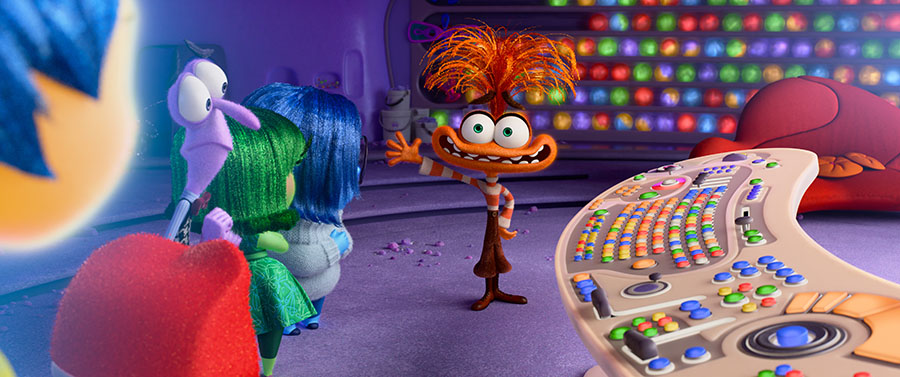
So, I really felt like the real world is where the trash is, the textures, the graffiti, the bird poop, etc. The mind doesn’t have that stuff. There’s no trash. There are the visual cannons from the first film where the mind is very translucent, or subsurface-y, with bright colors. So, I tried to play with those again. So, there are those textural differences, ethereal to the tangible, back and forth. But we tried to do some other things as well. I worked a lot with Adam Habib, our DP, on that. We wanted to relay everything that’s going on in the mind to what’s going on with Riley. Another example: with just pure color. We used orange to visually represent when Anxiety has influence over Riley, over the mind or over the real world. We tried to bring that out. There’s another thing you’ll see if you look again. There’s no orange in the film at all until we see Anxiety, and as Anxiety takes over, we really put that up. It happens in the real world as well, the furniture choices, the lighting. Whenever Riley is feeling anxious, even in the real world, we tried to play with that orange color in the environment.
AV: You mentioned Ralph Eggleston at the beginning of this interview. Can you tell me more about his legacy, and how he helped you out on this movie?
JD: Sure. You know, Ralph production designed Toy Story, the very first CG feature-length animated film. So, his legacy in the animation business is about as big as you can get, because he worked on the first one. I’ve been at Pixar for 26 years, and I feel like I grew up around Ralph. His influence on my work is very strong. I think Ralph believed in me more than I believed in myself, and I think he did that for other people as well. Having someone that you respect like that, who has faith in you, is unique. There’s this funny story. I was working on Ratatouille, and he needed someone to come in as character art director for Wall-E. I’m not sure about the details, what was going on there, but he came to my office and said: “Jason, I need you to do this. You’re the only one in the studio who can possibly do it.” Which was just partly untrue: there’s plenty of good character designers here. But I tell you, I’ve never worked harder for anybody in my entire life because I didn’t want to let him down and do anything that would change his opinion on me. And then, just in terms of the relationship with him and following his path through as a production designer, he was just always like an encyclopedia of filmic knowledge! I learned so many details on so many films, choices that were made here and there. And when I was doing Piper, I asked him for advice and stuff like that.
AV: In Inside Out 2, there’s a lot of new characters as you said, but can you tell me more specifically about the creation of one character in particular?
JD: I think Anxiety would be a good one to talk about because, first, she’s our antagonist, and two, she’s just one of the wildest designs in the film. You’d be surprised how hard of a time we had finding that design. The trick was we needed her to play our antagonist, but we wanted at the same time to say that it’s ok to be anxious. Fear and anxiety are like cousins, siblings, but Anxiety is the modeling, the projection of potential fears. That’s why she has such an important role in our lives. That said, we didn’t want to say Anxiety is a problem. It’s only problematic when she’s having control. Then you do irrational things. So, that was tricky. We wanted her to have an appealing shape, and at the same time, when you look at her, we wanted you to know immediately she’s Anxiety. That’s good character design. And that’s a really tough balance. We went back and forth, and back and forth. At one point, Anxiety turned into Shame, whose design was fantastic but, if everybody feels anxiety or joy, not everybody goes to the state of shame. After a year and half of story rewrite and trying to find a design that’s appealing for our antagonist, we fell on a design Deanna Marsigliese did, and I said “that’s it!”. It was the first time she pulled the mouth out this way. She played also with the big eyes, because Anxiety doesn’t sleep and drinks coffee, so it was natural to give her those big eyes. And we also wanted to go more “Muppety,” especially with the female characters. In the first film, Fear and Anger lived up to the promise of that Muppety-pushed thing. So, I wanted to really go further for all the new characters. Because they’re not human. They’re emotions. I really wanted to push to that extreme design place, and I felt like this Anxiety drawing Deanna did had it all.
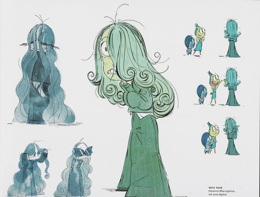
AV: The perfect design to be animated…
JD: It’s funny you say that. The first reaction of the animators is usually panic when they see designs like that. It was the same with Hankin Finding Dory because they knew how difficult it would be. In a way, that’s good because that means we’ve never done that before, and it’s gonna be something novel. I don’t mean I’d suggest anything, I would just listen to the animators. There’s always this balance of pushing them out of their comfort zone a little bit, but not to the point of being irrational. You have to listen to these people who have experience of animation in actual productions. Now that the movie is done, I think they’re all proud of it.
AV: Another exciting aspect of the film is the integration of other different animation techniques, be it with the characters of Bloofy and Poochy for instance, or Lance Slashblade.
JD: That sounded so easy when it came on storyboard. We said, it’s gonna be fun and quick and easy, and ironically it was one of the most challenging things we did character-wise in the movie. Because they’re existing in a dimensional, rendered environment, we had meetings after meetings just trying to figure out what the right approach was. For instance, for Bloofy, do we maybe project him on a card, a three-dimensional card that would live in the environment and have the animation on it, but would be affected by the light? We tried it, but our render engine is so powerful now that it felt like a flat piece of paper in there. So, we went around and around. Finally, it seems like a 2D animated thing, almost like Flash animation. But actually, he could be affected by the light in the room just enough so that it feels not like a piece of paper floating in there. The same happened with Lance, whom everybody wanted to work on, finally, including me. I was like a kid! The TDs wanted to work on it, the animators wanted to work on it. Old aging videogame players in the studio… How pixelated do you go? If you just go for 64 bits, does it look right? If his whole face was completely pixelated, he wouldn’t have real expressions. And if you simulate his hair completely, it doesn’t feel right either. So, we ended up with a geometric volume with hair painted on it. I’d sum it up this way: for a studio that is so well-known for making such visually complex, rich things, we had the hardest time making these arguably simple things. But I’m glad that we did it because it was a lot of fun for us!
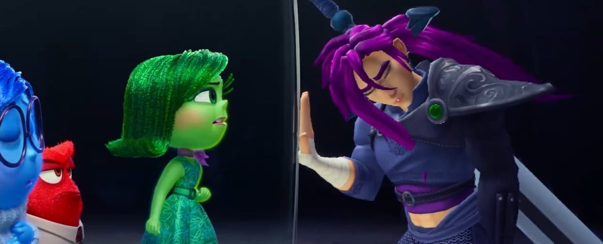
AV: Just like Soul, Inside Out 2 shows Pixar’s unique talent to take very abstract concepts and give them shape through animation.
JD: That’s the challenge! On this film, Pete Docter would always remind us that it’s the mind not the body, so don’t be referencing too many physical parts of the brain, even if we needed to reference something visual. As far as the Belief System is concerned, a long time ago, we had this forest idea from the first film, sort of neuron-based, with these trees. It got cut, but we tried to repurpose that for our film. From that neuron forest idea that came out from that visual language of the mind we got to the Belief system as you know it. I loved that idea of lights going on or pulses going through. I did my best to repurpose that idea. Have you seen that kind of video where people put a high-speed camera inside a guitar and then play? Then, they record the voice at the same time and then they slow the video imagery down to keep the sound the same. That way, you can see the wave forms when they plug the strings. When it’s dissonant, you can see a visual representation of dissonance in the strings, and the same when it’s harmony. It’s changing so much when the fingers play. I did some research around string-like things and sounds, and I came across that imagery that inspired me, and then I wanted to try to combine that neuron forest verticality with strings and see if we can keep these wave forms rather than pulsing lights coming through, which we still have as well. It was fun playing with the visual representation of sound. That was my visual touchstone. I also thought about a harp. I didn’t want it to be too floppy. It should have a more rigid element while being flexible. The guitar and the harp were the best examples.
And then, who doesn’t like glowing things? They’re so nice!
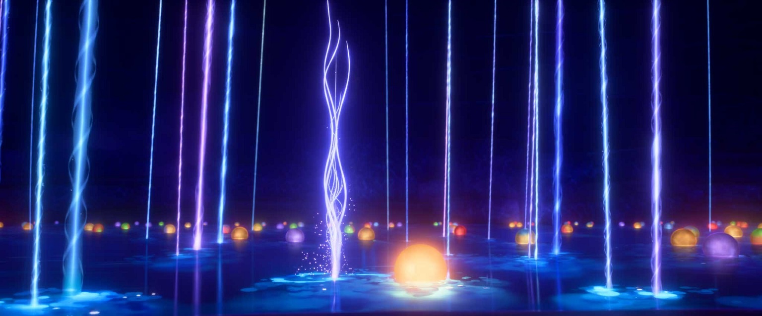
AV: The first time we met, it was about Finding Dory, and you told me that doing a sequel was more difficult that doing an original film. Do you feel the same for Inside Out 2?
JD: I absolutely do! First of all, your hands are tied. We already know what the world looks like, we have the characters all ready… But you gotta tell a new story, in that same world, with novel ideas. We’re no more in San Francisco, but in camp, we explore new places of the mind… Take the Back to the Future movies. It’s so clever. In the second film, Doc and Marty have to go back to 1955, but it’s such a completely new story, a new point of view. No one wants to see the same movie twice. So, you have to design, in those parameters, new locations. And here’s another difficulty with this film. People might not realize, but we had to build all the original characters from scratch because between the two movies, there’s about 14 years of technology that changed. So, every single bit of the software we used to make those characters is different. And that was another argument to make things different.
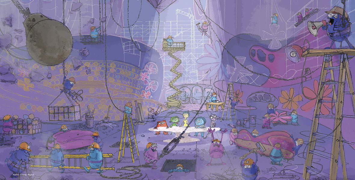
AV: At the end of the movie, Riley has learned something new about herself. What did you learn from yourself after this movie?
JD: First, let me say, the joy of being part of such a movie, that has shots that are so cinematographic and powerful. It brings me tears of appreciation, being a part of this film, and the beauty of certain shots just moved me.
Then, the simple answer would be “I just can do this, and I’m pretty good at this!” You know, projects like this are daunting. It’s a lot to take on.
In brief, I’d put it this way: we all know what a composer does when making a film score, but none of us thinks that person plays all the instruments in the orchestra. A production designer does the same thing for the visual part of the film.
Also, we made this film under some really tough circumstances – the writers’ strike, the actors’ strike -, and we really wanted to make sure the story worked. So, we kept changing the story ‘til the very end, which Pixar often does. Actually, we tried to make something awesome. And we did it all together. That’s the spirit in which I wanted to work with my team. And I think we did it!
With our deepest thanks to Jason Deamer, Chris Wiggum and Madison Stott at Pixar.


