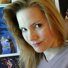
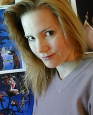
 There is little doubt that Dawn Brown was destined to join the design team of Oz The Great And Powerful – she spent her childhood in Kansas City!
After graduating from the University of Kansas, Brown moved to Los Angeles in search of adventures in the movies. She soon crossed paths with director, screenwriter and visual artist Clive Barker on his 1995 horror film Lord of Illusions. Brown has been a fixture in the art department ever since.
She has worked on some of Hollywood’s biggest features and with award-winning directors such as J.J. Abrams on Star Trek, Steven Spielberg on A.I. Artificial Intelligence, and David Fincher on Zodiac. A longtime collaborator with Tim Burton, she also designed sets and concept artwork for his films Planet of the Apes, Big Fish and Alice in Wonderland.
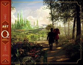
Brown’s latest project to hit theaters is Disney’s Oz The Great And Powerful, directed by Sam Raimi. The hit fantasy re-imagines the origin of the title character from L. Frank Baum’s beloved The Wonderful Wizard Of Oz. Animated Views is privileged to talk with the artist on how she brought the “merry ol’ land of Oz” back to life on the big screen.
Animated Views: With Oz The Great And Powerful, you’re credited as a concept artist, not as an illustrator like you were on Tim Burton’s Alice in Wonderland.
Dawn Brown: I prefer the term “concept artist”, and I am thankful that Disney gave us the proper credit. It is the studio’s discretion who gets what credit, if any. So, I am thankful the concept artists were properly acknowledged.
One could argue there is no difference between an illustrator and a concept artist. It is my understanding that “illustrator” is an older term from the days of the studio system. To me, the term “concept artist” more accurately defines the job as it is today, where we are frequently asked to create the concepts and ideas ourselves. More responsibility is delegated to the concept artists of today.
AV: What concepts of Oz did you work on?
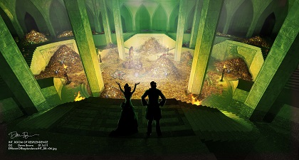
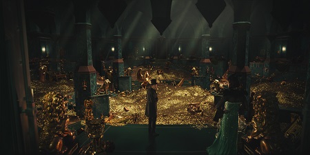
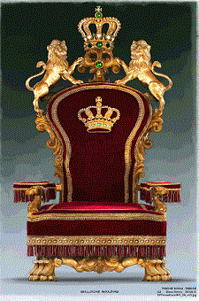
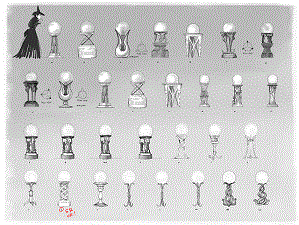
DB: I worked on the treasure room. Concept artist Jonathan Bach did an initial pencil sketch, and then production designer Robert Stromberg gave it to me to develop further. I built a 3D model of the room, and then concept artist Matt Codd and I created illustrations based off the model. Once the director approved the illustrations, the set was handed off to a set designer, Easton Smith, who did the working drawings – the blueprints – for construction. I don’t know how much of that set was physically built; a large part of it was digital. I also worked with the set decorator, Nancy Haigh, to design some of the furniture in Oz, namely the crystal ball stand and the throne.
AV: What techniques appealed to you: pencil and paper, painting, or digital?
DB: All the illustrations were created digitally. I usually start by building a 3D model, or receiving a 3D model from pre-vis or a set designer. I run the model through a quick render program and paint the details in Photoshop. At this point, it’s all a matter of keeping up with the digital pipeline. It’s not a matter of aesthetic anymore, it’s all about keeping the big machine rolling as fast as possible.
An example would be the illustration I did of the bridge outside the treasure room. The 3D model of the balloon was built by a set designer, Tex Kadonaga; concept artist Victor Martinez did an initial pass on the bridge, and Victor’s drawing and Tex’s model were given to me to combine into a new version. I built a 3D model of Victor’s bridge, adjusting it as needed to accommodate Tex’s balloon. I did a new illustration with the new assets. Once approved by the director, my illustration and the models were passed on to set designer Easton Smith to do the working drawings for construction. The assets were also passed along to VFX for their workload as well.
AV: Can you tell me about your choices of shapes and colors?
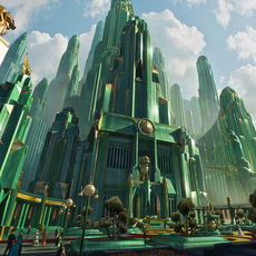
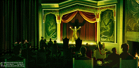
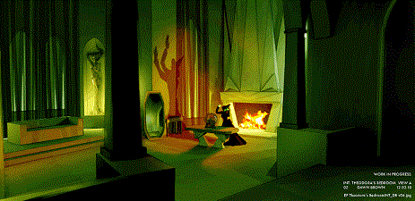
DB: Production designer Robert Stromberg gave us the initial direction that Emerald City was Art Deco influenced: geometric, hard shapes. The colors are greens and golds. Glinda’s world is Art Nouveau influenced. The colors are whites and wood tones. Sure, things developed as we went along, but that is how we started.
AV: What materials did you have to inspire you?
DB: We had really fantastic research to draw from: photos of architecture and nature from all over the world, at all points in history. It was wonderful!

AV: What was your attitude regarding the original Oz movie? Did you draw any inspiration from Edwin Willis’ work in 1939?
DB: We worked really hard to make a movie that stands on its own and lives in a world all its own.
AV: What were the challenges of the production?
DB: One of the biggest challenges was the fact that we were developing the film in Los Angeles, California, but we were building the sets in Pontiac, Michigan. There’s a bit of a disconnect in not seeing what you design come to life in the real world. We missed the chance to learn from what went right and what went wrong, when the designers and the construction crew were 2,000 miles apart.
AV: So, on this production, you were… not in Kansas anymore!
DB: We worked at a studio in Los Angeles; we were not on the Disney lot. The art department was upstairs, and production was downstairs. It’s great when both departments are so close. Director Sam Raimi was really involved with the look of the film; he visited the art department quite frequently. It was a pleasure to hear his ideas first-hand. He has an energy and enthusiasm that was shared by everyone on the crew.
AV: How did you work with production designer Robert Stromberg and set decorator Nancy Haigh?
DB: Most of the art department worked with Robert Stromberg on Alice in Wonderland, so we already had a system in place how Robert likes to work. He gave us a lot of freedom to explore and develop new ideas. I’ve worked with Nancy Haigh several times throughout the years. She is fantastic. I worked with her on some of the specialty furniture that we had to have built.
AV: What will you keep artistically and personally from your trip to Oz?
DB: I loved the freedom that Robert Stromberg gave us to explore and develop new ideas. The artists and designers in that art department are some of the most talented people in the industry. I have known most of them for many years, so it was like family. I really enjoyed working with Sam Raimi and seeing his passion and enthusiasm for telling this wild story and challenging all of us to create a world we can all be proud of!
Our thanks to Dawn Brown!


