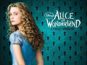
 When we think about Alice in Wonderland, it’s hard not to recall Walt Disney’s classic animated film. So, when making the live action sequel, the challenge for Tim Burton and his illustrators was to imagine a wonderland of their own.
Among the talented artists that collaborated with the creator of Jack Skellington stand Kei Acedera and Bobby Chiu, two Canadian illustrators working together at Imaginism Studio in Toronto.
Kei Acedera is an illustrator and art director at Imaginism. She specializes in children’s books, visual development and character design for film and television. She co-produces our series of art books with Bobby Chiu. Her art oozes charm and broad-based appeal, they never fail to bring a smile to people’s faces.
She started her art career at the age of 16 painting upscale murals for mansions and casinos. Acedera studied animation at Sheridan College for three years but left early to start her career as an illustrator and designer. Since then she has illustrated (New York Times) best selling books for Harper Collins as well as designed for TV and feature films for Disney, Sony and many others. Kei feels a constant need to create. When she is not working her magic on paper, she enjoys putting together arts and crafts for her friends and co-workers. She also enjoys making little t-shirts for her guinea pig, Tobi.
Bobby Chiu’s art career started at the age of two with a box of crayons and his family’s white living room walls. He got his first professional art job when he was seventeen years old, designing Disney, Warner Bros., and Star Wars toys at Thinkway Toys in Toronto, Canada. Bobby has since won a number of awards for his independent work. He hates traffic and line ups but loves watching the traffic jams while drinking his morning coffee from his studio apartment. He presently works as an illustrator for film and television, teaches digital painting online at Schoolism.com, publishes art books, and works on other top secret projects. Bobby currently lives and works in Toronto, Canada. There are still lots of doodles on his desk and walls.
Here’s what they shared with us about their experience on Disney and Tim Burton’s Alice in Wonderland.
Animated Views: How and why did you become illustrator/designers?
Bobby Chiu: I had no choice! I tried to take business school in university, but art has been in my heart since I was two years old and for me to succeed and have a meaningful life, I had to follow my heart to my dreams, so naturally I became an artist. I cannot imagine what my life would be like today if I had given up art and continued with business school.
Kei Acedra: I was very lucky to have parents who supported me in anything I wanted to do. Growing up, my mom made sure I always had a sketch pad and pencils with me wherever I went. I was happiest when I was drawing so I grew up believing that I would become an artist. I never imagined I would do anything else with my life besides art.
AV: Sometimes, you produce drawings together. Can you tell me about that process? How you share the task?
BC: We work very well together because Kei loves to sketch and draw and I love to paint. Usually, Kei would draw something for fun and I would look at the picture and immediately, I can “see” what it would look like painted. This gives me the urge to paint her pictures, which is where most of our collaborations come from.
KA: We often bounce ideas off one another for projects as well. We will have an assignment, we will work independently on some of the characters, then come back and compare notes. From that, we will work together to create a design that takes the best of both our works. I really like this process because it helps get us into each other’s heads and helps us work so well together!
AV: Can you tell me about Imaginism Studios?
BC: When I graduated from Sheridan College, I first worked at an animation studio. But after a while, I found that that life was not for me. I wanted to have more control over my art; I wanted to be more independent.
KA: Bobby and I were great friends from college. He graduated first but we kept in touch, talking regularly about art and what we were doing. One day, he called me and said that he had left the animation studio and started a studio of his own! He offered me a summer internship position, which of course I took. It was an amazing experience! My other friends took internships at bigger studios, but I feel I learned much more at a smaller shop because with fewer people, I had to take on more tasks so I was exposed to more of the art business.
BC: The big project we had in the beginning was developing our own TV show with an animation studio in Toronto. Now, we mainly do concept design for books and movies. We also started an online school where I teach a digital painting course and other industry professionals teach their specialties. Over the years, our clients have included HarperCollins, Borders Bookstores, Sony Imageworks, Walt Disney, and many others.
AV: The styles of the four of you at Imaginism are very different. How did you decide to associate?
BC: Kei and I met Stephen Silver at San Diego Comic Con. We were great admirers of his work and loved his shows. And since we were developing our own show, we had a lot to talk about with Stephen. We were also admirers of Jason Seiler’s work long before we actually met him. When we created Schoolism.com to help artists around the world learn from industry professionals, Stephen and Jason became our first two teachers. After that, our relationship continued to grow and eventually, being in a group together seemed like a very natural choice.
AV: How did you come from book illustration to cinema? Is your approach different according to the medium or not?
BC: We focused on doing our own projects and making our own sketchbooks for a while. Eventually, clients started passing our names around and we got inquiries to do some film and TV work.
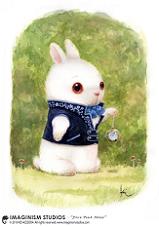
KA: I think our general approach to different mediums is about the same, but that is only APPROACHING the design. Once we get the basic ideas down, we will take the medium into consideration a bit more and work on the designs based on that. For example, creating a rabbit for a book might require us to make a very visually striking character that looks good on a flat page. However, designing the same rabbit for a movie would require us to consider how it would look in three dimensions, how it would animate, etc.
AV: Can you tell me about your fondest memories working in the realm of cinema?
BC: One memory that sticks out in my mind is when we received our first envelope from Sony Animation and Disney. Signing those contracts felt like a big milestone. After all our hard work, our dreams were coming true! I will never forget that feeling.
KA: My fondest memory happened recently when we were at a private screening of Alice in Wonderland in Paris. Seeing the characters that we helped design move around the screen, running and talking was quite incredible! And of course seeing our names in the credits was very gratifying also. All our work had paid off!
AV: How did you come to work on Alice in Wonderland?
BC: One day, we were approached by someone at Sony Animation who was contacting artists and building a database. We filled out the forms and under “specialty”, we wrote that we liked creating whimsical, fantastical creatures. We didn’t think much about it at the time, we just thought it was another way to promote ourselves and maybe someday someone would notice us and ask us to work on something fun. To our surprise, the next day, someone from Sony called and asked us to do a painting test to see if we could do what they were looking for. They asked a lot of artists to “audition” so we did the test for fun and forgot about it. A week later, we were asked to join Alice in Wonderland.
AV: About the process: you both live in Toronto. How did you work with the crew?
BC: The wonderful thing about our industry today is that we can perform and submit all of our work electronically, so our involvement was very easy. We worked mainly with producers in the art department, then Tim Burton selected the stuff he liked, the stuff he wanted to push further, and occasionally sketched out some of his own ideas which we incorporated. Tim had a tremendous way of giving us a lot of freedom to brainstorm and chisel away at the characters to start. Then he guided us wonderfully to hone and refine the vision until it became what you see in the film.
AV: What interested you in this project?
BC: I think the thing that interested us the most was the challenge. Because Alice in Wonderland is such a well-known story, our biggest challenge was probably to create characters that looked new and fresh. But that was also the most fun part as well! Because it’s Disney, it’s Tim Burton, it’s Johnny Depp, it’s Alice in Wonderland! This movie will be remembered for quite some time so we really had to push ourselves to make something memorable and that challenge is always exciting.
AV: What kind of material did you have to draw your inspiration from?
KA: When approaching Alice in Wonderland, we got inspiration and ideas from, 1) Lewis Carroll’s original story, 2) the script for the movie, and 3) Tim Burton’s style and flavor. We tried to make all of our characters suitable on all three levels.
AV: How does the story drive you to find a design, colors, textures, etc…?
BC: Every story has an overall look that a good director would like to build. Tim Burton’s visual themes are already well-known, so developing “Burton-esque” characters was not very difficult. The designs for Alice were mostly a collaborative effort between Kei Acedera, Michael Kutsche, and myself; we were encouraged to explore tangents, go wild, and just create whatever was in our mind’s eye. Sony and Disney showed tremendous confidence in us to create the proper look for the film.
AV: Did the look of the actors that dub certain characters inspire you in any way?
BC: No, not really because at the time, the cast hadn’t been completely finalized, so we only had the script and the original book as reference for how we would design the characters.
AV: What are your fondest memories working on Alice in Wonderland?
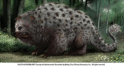
BC: For me, it was designing the Bandersnatch. I worked very hard on this creature, so seeing it up on the big screen really reminded me of the challenge, and how great it felt to receive approval from the studio.
KA: I enjoyed seeing our characters brought to life by the studio! Sometimes, after a big project like this one, we work on our designs for so long that we forget that the characters we create are meant for life outside our computers and our studio. So when Sony sent us pictures of statues of Bobby’s Tweedles, it was the first time we’d seen our characters in 3D, and it was amazing! And then when we visited Sony in Los Angeles and were able to check out a lot of promotional stuff that they were preparing for “Alice”, that was all very fun!
AV: Can you tell me about the medium you use in your art? It’s digital painting, I guess. What do you like about that?
BC: I like doing digital work because it’s fast and precise; I’m able to get the exact colors and lines that I want without worrying about spilling coffee on a painting or something. It really is an extension of all the work that used to be done traditionally. However, to keep my skills sharp, I often do designs traditionally as well, using watercolor on board, pencil and paper, etc. Sometimes, changing the medium or going to a different room of the studio to work will help me “think outside the box” and come up with new directions for characters.
AV: Stylistically speaking, who are your mentors?
BC: I think successful artists must have many influences but I think the greatest influence on my art has come from life itself. To be influenced by another artist means to learn to see life through their eyes. While this is fine to start with, I believe to be a good artist, you should ultimately learn to capture and interpret life through your own eyes.
AV: How did the meeting/melting between your visual universe and Tim Burton’s go?
BC: I think it went very well! My own art often has a dark, ironic edge to it, so working with Tim Burton’s vision simply brought more of that out! A great example of this, I think, is an understated part of the film: the gossiping flowers. I really enjoyed creating the flowers because they’re my type of characters: there is the vibrant color and beauty of the flowers vs. the dark nature of the flowers gossiping and judging Alice behind her back.
AV (to Kei, in particular): Your style is so delicate, nice and fine. How do you explain it interested Tim Burton, whose universe is much darker?
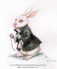
KA: Oh I’m flexible! I can be dark when I need to be, haha. Sony and Disney brought both Bobby and I onto Alice at the same time. I think we’re a good match together because we can offer that contrast of delicacy vs. dark irony. We were able to collaborate on some pieces that Tim wanted us to push so my work for the film wasn’t entirely so delicate and fine. Also, there were definitely some characters such as the White Rabbit, the White Queen and her horse, etc. who had finer, more delicate design elements so I contributed to those as well.
AV: Did your approach to the characters evolve along with the production?
KA: I think every artist needs to be able to approach the project in a variety of ways; you can’t really be a one-trick pony and maintain success. So yes, my approach definitely had to change as we went along. Some of the characters lent themselves well to being slightly cuter, such as Maly the dormouse, or the hedgehog croquet ball. Others, I just wanted to capture the design elements that I thought would work well and then Bobby or Michael Kutsche would add their own touches. Collaborating in this way was a lot of fun and a great way to learn about art through the eyes of other artists.
AV: Did Walt Disney’s 1951 classic inspire you in any way?
KA: Not directly. I watched the original animated film when I was young but for this film, because the look of Tim Burton’s movies is very distinctive, we tried to keep outside influences to a minimum so we only focused on the script, the book, and Tim’s style as inspiration for our characters.
AV: Kei, can you tell me more in detail about the conception (inspiration, process, evolution of the design, etc) of the characters you worked on?
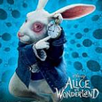
KA: The White Rabbit has a clear personality type. He is jittery, anxious, and nervous. My idea for bringing this out was by giving it wide, human-looking eyes.
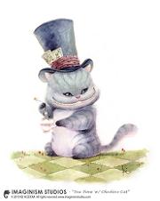
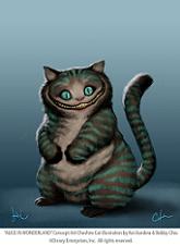
The Cheshire Cat was my favorite character! Again, this was a design that had a clear focus for me, which were the eyes and the grin. I wanted to keep these two elements exaggerated but still believable. For the grin, I paid attention to the underlying anatomy of Cheshire’s face, how its jaws would work when grinning like that. I tried to make the eyes haunting yet inviting. And of course, I kept Cheshire round and huggable!
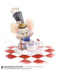
I experimented a lot with the dormouse. I tried to cover a lot of ground with my initial sketches, adjusting her “mousiness” from very much like a mouse, to being almost being a “human mouse”. The other thing I had to keep in mind was how to make it clear that she’s a girl. For that, I put a little slant in the eyes, accentuated her curves, and gave her a softer jaw and a rounder face.
AV (to Bobby in particular): Can you tell me about your style in general? When you look at pieces like Beam Me Up or Bunny Eater, or Poison Heart Bear, etc, there seem to often be some kind of an irony. It’s beautiful, but at the same time, there’s a double meaning or something like that. Please, may you tell me about that aspect of your art?
BC: I have always enjoyed things that appeal to the audience on multiple levels because to me, there is no better way to deliver a message. This is why I think most so-called young people’s books, films, and TV shows have this duality. The message is the adult part, but the playful and innocent aspect is like the sugar that helps medicine go down. Consider things like Harry Potter or the movie, Avatar: behind the fantastical characters and colorful magic, there is a constant theme of good versus evil, acceptance, and standing up against oppression. I am always inspired by art with cross-audience appeal. I think these things demonstrate deep design sensibility, and that is the key to the longevity of art.
AV: And what about the details in the conception and development of the characters you worked on?
BC: The Bandersnatch was intended to be a bear-like creature with many teeth. In the beginning, it was supposed to have a neck that could stretch out and snap up its prey, but in the end, the studio chose to remove that element, which I think was a good move. The stretching neck seemed excessive to me; the finished Bandersnatch makes more sense and seems much more believable.
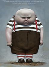
The Tweedles were more directly influenced by Tim Burton’s vision than most of the other characters. My initial thought for them was that they would be fat, round twins with dark hair but no eyebrows. (The lack of eyebrows would give them that eerie, creepy quality that would make the viewer uneasy but they wouldn’t immediately realize why.) Tim pushed it further himself; he sent us his interpretation of the initial idea: cartoony sketches of bald Tweedles with no necks, which I then painted in my own style to give them the semi-real look.
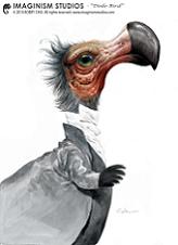
I initially created the Dodo as a gray bird character with a monocle and hat. Michael Kutsche added to my concept and dressed it up until it was the character that appears in the film. I really enjoyed working with Michael on a lot of the collaborative character designs that we did for this movie.
AV: Bobby, can you tell me about the importance of teaching for you (and digital painting on Schoolism)?
BC: Teaching is extremely important to me. I have been very fortunate to have met amazing people in my life; I have learned so much from all the artists that I know, not just my teachers from school, but even more so from other artist friends when we get together and share ideas, thoughts, techniques, etc. I believe, if you are good at something, you have a duty to pass that knowledge on. This is how we progress as a community and as a species. We do not re-discover fire or put a man on the moon every generation; those experiences are passed on so that future generations can learn and build on it. Art is the same way, which is why I love to teach. I love the moment when a student “gets it”, and I love to see my students improve and get better. When that happens, I’m so extremely proud and happy because I’ve made a mark on someone who might one day become great.
All Alice In Wonderland artwork by Kei Acedera and Bobby Chiu ©Walt Disney Pictures.


