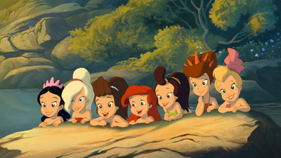
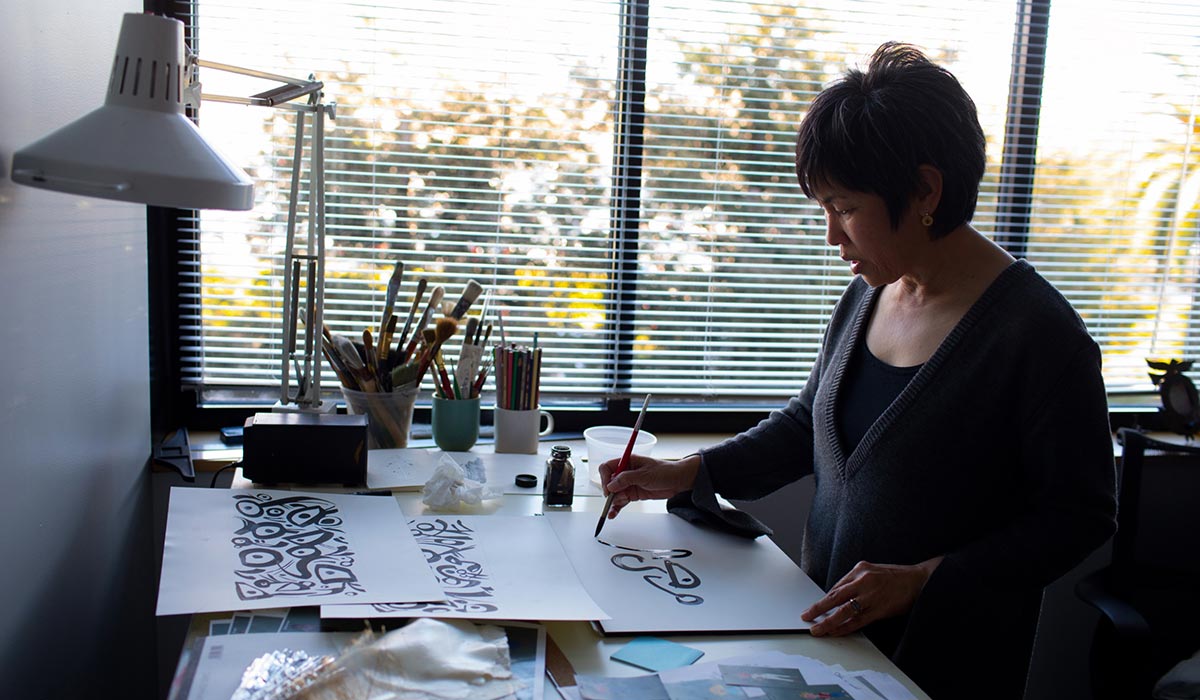
Jeremie Noyer continues his trip under the sea and behind the scenes for our exclusive Little Mermaid interview series. With the script on the page, it’s time to look at the work of art director Tony Pulham, as he recreates Ariel’s world for Ariel’s Beginning…
With our story complete, now we have to give shape to this undersea world. That’s the task of the art director: imagining the look of the locations where the story will take place. In the case of Ariel’s Beginning it’s the job of Pooh’s Heffalump Movie‘s Tony Pulham, who came back to DisneyToon Studios to give his own colors to the ocean.
British-born Tony has resided in the United States for the last twelve years. He began his career in London, working mainly amongst the network of commercial studios there, trying his hand at almost every facet of the animation process. In 1996, he and his family moved to LA, and he began work at Warner Bros. Feature Animation, working on Quest for Camelot, the critically acclaimed Iron Giant, Osmosis Jones, and numerous development projects. In 2001, he art directed for Mattel the CGI production Barbie in the Nutcracker and, in 2002, began working for DisneyToons, using his art directing expertise to bring the Hundred Acre Wood to life, before moving on to envision Ariel’s early life in Little Mermaid: Ariel’s Beginning, which he started on in 2005.
So, as we’ll see, Tony Pulham is an artist who really can paint with all the colors of the…current!
 Animated Views: How would you explain the role of an art director?
Tony Pulham: For me, it’s simply to create and direct a visual unity for the production, within the constraints of the brief, enhancing the story, but not overwhelming it.
AV: Animators often have past masters whose work they look back to. As an art director, do you have any mentors?
TP: I don’t really have mentors as such. I am influenced by many artists and directors’ work, but I lot of the work I do myself is instinctive, so I don’t often track what is influencing me at the time.
AV: How did you come to work for Disney?
TP: I received a phone call, interviewed with the producer, Jessica Miller and the director, Frank Nissen, of Pooh’s Heffalump Movie and that was it really.
AV: How did you conceive the visual style of Pooh’s Heffalump Movie?
TP: I wanted to honor the early Disney productions, but go further back to the original book illustrations of Ernest H. Shepard. I am English, so I grew up with the A. A. Milne stories. The Disney artwork was beautiful, but to me a little Americanized. It was important to me to get that English countryside feel that Milne captured so well.
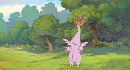
AV: So you were able to bring back a little of that during production on that particular movie?
TP: The movie was story-boarded while we were developing the visual style, so initially key story moments (beats) were taken and sketched out by Frank and colored by me. These images were used to sell the general feel of the movie to the executives. At the same time we had layout artists fleshing out the locations, and with notes from the director and I. The artists would fine tune the images until they felt exactly right.
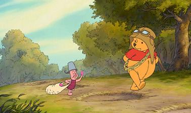
AV: And then Disney decided to keep your style for their upcoming Pooh productions…
TP: Every Disney art director creates a style guide for their production. It’s a many paged document that explains and illustrates the particular visual language of that production. Heffalump was no different, but as our movie was being animated in our Japanese studio, and as we couldn’t work face to face with a large proportion of our crew, I had to create a more detailed and exact style guide. It so happened that Disney was particularly happy with the look we achieved on Heffalump, so I was asked to flesh out and adapt the guide so that it could be used on any upcoming Pooh productions.
AV: What was the process like on Little Mermaid: Ariel’s Beginning?
TP: I sat with the director, Peggy Holmes, and she pitched me the whole story. Peggy comes from a live-action background, and she’s a choreographer, so she had a less traditional approach to animation, but even so she had a lot of love for the original Little Mermaid movie. She wanted to add a very theatrical feel to Ariel’s Beginning, while retaining its heart, which I think we totally achieved.
AV: What personal touch did you bring to the project?
TP: I wanted to make it feel more than just a straight-to-DVD movie. Some people approach the DVD sequels/prequels as lesser than features, and decide ahead of time that you can only a certain standard given resources and time. That was never how Peggy and I worked.
AV: How did that influence your art direction on the movie?
TP: I was strongly influenced by the first movie. I set out to match it as closely as possible. In fact, I used a lot of original artwork from the first movie as a base to work out from. The only real differences I added was a brighter palette, and more sense of place in the location designs – less abstract. And that was purely driven by the story of Ariel’s Beginning, which has Ariel finding an underground club, running away etc. I didn’t really refer to the second film or the TV series.
AV: Some backgrounds, like the Tide Pool, reminded me of some of Walt Disney’s Peter Pan backgrounds, like the Mermaid Lagoon. Were they of any reference for you?
TP: The design of the Tide Pool for instance, was driven by story. It had to be beautiful and peaceful in order for the arrival of the pirates to have the greatest impact. But also it had to fit into the Disney world. I would say we were influenced more by a Disney look in general, rather than specific artists. We didn’t look at Peter Pan at the time, but I’m sure it got into there somehow. I think it’s more likely though that I was influenced by the British artist, Roger Dean [see below], who did a lot of record album covers in the 70s.
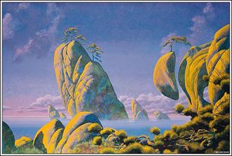
AV: I noticed that, often, the colors of the sequels are brighter than the ones in the original movies. Can you tell me why? Is it because sequels are rather aimed to younger audiences?
TP: It’s true that there has been a trend in recent years for brighter more colorful movies. Disney is affected by market research etc, and they know who buys their products, but this isn’t how everything is decided at Disney. There is an on-going discussion on how vivid the movies should be. I personally think the palette choices should be made by context. If an entire movie is bright and colorful its palette’s usefulness is canceled out.
AV: What are the different tools and kinds of techniques that you have to drawn from when art directing a production like this?
TP: There are too many choices when it comes to the look of an animated movie, so there has to be a guide for the crew that sets out palette, design, the feel etc, of the production. This is the style guide. The material in it is gathered from development artwork, color keys, sometimes previous productions. You basically set out the art direction the look is going for and explain why.
A color key is a color sketch or finished background painting of a particular location or moment in the movie that shows other background painters how to paint all the backgrounds there.
The color script is a color guide for the whole movie, showing the evolution of the emotion during the story. For instance a desaturated low contract part of the script may indicate sadness, while a bright contrasting part might indicate excitement or drama. There are no set rules, but it should be clear and understandable.
A location guide is usually one or two images from a particular location, with any needed explanatory notes. Again as guide to the layout artists as to how to draw the location.
AV: And all this goes into the background artwork. How is a final background made?
TP: It’s all digital now. Most artists use a program called Photoshop. Put simply, the layout or pencil drawing of the scene is scanned, then (referring to the color key for that location) the layout is painted over in color on separate level. The finished BG is then dropped behind the animation.
AV: How did you imagine the villain’s environment? Did you want the colors reminiscent of the ones of Ursula, the classic Mermaid villain?
TP: Her location went through a few different versions, as the story evolved during the production, but honestly I didn’t look at Ursula’s environment much. Once we had the character of Miss Del Ray worked out her location naturally followed through.
AV: For the Catfish Club, the colors are not as bright and fanciful than one would have imagined at first, with tones of blue, grey and purple, while it’s intended to be a very musical, hip place. Can you tell me why?
TP: That’s purely for technical reasons. It’s far easier to use all different lighting effects on a neutral background than on a bright or contrasting one. There wasn’t a deliberate link between her lair and the club.
AV: Peggy Holmes is a choreographer. Did that influenced the way you conceived certain locations?
TP: Yes, certainly. Wherever we were going to use choreography in the movie the location would be carefully worked out to accommodate the action, camera angles etc. Peggy actually brought in dancers to choreograph. This was taped and used as a starting point for our designs.
AV: There’s been a great deal of reworking on this movie. Can you tell me about that aspect of the production?
TP: Even though the movie was being shipped overseas to our co-studio, there were still story and staging changes happening in the LA studio. This isn’t unusual. This meant that a lot of the material we were receiving from overseas was out of date, so adjustments had to made. It’s also usually the case that artwork produced by co-studios is “plussed” or improved upon by the LA studio. This is just the nature of it. The small LA crew were an effects crew we used for the tide pool sequence. The overseas studio was too over burdened to take on those particular effects.
AV: What will you keep from this particular experience?
TP: It’s difficult not to sound pretentious here, but really what I’ll keep is the pleasure of working with Peggy and the rest of the crew, including our overseas crew. Everyone worked incredibly hard not just to get the movie done, but to add as much quality as they could to the production.
AV: Can you tell me about your upcoming projects?
TP: I’m currently working on a CG project for Warner Brothers, but I’m afraid I can’t mention any more than that…
With all our gratitude and admiration to Tony Pulham. All material ©Disney


