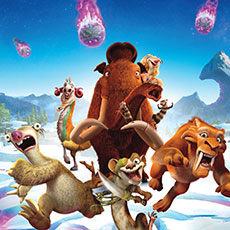
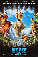
Ice Age: Dawn Of The Dinosaurs. Everything is in the title! The third opus of the beloved saga now features the impossible meeting of ice age creatures and dinos for thrice more fun! It’s another great opportunity to retrieve all those wonderful characters we’ve come to love over the years and over the films: Sid, Manny, Diego and Scrat, now meeting new, unforgettable characters like Buck the weasel and… Scratte!
And for us at Animated Views, the release of the movie is also a great opportunity to meet again with character designer Peter de Seve, who created all the characters for the whole saga — one dino-size work, indeed, but a huge success as we can but expect from the artist!
From the first opus to the latest (definitely hoping for a fourth!), here are all the secrets of the creation of the Ice Age characters!
 Animated Views: How did Ice Age start for you?
Peter de Seve: I live in Brooklyn, New York and most of the films that I had worked on before were being produced in Hollywood. One day, I got a call from Westchester, New York, from a small studio I had never heard of. They said they were working on their first animated feature called Ice Age. It seemed like this was probably just going to be a paycheck. I had been involved with small productions before and it’s a very, very difficult thing to make an animated film. Unless you’ve got the money and the chops, as they say, it’s almost impossible. But it turned out they had both. They had the talent and the money because Twenty Century Fox had recently partnered with them. So, I was invited to work on this project and there were a few other designers proposing their own character designs. After a while, my designs seemed to be sticking. Chris Wedge was responding to them and seemed to like what he saw. So, more and more I became entrenched in the production of the film and, before I knew it, I was designing all the characters. Originally, I thought, like other films that I worked on, I would just be one of many people. But, because it was so close to where I live as opposed to California, it was a great opportunity to become more involved than I ever had the chance to do before.
AV: How was it to be the only character designer at the helm?
PDS: Well, it would have been intimidating if I had realized what was happening. I didn’t realize what responsibility I had until I was deep into production. I sort of looked around and realized, ” Wait a minute, I’m responsible for all the characters!” It was great!
AV: And now, you’re the character designer of the whole Ice Age saga. How is the work like?
PDS: Each character is an enormous amount of work. It’s more than just coming up with one good drawing. Once you come up with the drawing, you’ve really just begun the process. From that point on, I am responsible for supervising the sculpture, helping it become modeled in the computer, and all the way down the pipeline in materials and fur, I have a voice in every aspect of how the character looks. In the first film, it wasn’t the case officially. I started to make suggestions over the modeler’s shoulder thinking that it was really not my place, but I did have this idea –suppose you made that shape a little rounder and this one a little bit straighter… My suggestions started to bear fruit and I was invited to be more involved in the process. So, in the second film, it became more official and my duties were described more as, in a sense, the art director for the characters.
AV: Blue Sky Studios seem to propose a kind of a third way to Pixar and DreamWorks. Do you agree?
PDS: From my own perspective, the difference has been up until recently to rely on one designer to dictate the look. I like to think it gives the film a stylistic consistency within the characters that you don’t always see. I’ve seen a lot of films that look like exactly how they were produced, which is by committee to some extent, with many people, one person designing this character and another designing that one and so on. It can lead to a fractured look. I’m very happy with the consistency that we achieved in the Ice Age movies. Now, was it on purpose? I’m not sure. I think a lot of what made the look of Blue Sky films unique was the fact that we didn’t have any precedents to worry about. We just, in some way, made it up as we went along. And I think that is, to some extent, why I ended up almost by accident having the responsibilities I had. There was nothing to compare it to. The studio was that young and the process was that new to them, to all of us.
AV: Before working on Ice Age, your work was only in 2D, drawing for character design and illustration. And then, you got into CG and modeling and those kinds of things to supervise. What was the move from pencil and paper to computer like?
PDS: In the beginning, my experience up until that point in both print illustration and character design for animation was almost exclusively 2D. The medium of CG animated films was still quite new. So, when I first came to Blue Sky, I proposed designs on paper that looked pretty snappy from that one angle I was drawing the character at. But it soon became evident to me, with some reality checks from the modeling department and the animators, that something that looks good at one angle might not necessarily translate at another angle in three dimensions. So, I needed to recalibrate my thinking and to start thinking less about drawing and, in a sense, more about sculpture. I started to realize that a two-dimensional drawing can be a cheat to some extent. So, when I did do drawings on paper, I had to be able to defend them from every angle. As I matured as a character designer, I’ve been able to think more sculpturally, which of course is what’s required, and I think it informed the rest of my work across the board in a positive way.
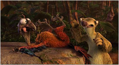
AV: The design of the characters of the Ice Age saga is based on a delicate blending of accurate, scientific information on prehistoric creatures and pure animation fantasy. Can you tell me about that balance?
PDS: I have always tried to blend as much historical accuracy as I could to the creatures that I design, especially for the Ice Age movies. Now, I look back on the first film and I notice some of the anatomical mistakes I made. I’ve learned a lot about drawing animals in general. But I also tried to be fairly consistent about what kind of creatures existed in the ice age and what kind didn’t. As we’ve moved along –and now we’re on the third movie-, I’ve become a little less concerned about that. I won’t do anything that’s obviously inconsistent but I will cheat the fossil records by a hundred thousand years if necessary, if it allows me to get a really good character in there.
AV: What were the first Ice Age characters you designed?
PDS: I remember when I first began I just created a sort of visual wish list for the director and explored the museums and the books because I had to see who the potential inhabitants of this world were. We did know for sure that there would be a sloth, a mammoth and a sabre-tooth tiger. Beyond that, there was really no clear-cut plan. The script suggested this character is a bear, this one’s a big mammal, and then I had to find corresponding animals that actually existed. So, that gave me a lot of freedom, which I still have today, to be able to suggest to the writer and to the directors. In a way, I helped to cast the characters. The production relies on me to portray the characters written on the pages. It’s such a fantastic job. Basically, I get to, at least in the beginning, suggest anything that makes sense, and anything that I think is going to be really, really fun to see on the screen. And most of the time, I’m very happy to say that those guys agree with me. So, it’s a really fun collaboration.
The very first character I designed fully and the very first character I saw animated was Sid. It was just the most incredible experience to see him animated for the first time, and because of that, he remains my favorite, as much as I love the Scrat. I just get a lot of joy looking at Sid. Many things came together in creating that character. I stumbled on a really fun silhouette for him, and a shape that the animators seem to never grow tired of having fun with.
AV: Do you happen to collaborate with the animators?
PDS: Yes. On top of just doing drawings of potential characters, I draw them “in character” and so, all of my sketches help to inform the animators how I see this character move and act and pose. What is great about working at Blue Sky is that everyone is highly collaborative and the animators often invite me in to hear my opinion and to help clarify how a certain character might move and behave. For instance, Buck. He a really fun character— a blending of Indiana Jones and Colonel Kurtz!— with a particularly unique shape. He’s very cylindrical because he is a weasel. I did many drawings taking advantage of that shape so he would be able to twist and turn and jump and leap in unique and fun ways. All of the animators were very interested in seeing and talking about that, even so much as how his face moves, his jaw moves. For every character I design— and I think this, too, is also unique or at least used to be— I will do many studies over a default model of the head and will run it through a series of expressions. So, I’ll draw tracings over that default static model and go through all the phonemes and extremes poses of the mouth and jaw to show them how I see this character moving and talking. Everyone finds this process extremely helpful, and from a character designer’s point of view, I think it makes perfect sense. Who better to ask than the person that came up with the character?
AV: Speaking of new characters, how did you get from Scrat to Scratte?
PDS: In France, they called her Scrattina, and I think it’s a much better solution to her name. Somehow, I had labeled one of the drawings “Scratte” just for fun, just to feminize the word “Scrat”. I was never able to say the word out loud because it just doesn’t translate in a beautiful way. But the Fox marketing people saw that and the next thing I knew is that they were calling her “Scratte” in the trailer. Much to my regret!
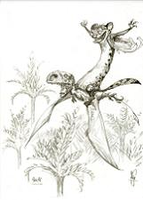
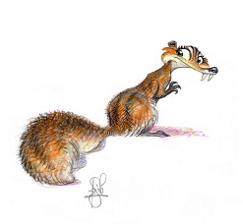
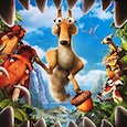
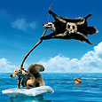
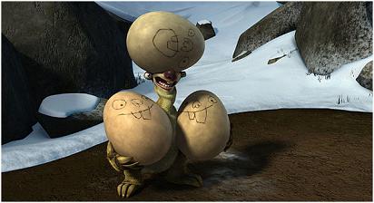
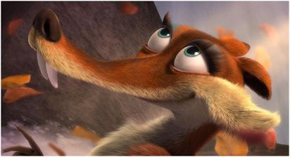
Now, to answer your question, Scrat was not intended to be a big, breakout character at all. He was going to be in one scene, in the beginning of the first Ice Age movie. I think he was intended to end the film as well, but that was it. They ended up animating his scene as the first scene they animated, and the studio needed something for a trailer. They ended up using that sequence, which is a wordless sequence of classic silent comedy, and the audience responded in a huge way to it. They just loved the Scrat and before we knew it, it became clear we needed to weave that character into the rest of the film somehow. So, it wasn’t intentional but he still remains certainly the most popular character in the franchise. The last two movies and two shorts have been able to get a lot of mileage out of the character and out of his antics with that acorn. It’s amazing they’ve been able to get this far with it. But the writers and the animators always seem to be able to find something really fun to do with him! I think it was an inspired idea to give him a girlfriend in this film. The idea didn’t come out of nowhere. The theme of this particular episode is family. In many ways, it’s about starting a family— or not. For instance, Diego finds himself a single guy while Manny and Ellie are having a kid and Sid is going through a similar change in his life, too. Diego suddenly realizes that maybe he, Manny and Sid are not a herd anymore and that their family is breaking up. This causes Sid to go out and discover his own family in the form of three baby tyrannosaurus rex. He finds the eggs and mistakenly assumes that they’ve been abandoned. Meanwhile, the Scrat has met this Scrattina. The reason I think it’s an inspired idea is: is there anything else on the planet that could possibly compete for Scrat’s attention, except for the nut? A girl is a pretty close second. But it’s a struggle for Scrat. It’s not totally clear-cut. And the movie is about his struggle with: Does he love her or does he love the nut? And does she love me because she loves me or because she loves my acorn? So, it’s really quite funny and there’s lots of very classic animation around their relationship. It seems to be playing very, very well. Designing her was really fun. I knew that she had to in some ways be the antithesis of Scrat. She had to be smart, she had to be beautiful and she’s slightly more evolved in more ways than one. It turns out she can fly. She’s a flying squirrel. Which is a great edge to have on Scrat. She’s more evolved than him emotionally like most women are from men— or so they think!— and she’s also physically more evolved.
AV: Speaking of the dinos, how did you deal with them, since it’s material that has been dealt with very often in the past?
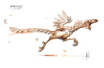
PDS: It was like walking a tightrope in many ways because it is impossible to forget all the incredible work that has been done over the decades in envisioning dinosaurs, way back to Willis O’Brien in King Kong and all these things like Jurassic Park. I saw every dinosaur movie ever made. I was a huge fan of dinosaur and monster movies when I was growing up. So, this stuff is engraved in my head. Which is not to say that I was an expert in paleontology, and I think that would probably be pretty clear to anybody who knows what they’re talking about! But like the mammals in these films, I did my best to respect scientific fact but not be enslaved by it. If I needed to change the proportion or scale on a dinosaur for effect either dramatic or comical, I would do it because, in the end, it’s about how fun it is to watch, not how accurate it is. So, I needed to get comfortable with my own vision of the dinosaurs and also to understand and recognize that no one has ever seen a dinosaur and that no one can be absolutely sure of certainly their color or how they looked with flesh on their bones. We certainly know what their bones look like, but there’s a certain amount of freedom that one can give oneself. It’s still very intimidating and I worry what William Stout is going to say to me the next time I see him –he’s a great illustrator and dinosaur expert (character designer on Dinosaur). He’ll probably shout at me!
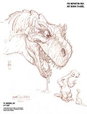
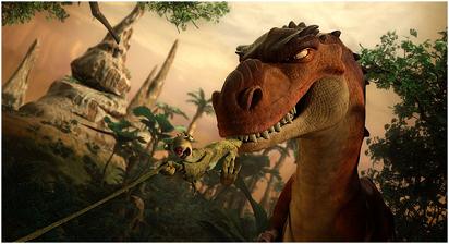
So my challenge was to do two things at the same time. Work with dinosaurs that are essentially familiar to the audience— we brought many of the classic creatures that we all grew up on— and then introduce some somewhat left unknown. All of them had to look as if they existed in the same universe as Sid, Manny and Diego. And a lot of that is, I think, accomplished just by the fact that I’m designing them because it’s the same hand that created the other Ice Age characters. So, already, there’s a consistency. But I still had to make sure that they’re both terrifying and also appealing, especially Momma Dino, the T-Rex mum. She had to do two things at the same time –and it was a real challenge as a designer. She had to be Jurassic Park scary in many ways. She makes an entrance that’s classic T-Rex, rampages through the Ice Age village. But then we discover that she’s actually a loving parent. So, she had to play those emotions, and many more. She runs the full range of any animated character except for the fact that she does not speak like the rest of the dinosaurs.
AV: Retrospectively, do you see that third opus more as a daunting challenge or as a kind of a happy family reunion?
PDS: It’s both. Nobody at Blue Sky is complacent about what they need to bring to the films. Everybody does their very best and I like to think that I do, too. At the same time, I get to work with the people I’ve been working with very closely from the first movie. So, in that way, it is a family reunion and we have a lot of fun. Even more fun with every film because we understand each other’s processes and sense of humor. We know how to work with each other. We’ve developed a short hand over the years. And in a way, it’s also a family reunion because we love these characters so much. I know I do, and I’m always happy to go back to this world. I think I can safely say that I really am proud of this movie. It’s the best looking of the three films, sure it’s richer, it’s deeper, it has more scale and it’s very, very funny. I laughed out loud many times, which doesn’t always happen with me. And it’s got dinosaurs. So, how bad can it be?
is available to pre-order now from Amazon.com
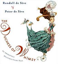
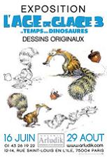
Peter de Sève’s art can be seen at the Arludik Gallery in Paris this summer
And don’t miss the publication by Akileos of A Sketchy Past- The Art of Peter de Seve (hardcover – forword by Chris Wedge) this October.
With all our gratitude and appreciation to Peter de Sève and Malia.
All artwork (c) Twentieth Century Fox Film Corporation, 2009
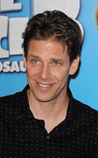
Peter de Seve photo (c) Pascal Le Segretain/Getty Images Europe.


