 Every cinephile loves a good hero—someone to admire, someone to root for. And the best heroes — the ones who live on long after their films hit the big screen — are, at heart, human. They have flaws and fears, and they’re utterly relatable, even as they soar to greatness.
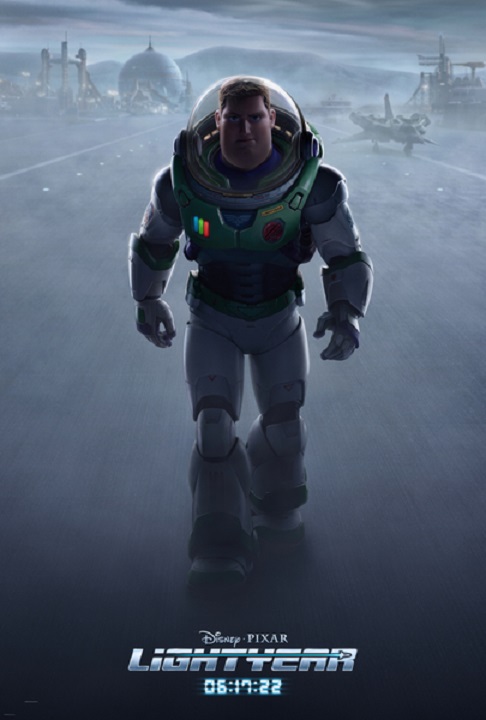
Buzz Lightyear is such a hero. That’s what filmmakers pictured when creating the character for Toy Story (1995). And it’s in the same spirit that director Angus McLane envisioned – 21 years later – Lightyear, the movie that inspired Andy to beg for the space ranger toy that would change the lives of Woody and the other toys of the boy’s bedroom forever!
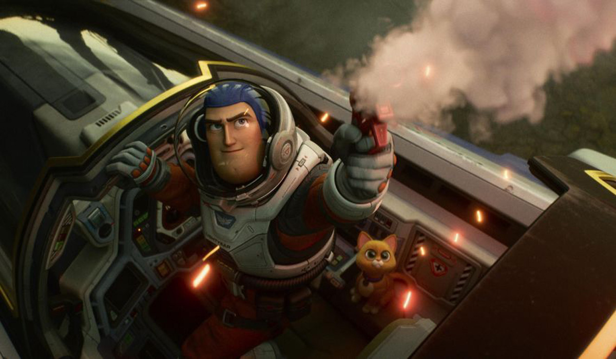
Both a sci-fi action-adventure and the definitive origin story of Buzz Lightyear, Lightyear follows the legendary Space Ranger on an intergalactic adventure through both the hostile planet of T’Kani Prime and through time.
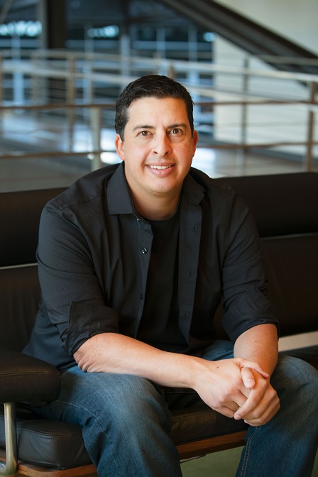
To imagine such an extraordinary voyage visually, McLane appealed to production designer Tim Evatt, who is no alien at all to Pixar style and lore. A 14-year art design veteran, he served as a set and character artist on many of Pixar’s more recent releases: Toy Story 3, Cars 2, The Good Dinosaur, Finding Dory, Coco, The Incredibles 2 and Soul. He has also been involved in the production of a handful of animated Pixar shorts including: Toy Story Toons: Small Fry and Toy Story That Time Forgot, and he was the production designer for the 2020 Oscar-nominated animated short Kitbull.
Here’s our conversation.
Editor’s note: This article contains spoilers for the film.
 Animated Views: From set designer to production designer for the first time on a feature film, can you tell me about your own journey through time at Pixar?
Tim Evatt: At Pixar, I’ve learned a lot. The first movie I did was Toy Story 3. During my studies at the San Francisco Academy of Art, and then in video games, with Activision, Sanzaru and EA, I did a lot of different things; and then Pixar called me and told me they wanted me as a set designer on Toy Story 3. It was a good starting point to learn how to draw for a film. And I was doing it the Pixar style ways. I mean, they go to a location and research with photos, and then they put all these details into drawings that they give to 3D modelers later on. Pixar has a big tradition in reference. So, for example, on Toy Story 3, I went to the dump. It wasn’t glamorous! It was just doing the research and seeing the color and what looked like everything, and then put it in the final film. I’ve been on a lot of movies since then.
On Finding Dory and The Good Dinosaur, learning 3D and Maya helped me compose camera shots. I had mentors like Matt Aspbury and Andy Grisdale from Layout. So, I started learning from them. I was in a unique case because I started learning more 3D building and that complemented my drawings in 3D. Because sometimes I love drawing, but I do love building Maya 3D models, too, like building a set, building an environment, seeing the space and then putting a camera. It’s like Lego building. Like toys. Angus McLane was the co-director on Dory, and he saw my contributions of building a lot of sets alongside Don Shank. I was doing complex scenes and showing Andrew a moving camera underneath the ocean, and I think it kind of had them see I was an artist that can do multiple things.
Growing into Soul, I became sets art director, and then I had people encourage me to apply to Lightyear for production designer. I was already production designer on a smaller short named Kitbull. It was a little cartoon short that Rosie Sullivan wanted me to help out with. It was a good learning experience for me. For Lightyear, I applied and I already had art pieces and rough models, and I told Angus : “the most important thing for this movie, is that you need great 3D modelers to come on early so they can start replenishing the assets.” There’s a thing at Pixar where we reuse models constantly, and it’s okay, it helps. But what happens over the years, the models are not cohesive, they tend to start looking from different movies. I mentioned that to Angus and I said “the most important thing is that we have to replenish our models through 3D.” I was able to get Greg Peltz. He’s an amazing 3D modeler and he became our art director, with Garett Taylor. For this movie I got two sets art directors because I was, like, this movie is so massive, there’s a lot of things that we have to engineer for this film. So, I gathered Greg’s teammates that could engineer the movie.
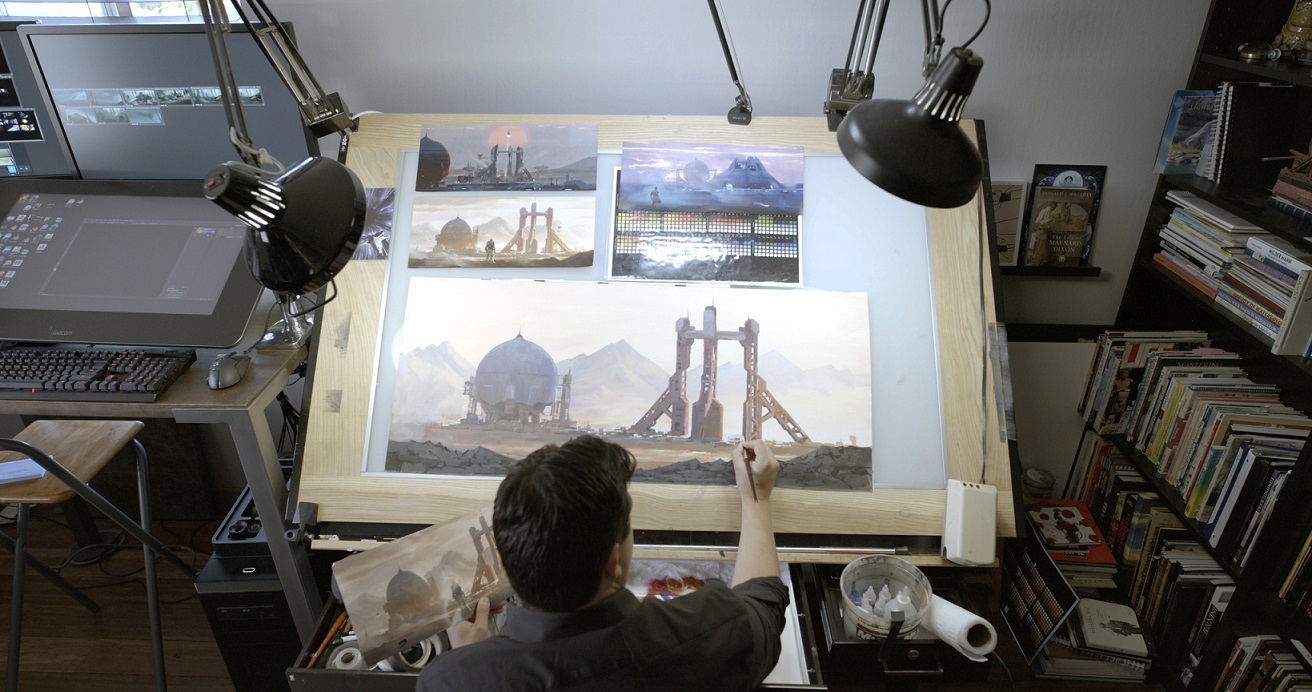
As far as I’m concerned, I was more on the emotional aspect of the film. I’ve done some set design for Lightyear, but I think it was more important for me to organize the shape language and the idea of mood and color and encourage my team to encourage the other departments to be creative. Angus is a very particular director. So, I felt my role was to cultivate all his influences. We looked at a lot of references from films to toy design. We kind of just gathered this imagery and later on we would distribute that to the team and say, “those are really the things that Angus really enjoys”. And we did little test models. We got an ILM modeler that would build actual practical models. Because Angus wanted the models to feel like they’re from the 80s. We all grew up with all these great sci-fi movies of the 80s, and I think our team wanted to feel that when we watch the movie. It feels like something I watched when I was a kid. Anything sci-fi from the 80s, we studied it, we looked at it, we got inspired by it, from artefacts to lenses, from compositing to matte painting, it has this dreamlike quality. When I watch an 80s movie, I miss those times when they made things practical and real!
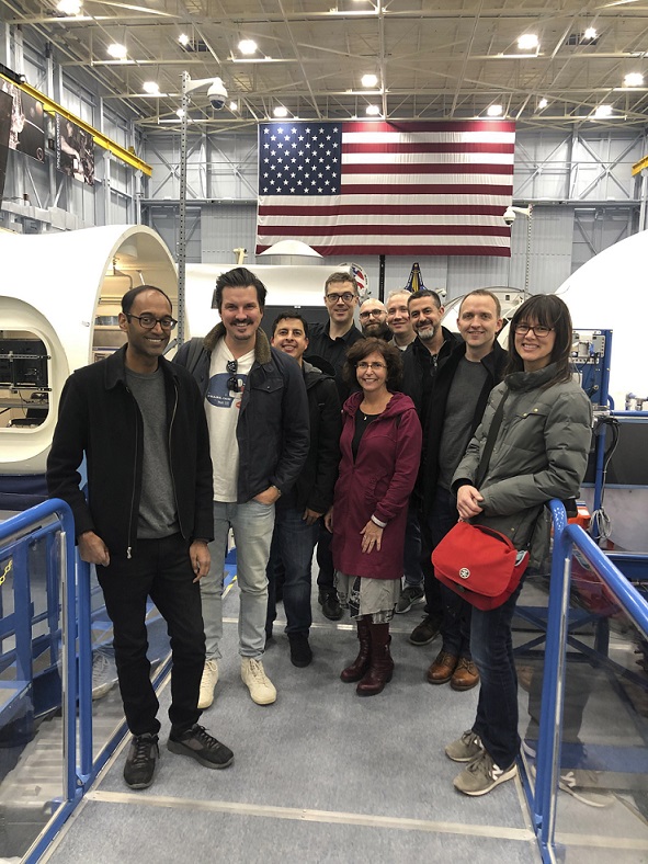
AV: Indeed, in order to prepare the movie, you researched 80s movies, but also you went to NASA. How did you balance imaginary and realistic references in the film?
TE: It was important for us to check-off our list. So, we went to NASA and hung out with astronauts and looked at how things are practically made for real space flights. But we didn’t want to lose the fantastic-ness of design. We didn’t want to go so real that it looks not fantastic. So, we did balance that. Part of it is the casting of the team. I’m a big sci-fi nerd, but the people that I chose to be on the project, we just had to use the same language. They were able to build things and get influenced by sci-fi and implement it. I’ll give you an example: Greg Peltz could look at a practical thing from NASA and he could look at a sci-fi thing, and he could merge them together and make something that is fantastic but practical. As filmmakers, we’re teammates. We’re all in it together. Not one person has all the solutions, but some people have an ability to solve problems. I really leaned on my art directors to help solve a lot of these problems. We definitely wanted to go to NASA and then, we also did a trip to Skywalker Ranch to actually see their practical models like the Millennium Falcon. Oh my gosh! We were there for four hours and it was unbelievable to see how all these models are perfect. The Falcon is huge and you look at the actual one. Those model builders were so phenomenal in what they did. That was very inspiring!
AV: How did you manage to take all these references and inspirations, and make a genuine, present-day Pixar movie?
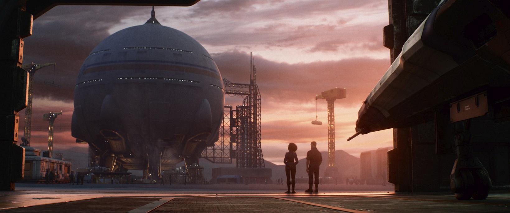
TE: There were so many rules from the original Buzz we had to stick with. If we’d moved away too far from what Buzz actually looks like, people would have questioned him. So, we had to stick to those rules to actually update the new Buzz. In the research that we did and the detail that we did from research at NASA, it’s typical of a traditional Pixar film. For Bug’s Life, they would go low into the grass using little cameras. They would put those little cameras on a Lego dolly and see what it would look like. Bill Cone used to say that when you’re lower from the grass, the grass has light coming through and you have this kind of stained-glass window effect. On Lightyear, it was like – how do we get practicality from NASA and fantasy into the film?
Also, we used weather to show Buzz’s mood through the whole film. So, weather was a way to incorporate that. When I looked at the whole film, I was like – what are the main stakes of his life changes? What is cool about Lightyear is, it teaches kids and people in general how to live with a mistake. When Alicia dies, everything becomes like he has to make a decision and make things right. One of the other important things was to have everything turn white when Buzz goes lightspeed. With Ian Megibben, who was the head of lighting, we would talk about what are the stakes in the ground of the visual of the film, and how do you tie together some of these moments. I used blue with relation with Alicia, lightspeed is life, and when there’s like a storm coming with Zurg, the environment turns all green, twisters actually happen and the weather turns green for some reason. So, I think very deep research is what Pixar films are famous for. And story-wise, characters and personality are of utmost importance. So, we thought how to make Buzz a likeable character. Because he could be very “police officer”. But that makes him so fun, too!
AV: Speaking of Buzz and Zurg, how did you design these realistic characters out of toys – whereas in the industry it’s generally the contrary, with toys inspired by live characters.
TE: We added a lot of realistic details to the original toy designs. For instance, the surfaces of stuff look more practical through metal and mechanisms. The original Zurg didn’t have the chest opening up. On the other side, Greg would look at some of the original hand shapes and keep them similar to what the toy was. There is a moment when Zurg laughs and his head bounces just like the original toy. It’s a nod. What we were going for was like, for example, seeing Tim Burton’s Batman and then seeing the TV show from the 1960s. There’s a totally different mood to it. We were going for more of a seriousness. And through that seriousness you feel the stakes. We also wanted you to feel that if Buzz’s helmet came off, he could die. The same, when you see Buzz get hit, you have to realize that he could possibly get harmed. So, the suit and all that have to have that kind of believability. That’s pretty much the direction we wanted.
AV: Can you tell me about the creation of Sox?
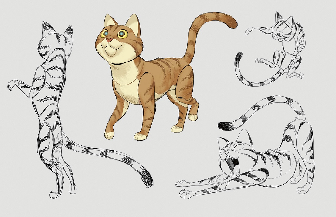
TE: We had early designs from Dean Heezen. He was very much like a cat, very realistic, but still with mechanics to it. Angus really loved the design. And at the same time, Nicolle Castro, who’s a great storyboard artist and loves drawing anime and stuff, did another drawing as a joke. Seeing that, Angus mentioned that that was the direction that there were working on. It became kind of a proof of concept, Sox being cuter. And after that, Matt Nolte and Dean went back in and made Sox more of a cute character. They used to see it like Teddy Ruxpin in a way.
AV: Was it hard to integrate that character within the serious universe of Lightyear?
TE: Angus was going for that one, like a little dog, and at the same time, he wanted to embrace the restriction of a robot. He’s very good at analyzing physical animation and he loves the restriction of things. Robots may not move very smoothly but he uses that as an inspiration for the character.
AV: Time is an essential parameter of the film, its story and stakes. From your point of view, how did you approach the passing of time in the film.
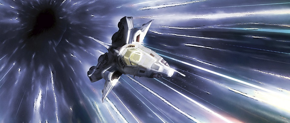
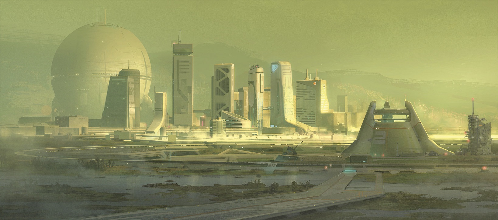
TE: The way I felt it, Buzz is coming, in a way, from an egg – a simple egg, a pure egg, the clothes should be all white. There’s a pureness of things. They’re sterilized astronauts in the beginning. Since they crashed, I really wanted – along with my art directors – to bring ancient elements together from the first flight ship that goes into space, that they’re kind of using elements that they found and kind of repurposed. When he leaves for a few minutes and comes back in the future, we wanted to use the silo to give a measure of the time that had passed. Since he’s been gone for 4 years, we made the silo being fully built. There was a restriction of how we could age the characters. So, we had to rely on color of hair or positions of the bodies. The growth of the population of the base was a way to measure that progress, and then the sets team had this great solution of adding farms and green to show that they’re cultivating the planet to get food and stuff. So, time goes on with that. And then, weather was a way to show that time was moving on.
The character of Alicia is very important in that regard because she actually gets very old, and you realize through her that time has actually gone. Buzz is so focused to get his mission done that he doesn’t realize life has moved on; and I think when Alicia passes away, that really hits him. Izzy being older, along with Burnside, he also realizes that time has moved on. Some of the sets were a way to show that time has aged. Even the shading. The shader art director made sure everything was clean in the beginning and gets more and more dirty and dilapidated. I had one of my sets art directors take a simple hallway, and the hallways really show Buzz’s progression, because the Zurg walls show more advanced technology than the one they had when they landed on the planet. That was important to show that through the ship language.
AV: What was the funniest aspect of your assignment on Lightyear?
TE: I feel like Angus and Ian let me run with how to progress the film, how to track everything. Angus has just a love of toys and he loves old colors. How do I make film transitions with Angus’ choice of old colors of suits and stuff, because they might stick out really bad in a certain color and lighting. Angus really wanted this red suit when Buzz came back from lightspeed, so I did this really bold, arbitrary mix of color. Ian though it was a very good way of organizing things. So, we had to track every suit Buzz was gonna wear and get the Lightyear suit back on. In an action movie, it’s really hard to do a progression of colors when you have explosions and very dynamic things happen. So, it was a challenge for me. But I had a really great time watching all these movies that I enjoyed, and working with Ian and the writers, we were able to make a film with all of these influences. That was the fun part for me, to really set the mood with Ian and Angus. I’d done set design and character design, but this was a great first as a production designer. I did a little bit of that with Kitbull, but this was my first time really getting to look at the whole film and getting to adjust the way it’s presented. That was really fun!
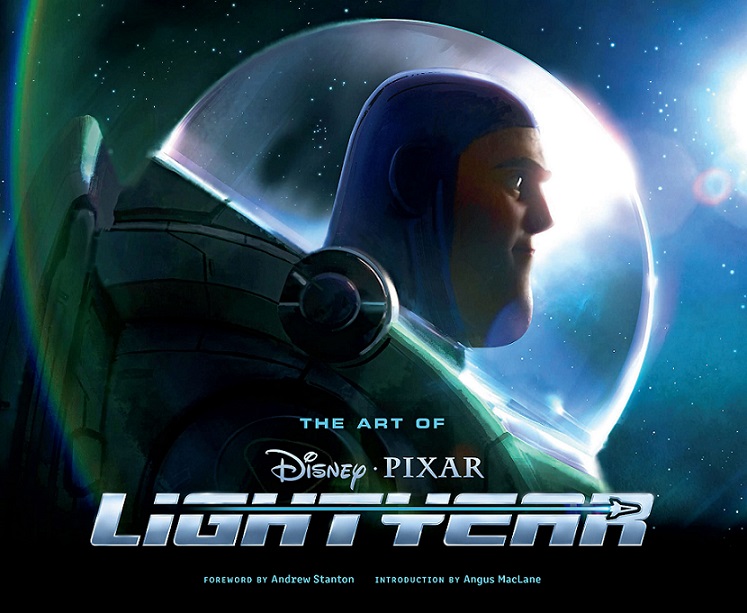
With our thanks to Tim Evatt, Andrea Lirio and Chris Wiggum at Pixar, and April Whitney at Chronicle Books.


