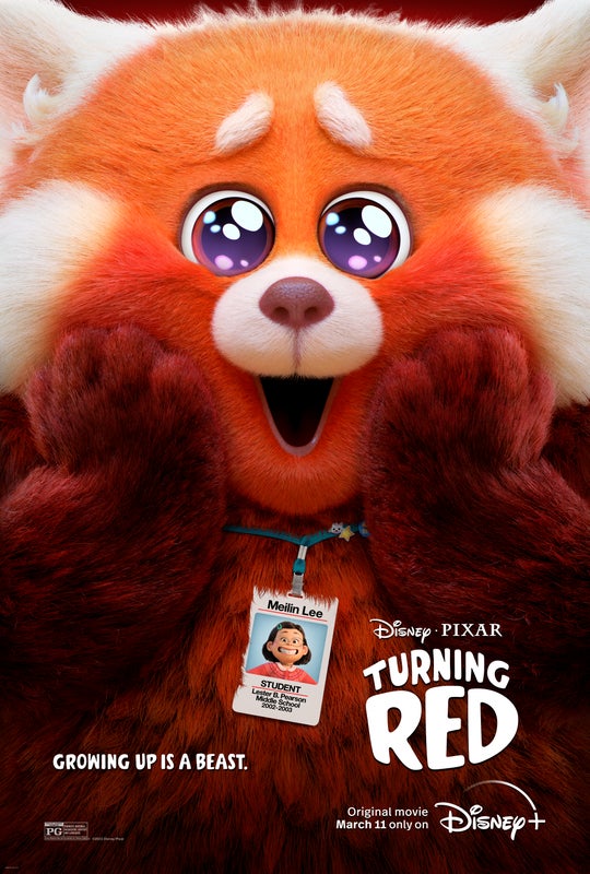
 Turning Red is certainly the most unlikely of Pixar’s features. It introduces Meilin Lee, a confident, slightly dorky 13-year-old with a solid group of friends, an admirable record in school, and a better-than-average relationship with her family for the most part. Meilin — Mei to her friends — has every reason to expect smooth sailing throughout the rest of her middle school career.
But this phase of growing up is marked in an unexpected, can’t-hide-from-it, larger-than-life way: When Mei’s emotions get the better of her, she “poofs” into a giant red panda. “It’s kind of like ‘The Incredible Hulk,’ but cuter,” says director Domee Shi.
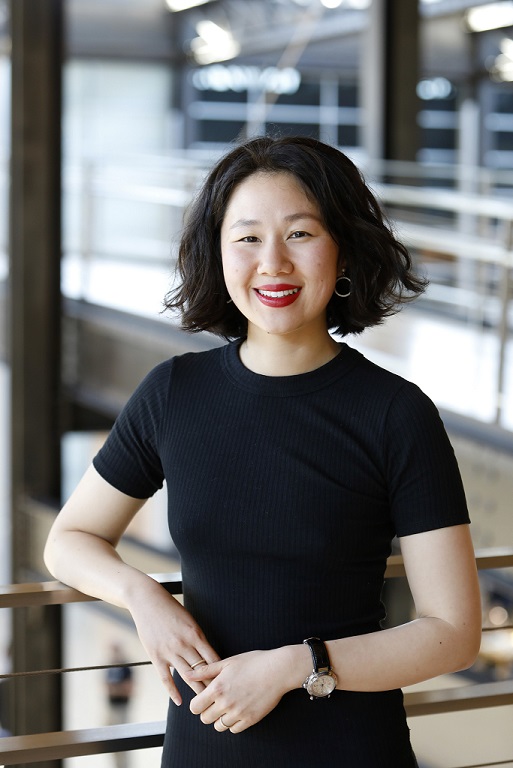
To imagine with her the look of that one-of-kind world, Shi appealed to the same Production Designer as for her Academy Award winning short Bao (2018), the talented Rona Liu.
Born in China, Liu moved to the Bay Area at the age of 10. Ever since she was a young girl, she has always been a fan of Disney films and art, and remembers fondly pausing her copy of The Little Mermaid to draw her favorite character, Ariel. Pursuing her passions, after graduating from Los Gatos High School, she attended the Art Center College of Design and first got a job in Disney Consumer Products as a character intern before joining Pixar in June of 2011 as a sketch and shading artist in the Art department, responsible for designing the colors and textures that go on characters, environments and props in a film. Since joining the studio, Liu has worked on The Good Dinosaur, Finding Dory, Bao , and now Turning Red.
She tells us more about her experience on the latter, which was intense artistically as well as personally.
 Animated Views: Turning Red is so original that it’s been often commented as a fresh start for Pixar, be it story-wise or visually. Do you agree?
Rona Liu: It’s definitely fresh but, maybe because I’ve been working at Pixar for so long, I feel like the start has been a long time coming. Pixar has started to invest in new, young, fresh voices for a long time with the Sparkshorts project and films like Burrow, Purl or Kitbull.
And then, in terms of a fresh look, because you have a fresh voice with Domee, she’s encouraged to tell a story about herself, this 13-year-old coming of age story, and since it’s a very personal story, I think the look has to fit the story she’s telling. We weren’t so much trying to go, ‘Oh, we have to come up with a new look!’, but it was more like a fluid, natural thing, as we were trying to tell a very personal story. In terms of the color palette and the ‘chunky cute’ style, it’s really the kind of thing that we grew up with like Sanrio, anime, cute video games, Pokémon… Those had a certain type of aesthetics that we were trying to marry with the Pixar style. We didn’t want to impress people with something new; we wanted to propose the thing that really fits, that can tell a really authentic story to us. The outcome is this fresh look that I’m really glad people are picking up and responding to.
AV: In the documentary Embrace The Panda, which is also a very fresh way to promote an animated movie, you talk about the way you discovered Domee’s work. Can you tell us more about how you got along with her?
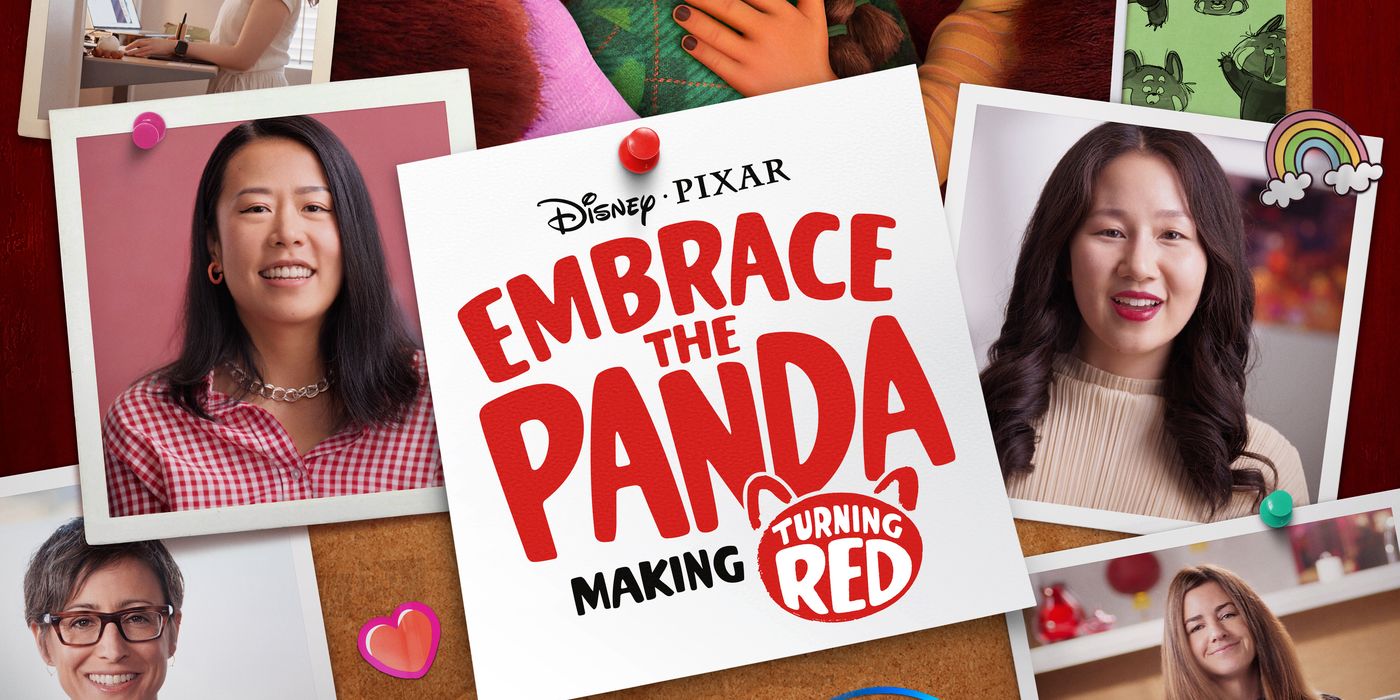
RL: Embrace The Panda was definitely unexpected. Usually, we do DVD specials, with behind-the-scenes. I think none of us expected something so personal as Embrace The Panda. So much of that credit goes to the director, Erica Milsom. She’s always wanted to dive deeper, and I think all credit goes to her for making this behind-the-scenes something so relatable. This is really inspiring, you know – there was that segment when I talk about my divorced parents and how that had an influence on me, and people were chiming in and telling me they had a similar story and felt the same. That was something very special that Erica did because it connects with our viewers on a different level. We have our movie, and it connects with kids in a fun storytelling level. But this is on a more human level. In terms of marketing and promotion, I was telling my husband this is a really smart way to put everything together, and I think that Disney+ was the perfect platform for it all to come up at once. The perfect way to share everything with the world.
In terms of Domee and her personality and what drew me to her, there’s a really funny story. I was actually in college, and my friends and I were pulling all-nighters. It was 2am or something and my friend showed me this Sheridan College film, a 24-hour, animated, student-made gif. It was only like a few seconds long, and it was kind of a funny hamster dancing to a K-pop song, and we were like ‘whoever animated this is going to be a really successful, funny director someday, because this is just gold!’
Skip to like 5 years later. It was like my first day at Pixar. I was hired with a group of people and a bunch of us were just walking around and someone goes ‘Hey, are you one of the new hires? We should grab one sometime!’ and I said ‘Yeah, sure. What’s your name?’ and she said ‘I’m Domee,’ and I was like, ‘Domee Shi???? The girl who animated the dancing hamster???’ I was just in awe. Then, she became a friend and we would hang out on weekends. When she was pitching Bao and getting this project greenlit, she approached me to be part of it. All this started out as just friends playing around with ideas and sharing mutual interest like Studio Ghibli films, seeing how we could put some of that look into a potential project, and going to Chinatown on the weekends studying, like, dumplings, and getting ideas for how maybe dumplings could be animated and made realistic in the 3D world. So, our collaboration started with Bao. And then for Turning Red, I was telling her, like, ‘I would follow you off a cliff. Anything you do, I’m in,’ because she’s brilliant. I just love her style, I love her directness, her decisiveness. She’s special. And here I am now!
AV: How do you explain how your two artistic personalities match so well?
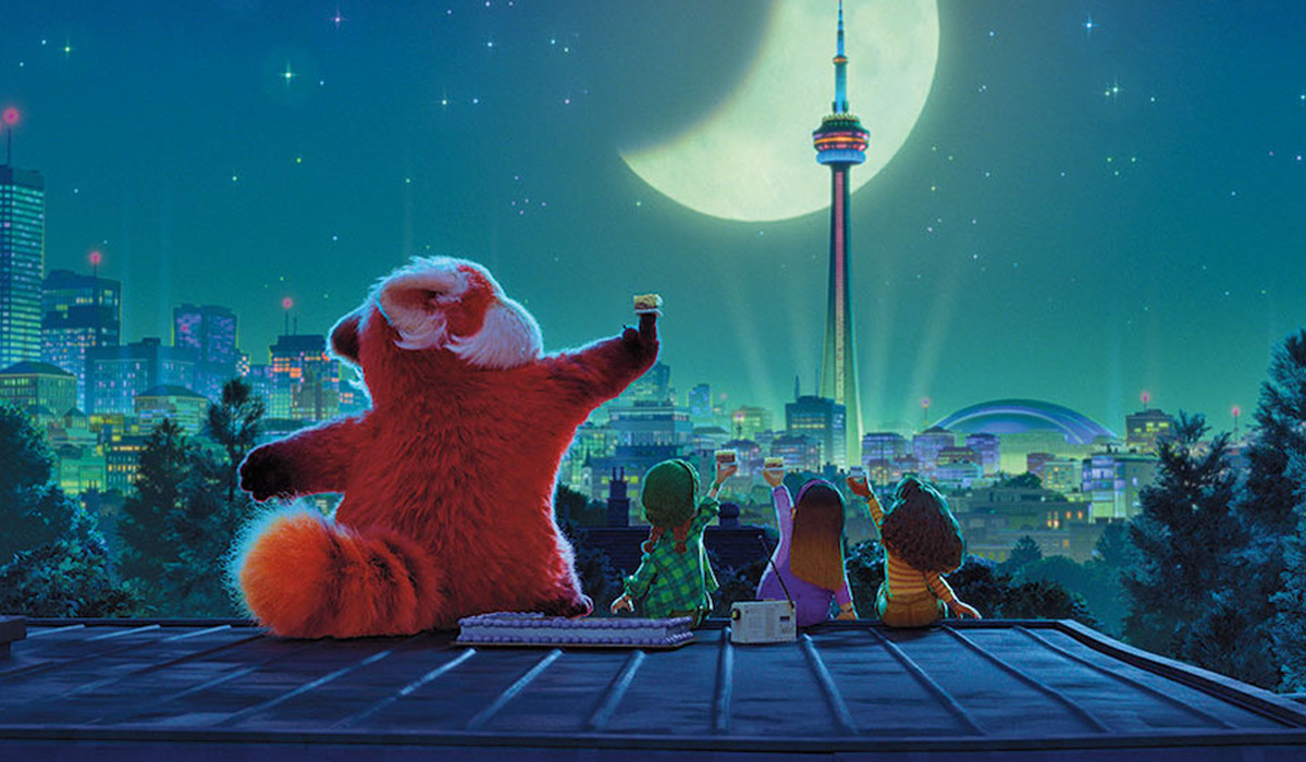
RL: There are a lot of similarities between us. All of the essential things, we pretty much see eye-to-eye. We love round shapes, we both love animals, cats, we both love the silliness. We’re really interested in the humorous side of things, and try to capture that in our art. We have a similar interest in Studio Ghibli films. We both grew up with Pokémon, anime, Sailor Moon… It’s something that really bonds us. But we also differ a little bit. I feel at home when the show tends to be a little more mellow and a little more quiet (for instance, one of my favorite scenes is when you have all the girls sitting on the rooftop, with that giant moon, as they’re thinking that tomorrow, they’re gonna become women), whereas Domee’s art is very funny, very outgoing, very punchy, and I feel like that came into play in kind of different moments in the film.
So, I think the baseline of our interest is very much in line, and then kind of more superficially, we have slightly different personalities and ways to express ourselves. That really came together when we were making that film together. We ‘plus’ each other out because we kind of fill in each other. She can really excite me and push me to the punchy, edgy kind of side, and then I can really support her on the more quiet and graceful side. We really balance each other.
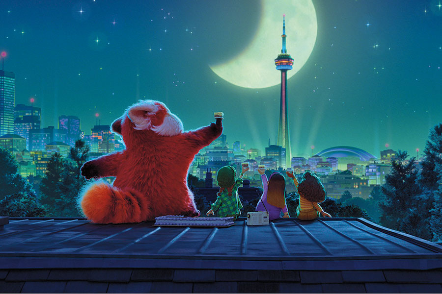
AV: You mention the culture you have in common. How did you kind of re-activate that culture of your youth?
RL: Definitely growing up, I was, like, Sunday nights just watching anime. I forgot what channel, but at 10pm, they would show, like, two episodes of Evangelion or Dragon Ball Z, and I was asking my mom if I could stay up just a little bit so that I could watch everything. When Domee pitched her ideas, she asked, ‘Who were we when we were 13?’ Then, it just all kind of flooded back. And then, there was a lot more to dive into. I went and looked at Sailor Moon, and we started watching them as a team and sharing our favorite mangas and stuff. That kind of inspiration was always there because it was who we were at 13, doodling and watching anime. And now in our 30s, we’re kind of reliving ourselves when we were that age, also inviting people on the team who don’t have that background, like, ‘hey this is an art form. Let’s screen it as a team!’
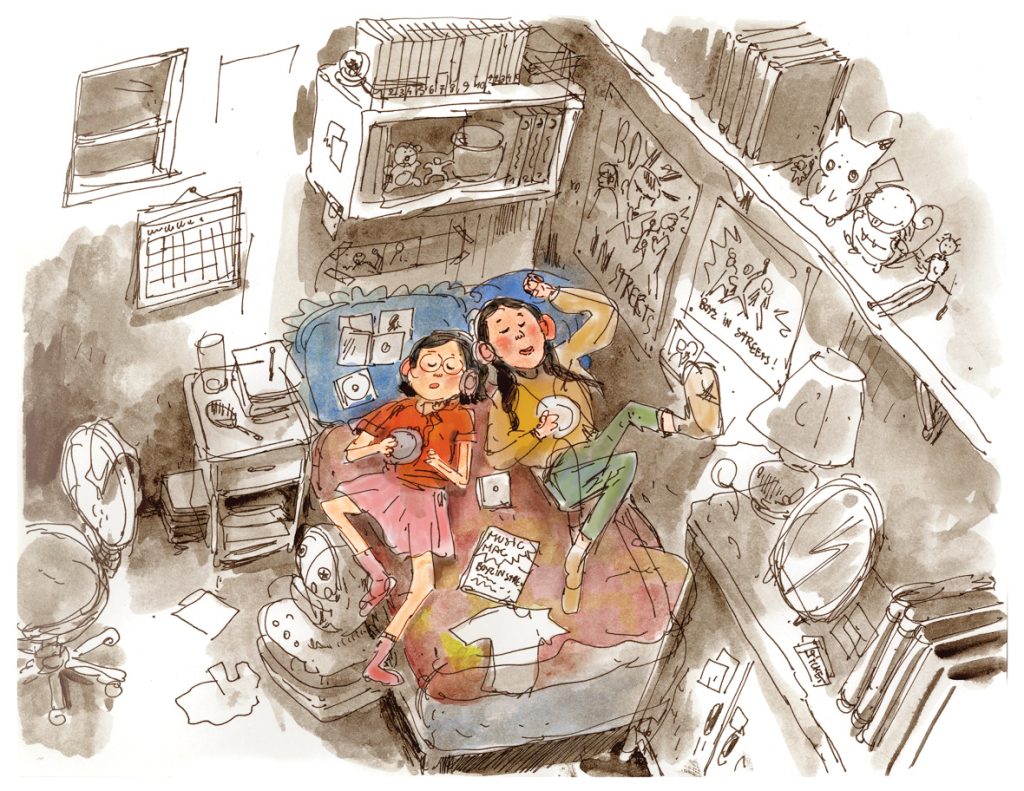
AV: How would you explain the ‘chunky cute’ concept?
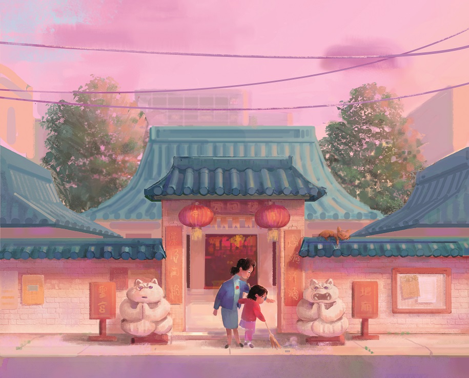
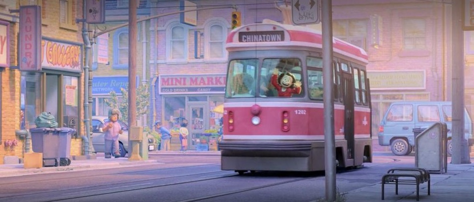
RL: For us, the ‘Chunky Cute’ means really embracing curvatures, really embracing round angles, having no sharp angles, no completely straight lines. Even if you look at our buildings and everything, even if something is straight, if you kind of zoom in a little bit, it has a little bit of wobble. There’s no thin tapering. If you look at the characters, the ankles are thick and round. With panda, she’s very thick and very round. In this environment, if the real buildings have 5 stories, ours have 3. So, it’s about minimizing a lot of details and just distilling details down to the essentials. If this building has 6 windows, can we still make it feel like a building by getting it down to 3 windows? If this place has 7 staircases, can we do 5 and make it still feel like Toronto? This kind of idea started with Bao, and that’s kind of something that Domee and I gravitated toward.
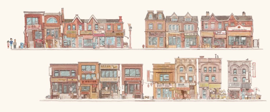
We were at the Asian art museum and we were looking at these ancient clay sculptures. It was clay houses, like ancient miniatures. They looked like houses and they had all the essential elements that make them look like an ancient home, but just not so detailed. And yet, it was so realistic. Early on, we were talking about the photo-real look of past Pixar films. One thing we were always saying to ourselves on Turning Red was, ‘Let’s not go for photorealism, but let’s go for believability.’ It needs to feel like Toronto, it needs to feel like a human character, it needs to feel like four friends. We need to make the world feel diverse without getting so specific on race. Like all the friends need to feel like they’re from different ethnicities but we don’t need to pinpoint exactly what Mei’s Chinese group is. So, it was really believability versus realism, and we favored believability.
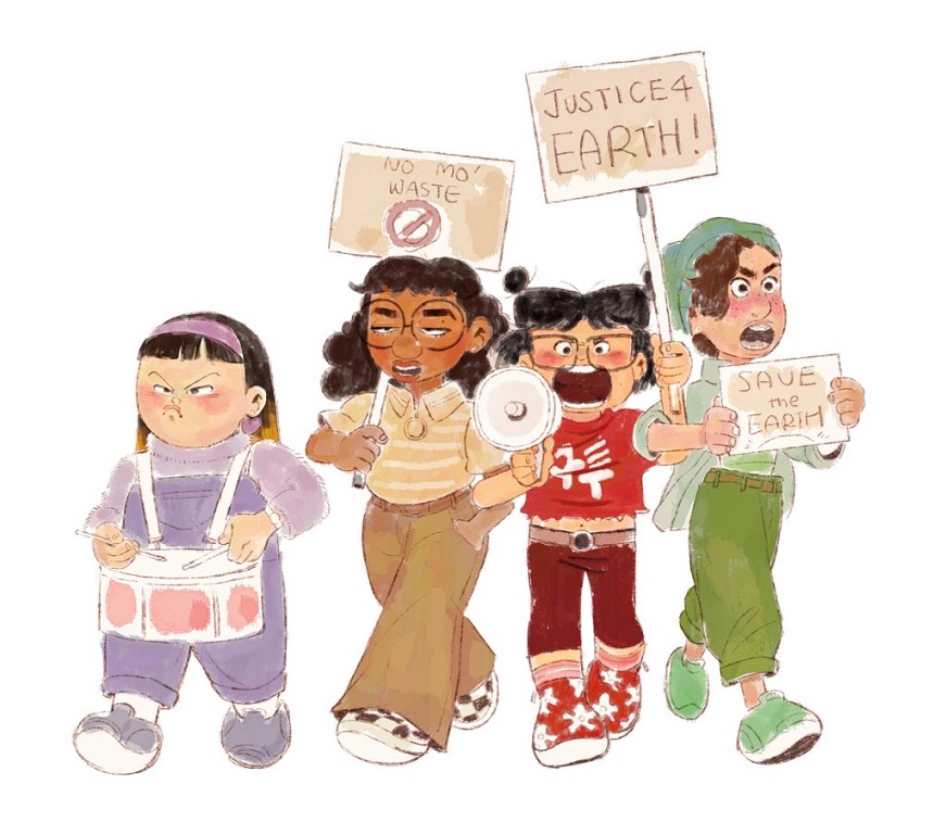
AV: The pastel colors and the overall palette of the movie seem rather girly, but at the same time, the appeal of film is universal. How did you succeed that balance?
RL: We never thought our colors as girlish or boyish ; it was never driven by gender. A lot of the references we used was pastel photography. If you search pastel photography on Instagram, you’re gonna get all these hits, and I think that aesthetics is characteristic of that generation. It’s kind of an homage to the 90s. It’s just what people were into at that time, and this is something that we still are into. We really love this aesthetic, and it also makes us feel like this is what we would have been into at 13 as well, and it’s the perfect way to depict an innocent young girl’s world.
We also needed emotionally to go somewhere color-wise. So, we started out in this innocent mode. Meilin’s very confident, she knows who she is, and we start out very peaceful, very pastel, very low-contrast. I though it supported who she was as a character. But then as she evolves, we can start punching up the contrast, the saturation, and when you get to third act, you have some very high contrast, with very dark colors. The pastels are no longer pastels, they’re extremely saturated and in your face. For us, it was also a storytelling tool, to make sure that the audience subconsciously gets that the colors are supporting this excitement and tension.
AV: Scale is also essential to the film. As you said it, ‘Chucky Cute’ is about keeping things small, but when Meilin turns into a panda, she really looks big and out of place in her house, and the same with her mother when she gets into the stadium as a giant panda herself. How did you make it both intimate, small and cute, and big at the same time?
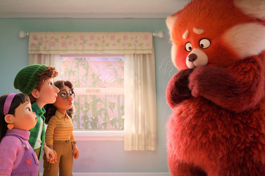
RL: When Mei turns into a panda, she needed to not fit into the house. To be honest, it was definitely a lot of planning with our sets department and layout department. We did a lot of testing. Early on, we couldn’t have made the house without the characters and we couldn’t have made the characters without the environment. Constantly, we had to move them at the same pace so that we could keep comparing them in terms of scale. The house itself went through a lot of scale changes as the panda was being developed. I remember at one point it was a lot smaller, and the school was a lot smaller, too because, before we had the characters, we were just eyeballing our environments. We were, like, ‘Oh, we’re going to the chunky cute. So, we’ll make it smaller and smaller.’ And the moment our layout DP Mahyar came on, he was like, ‘Guys, we need to do some tests. I think we need to make things a lot bigger. Because for us to shoot in there, we need some space for the camera and we need to have the panda fit.’ So, once we started doing the tests, we were still ‘chunky cute’ in terms of the design, but the scale of things had to grow to fit our panda.
And when we got into the stadium, the same thing happened. There was a lot of preliminary testing with a rough, giant panda – Mingzilla! – and the stadium in order to see how big we could make her before things started to either break out of the chunky cute world or started to feel like she’s like a miniature. We had to make sure everything was still believable, and didn’t look like a toy and a miniature stadium making the audience start to question the look, and taking them out of the emotion of the film. So, it was a lot of back and forth and a lot of collaboration between all of the departments to make sure that Third Act looks as menacing as it possibly could, but still cute.
AV: How did you get so accurate in terms of reconstructing the 2000s?
RL: A lot of our research happened as we invited everybody to go back and bring up their yearbook photos. So, we had these boards of everybody’s 13-year-old pictures. People brought in their yearbooks and we were just looking at yearbook photos, what clubs they were part of, what musical instruments they played. And if you were a mom or a dad, you could bring in pictures of your kids. Our graphic director Laura Meyer’s daughter actually made a music video to, I think, NSYNC or something, and she brought that in. People tried to connect to the film any way they could, because we either have all been there before or we have people that were there right now. That’s kind of where our references initially went from. Then we searched on Google and Getty images to make sure that we’re not getting references of kids from now but of kids of the time. For instance, none was using smartphones then, everybody was using cellphones and maybe even pagers. There’s also the type of backpacks people had, the types of pencils and pens kids would use back then… All kind of things that were specific to that time.
AV: What was your most intense moment during the production of the film?
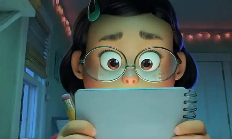
RL: I would say one of my most poignant moments on the show is just Mei in her room singing to herself before she rolls on her bed and draws her sketches, as this room is bathed in this fluorescent, bluish green light. To me, it was so special, because we’d been doing so much work in arts and with the technical team, and it was a moment, like, ‘Will this amount of work pay, can it look good?’ The pastel colors, the low contrast, and ‘chunky cute’ style – is it gonna look good on the big screen? This was one of the first sequences that actually got through production and I just remember seeing it on the big screen as a test. It was like 80% done and it looked so good! I think a lot of us got then so much encouragement from that, because it felt like the film was really in the making and it looked really, really good. We were just awe. That was a very special moment!
AV: You brought so much of yourself into the movie. What will you take away from it?
RL: The thing that I think I would most take away with me is just the friends and the colleagues that I’ve met on this show. Because it’s a pandemic, because everybody worked from home, away from each other, it was such a new territory for everybody. So, I would say the collaboration was just so tight. If it hadn’t been that way, this movie would not have been made. All of us walked away just so much closer and I honestly just cannot wait to work on our next movie with the people I worked with. We can think alike; we can finish each other’s sentences. We’ve been through hell together, and now we’re ready to get into a new project.
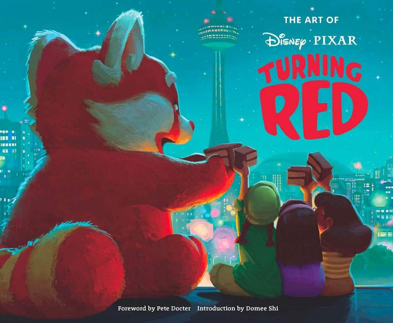
With our thanks to Rona Liu and Chris Wiggum at Pixar, and April Whitney at Chronicle Books.


