
 As a child, director Chris Williams (Big Hero 6, Moana, Bolt) was obsessed with drawing and writing and working on stop-motion films. He loved movies, and particularly enjoyed adventure stories like Raiders Of The Lost Ark and King Kong.
He was drawn to films where characters ventured out into the unknown. And he found old maps to be fascinating, “specifically those old sea monster maps,” as he puts it. “I remember looking at those incredible maps. They were just so compelling to me. Some of it was just the fact that they were unfinished, and there was the promise of what lies beyond, but also the fact that they would populate the oceans with colorful sea monsters! I would look at them and I’d think, ‘Man, that would be a great setting for an animated movie.’ And so, I guess I made one,” Williams said.
That’s when The Sea Beast was born.
Chris pitched the idea of The Sea Beast to Production Designer Matthias Lechner in 2019, and he quickly began work on finding the right design to bring Chris’s epic vision to life.
Matthias was born in 1970 in Mannheim, Germany. He spent his youth in an idyllic south-German setting. In 1990, he moved to Hamburg to find his place in the awakening German animation industry. Later, he studied classical animation in Dublin, Ireland and moved as an “animation nomad” to Hamburg, Seoul, Copenhagen, Toronto, Montreal, Vancouver and Los Angeles. For 30 years, he has worked as an Art Director and Production Designer on a number of European and American animated features like Disney’s Zootopia and Ralph Breaks The Internet.
As the Production Designer of The Sea Beast, he talks with us about this new adventure in light of past experiences.
Animated Views: How did you get to work on The Sea Beast?
Matthias Lechner: I was at Disney, I had just finished with Ralph Breaks The Internet and started to work on Encanto, and I knew it would be something special. So, it was actually hard to go from Disney to The Sea Beast. It’s not that I wanted to, but Chris made it so appealing to come to The Sea Beast. Partly, for me, it was a career step up, from Art Director Environments to Production Designer; so, that was tempting. The other thing was that it was so uncharted, to speak with sailing terms. Netflix was just opening up; and we all felt like a start-up. We didn’t know what style we were gonna choose. It would have been a little scary if it wasn’t for Chris, so I wanted to take on that challenge.
AV: Indeed, how did you choose the style of the film?
ML: First, it was a little bit daunting to come up with something different, because I love the Disney style, and so does Chris. We both come from that tradition, and we wanted to keep some of that. That’s the reason why we’re in that business: to make movies like that! But then we tried to find another angle to this movie. The first thing Chris told me was that it was gonna be epic, complex, big, and most of all, immersive. So, I thought: if the style is too visible, too extreme, it would act like a filter between the movie and the audience, who will be always reminded that they’re watching a movie. I wanted to really keep the people into the film.
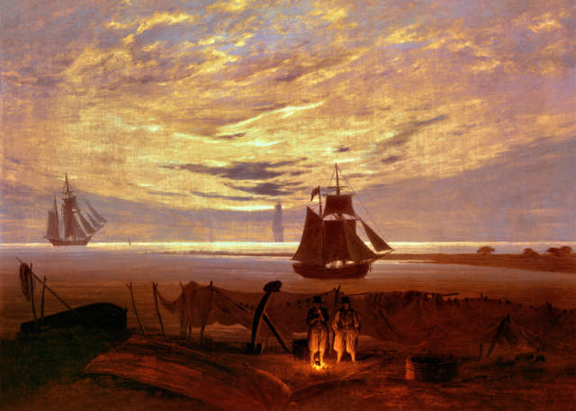
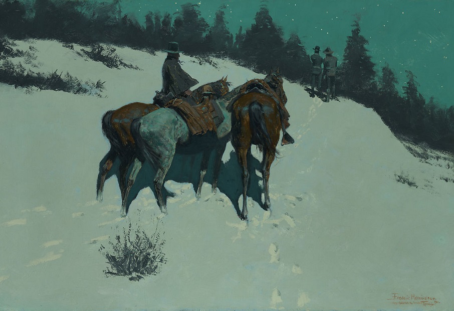
I grew up in Germany, and I remembered some paintings in the museums by Caspar David Friedrich. Some of them are so big, like a wall, or a cinema screen. They’re very into composition, very subtle in the lighting and just epic. So, that was one inspiration. The other one was Remington. The trick is, when you do a movie like The Sea Beast, which is a period piece, because of sunlight or candle light, it can turn very brownish, with muted colors. In that regard, I really like what Remington did with natural environments. The nights can be of strong green, or something like that. That was very inspiring. I wanted to make this movie very colorful.
AV: I was very impressed by the treatment of the natural elements: water, air, fire.
ML: One of the reasons why we wanted to make the water very realistic is that it gives the audience a sense of scale of things. It’s sort of like a measuring tape. You know how big a wave can be, you know what water looks like, and if something giant comes out of it, we have a good relationship to how big it actually is compared to the water. As 80% of the movie takes place on the water, it was very important to make it right. With Sony Pictures Imageworks, we had a great partner for that. Our Tech supervisor actually grew up on a ship for several years. So, he really, really knew what he was doing. And Sony works on live action films, too. So, they already had the right systems to create it. We worked a lot on the color of the water. In some scenes, it’s very green, and in other ones, it can reflect the sky and get darker. You can do a lot of coloring. It’s usually a matter of detail. It’s kind of a “how many” question. How many levels of detail can you put on the water? It can become very hard to render. So, we had to always find the right balance.
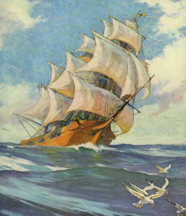
As for the sky, when I started, Chris had that painting on the wall by N.C. Wyeth, who did these great adventure ship paintings with giant clouds in the background. So, we did try in the beginning to stylize his style somehow but we didn’t get anywhere with this because it always looked like somebody painted the sky, like in The Truman Show. So, in order to have our world look as believable as possible, we ended up having a realistic-ish sky. I mean, you still can see it’s a little painted, you can see the clouds are a little bit over the top, but it allows the audience to look into infinity. That’s why it had to look that realistic. And it fits to the water.
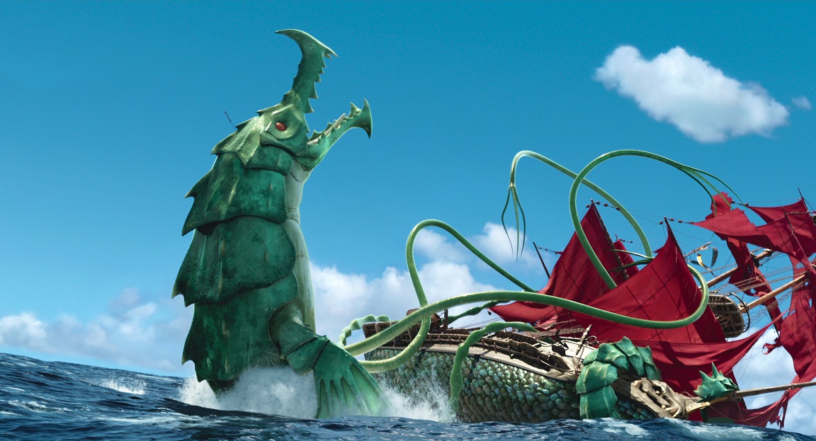
And regarding fire, for that movie, I wanted to establish an opposition between green and red, and I wanted to hit that right at the beginning. So, when the boy is in the water, we have the green moonlit water versus the red, burning ship. And, as I told you, we worked a lot on the lighting.
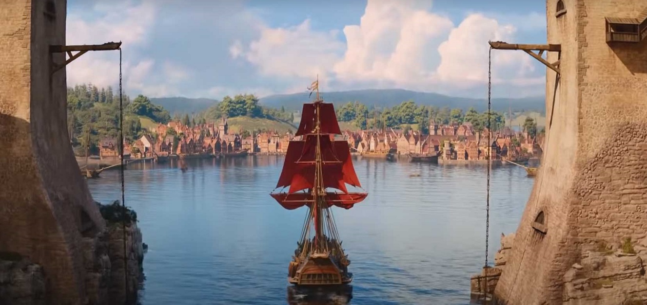
AV: How did you approach the ship, the Inevitable?
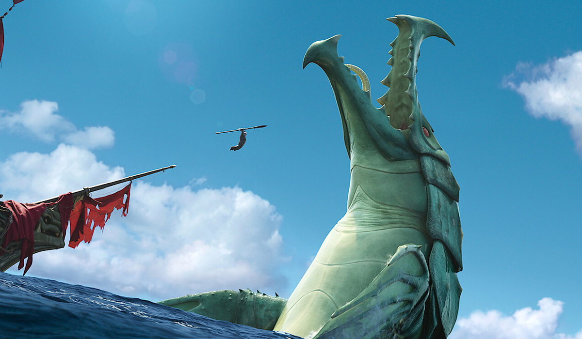
ML: We wanted the ship to feel real. We looked a lot at Master And Commander, the Peter Weir film, because it felt like you’re actually on a ship. And it’s just the amount of ropes on screen! It’s something that you don’t see in animation a lot. So, we really spent a lot of effort on making the ship correct, so to speak, and we had several experts help us with that, sitting right next to the modeler, making sure that proportions are right and that everything makes sense. We asked them about the kind of ship we would need for our movie. For example, when you think about pirate ships, you think of portals opening and cannons coming out. But if you wanted to catch something that’s moving in the water, you have to realize that little guns work better. There’s plenty of details you don’t really see in the movie, but that we put into our design to have the most accurate ship possible. We also have that figurehead that’s really big. It’s iconic for a hunting ship but it also protects the front, with spikes coming out. So, in essence, it’s a ship that can really work, that gets all the ropes and all the correct rigging. One thing that I came up with is the sails. I wanted that this ship had an identity and could be recognized from far away. So, I found this technique of tinting the sails to protect them from sun damage, and I turned them red. And that works really well. That’s lots of research, which is something I learned from Disney. They’re very keen on research, and out of research come ideas.
AV: And how did you create the design of the beasts themselves?
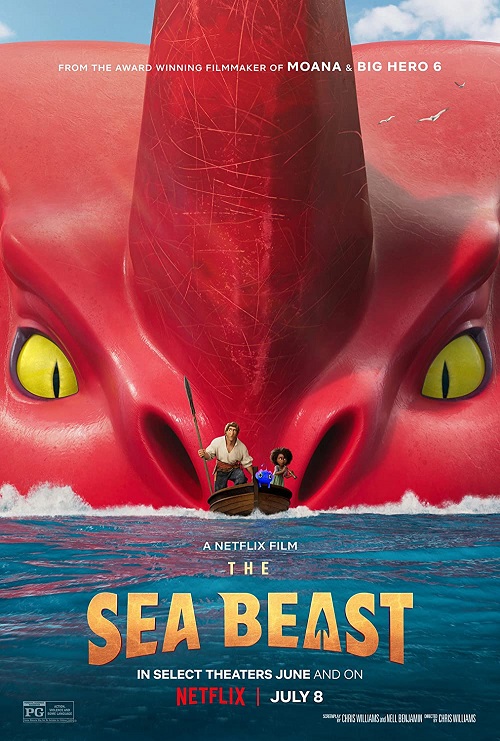
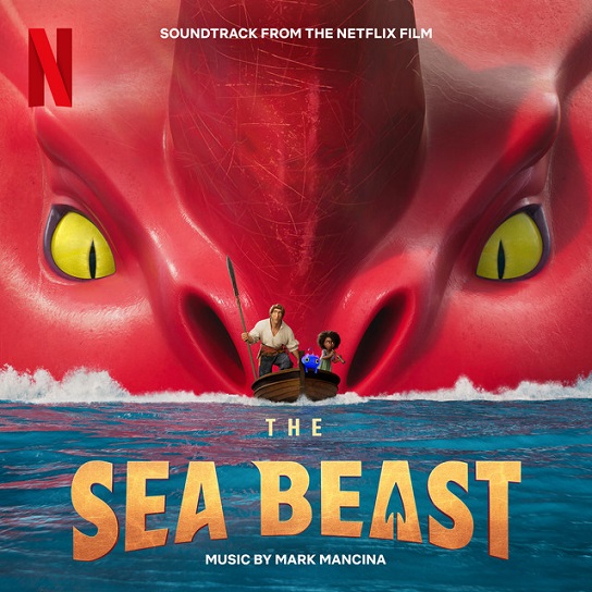
ML: We had Shiyoon Kim as Designer of the beasts. All the beasts coming out of one person’s imagination gives them a certain DNA to begin with. I approached them more as adversaries versus species we can relate to. So, the adversaries like the one we see at the beginning of the movie is insect-like and has an exoskeleton, whereas the main sea beast has a very smooth skin. The difference is also that the ones that we relate to more have primary colors whereas the other ones have secondary colors: you have the green beast at the beginning, and then the more “let’s be friends” beast are blue and red, and then the yellow ones on the island are also recognizable in opposition to the purple one.
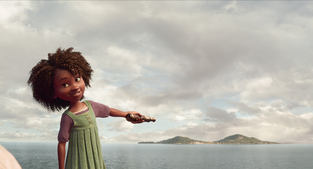
I already talked about the opposition “green vs. red”, but more generally, the theory behind the colors was that we’re in a world based on dualism, whereas Maisie starts to sort of collect all the colors. All of them can actually get together. Some of these colors are already on her costume and in the end, she has blue and red, and Jacob has some yellow on him. She actually creates a family of colors.
AV: What about the human characters, that go from realistic with Maisie and Jacob to caricature with the royal couple?
ML: Tony Fucile was the guy who designed most of them. The deal with the characters in general was not to get to the “uncanny valley”. We wanted this movie to feel more real, more immersive, but at the same time, when you go too far, it loses its charm. So, Tony found a really nice way of keeping in both worlds, the Disney world and a little extra on top. The royals are side characters, so you tend to go more extreme with characters that have a short time on screen and are a little more extreme in their personalities, not as subtle. So, we just pushed them. A lot about the royals in their costumes, too. We spent a lot of time on costumes in general.
AV: You mentioned Tony Fucile. Can you tell me more about his contribution as a character designer?
ML:First, I have to give credit to Chris. He animated before and he really knew what he wanted to do. So, basically, we came up with concepts and photographs. For example, for Maisie, one thing that was important to me was to make her not doll-like and find some real angle in her. So, I looked at some kids that had a hard life, for example during the Great Depression. I think in particular of one photograph of Allie Mae Burroughs that kind of stuck in my mind. She had, like, these little creases under her eyes. And then I noticed that you actually see that with kids a lot. It’s not tired, it’s not old, it’s just that they happen to have these little creases here. Another thing is that animation usually has a very distinct way of how the eyelid works and I just wanted the space over the eye to be a little bulgier than usual just to give her character, and I saw that on kids, too. Then I shared these ideas with Tony, and he came back with so many sketches, and they were all great. But we had to make choices. And then, when we narrowed it down, we had a costume designer, Michele Clapton, who did the costumes for Game Of Thrones, who gave us a lot of ideas. And then, when Tony’s done finding the character, he goes to somebody else like our art director who makes paintings, so, defines the skin and the hair and all that stuff, and then he goes to modeling which is a very collaborative thing.
AV: From the island to the kingdom, your role as a Production Designer is about creating a whole, big world, and that was also true on your previous films, Zootopia and Ralph Breaks The Internet, that also had such a really huge scope.
ML: That’s what I live for! Because that comes natural to me. That’s partly why I’m in animation. That goes back to childhood. There are two types of kids. There are the ones that like to set all the little stuff – that’s me. And there’s other ones that like to play with the dolls, and that becomes the animators. So, I’ve always had a great time setting up big worlds since childhood. And part of that is just thinking for a long time, it’s sort of like an exercise, an empathy, putting ourselves into the shoes of the people that we would have in that world, with their experiences and their needs.
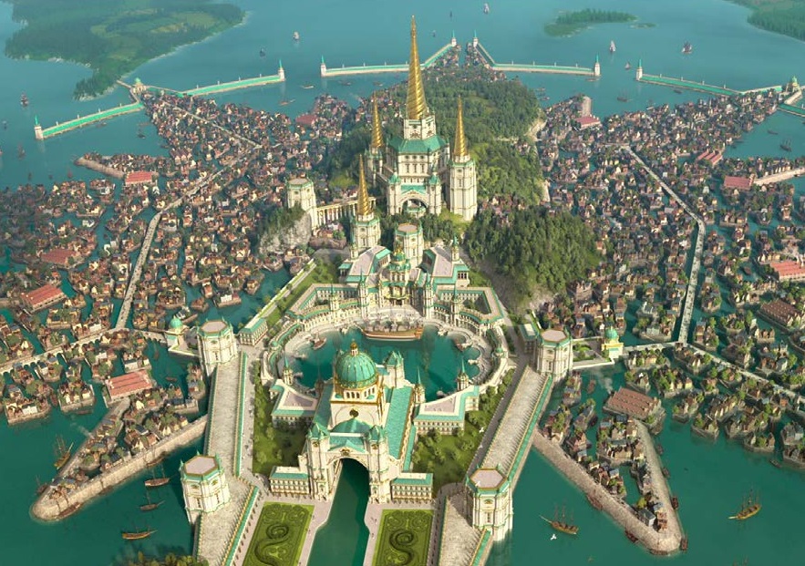
For Zootopia, there was a long search, because you don’t know what would animals feel. Are these animals, anyway? And so on. We designed a lot of things that didn’t really end up in the movie, like a big palm hotel. And something I liked in that film is that we don’t explain it. I like things in the movie that are just there because we made up this choice for reasons but they’re not explained. It’s like when you go to New York, you don’t have to explain every building. So, it’s great to have these things in the movie. In The Sea Beast, we don’t explain why the city is the shape that it is. I do know, and then the audience assumes that the people that built it know and it kinda of makes sense in the logic of the film. Finding that logic is lots of fun for me.
AV: And in Ralph Breaks The Internet, that world is virtual. So, how did you give shape to that virtuality?
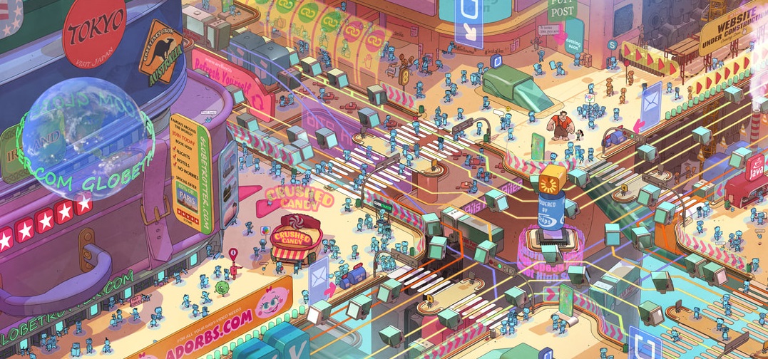
ML: Coming from Ralph 2 to The Sea Beast, it was such a pleasure to work back to something that you could grasp so easily. Because it’s a period movie. Ralph was a real head-stretcher. What is the internet? Obviously, it’s not a real place, but you know that’s a place the characters go to, so you have to give it a physical form. Again, we did a lot of research, we visited a big internet hub. We were allowed inside and I have to say the most memorable thing about that is the chaos. The internet has been growing there since the 80s, so there were several feet of cables that nobody knew what they connected.
Then, basically, from that, we took a couple of concepts like “the internet is infinite”, and made it grow from the bottom up. So, if you go down you have the “oldernet”, where the start of the internet is, and then, the higher you go, the newer it gets. Bigger websites have bigger buildings, so to speak. And then you combine these ideas and hopefully they work. You don’t know really, until you’re in the movie.
AV: How do you translate your European background into your art?
ML: I grew up with a lot of Belgian comic books and I really loved the world that Franquin built, for example. I grew up in Germany in 1970 but I have this sentimentality from France and Belgium of the 60s, and from these comic books, and that might be seen a little bit in Zootopia. The film also was very personal because I was living in British Columbia, where my wife is from, so that’s why I was there. I spent two years there, and I felt a little like Judy Hopps coming into the big city when Disney asked me if I would come here and art direct the film. Our journey was a little like hers, coming from a small village to a station that looked a little bit like the one that I had close to my house in Germany, and then we go through the big forest similar to the ones of British Columbia, and then we end up in the big city. We had a very similar journey.
You know, you always put certain things from your childhood in there. In The Sea Beast, it’s the cities, of course, the towns, because I grew up in a medieval town. The grassy hill the beast comes over reminds me of the hill that I knew when I was a kid, which I liked to slide down, that sort of thing. So, you always sort of come back to your childhood. Whether you’re aware of it or not, it appears under some hollowed form in your designs.
AV: Compared to 2D, computer animation allows infinite environments. How do you find the balance between finite and infinite in order to unleash your creativity without losing yourself?
ML: It’s funny you say it this way. I started making 2D movies. The first half of my career was in 2D. And one thing I really enjoyed is that, if you want to have an expansive city for one shot, no problem, you draw it, it’s there. In 3D you have to build everything. So, you have to have a good plan of how you can get the most out of the buildings possible, which is not a problem in 2D. You just draw whatever you want. So, in a way, I’d say I’d have more freedom in 2D. In 3D, I use a lot of Sketch-up, as sort of a planning tool. In The Sea Beast, I built the city in Sketch-up first and this way, if I build 20 buildings for the city, I build them the right way so that they look a little different from each side, which I also did for Ralph Breaks The Internet, for the websites. You build them in a way so that they have different elements and different angles so that you can combine them the best way. And then I can try them out in 3D already. You have to actually plan a lot more because everything costs so much in 3D.
AV: You brought so much of yourself in your movies. But what did the movies bring to you?
ML: Let’s start with Zootopia. I had never made a movie for a large studio before, so it was simply about learning how Disney works, how Hollywood animation works; and thankfully, I had those two years at home, coming up with concepts, and I tell you, every day I was like asking myself, desperate, what do these people want from me that they don’t have already? I was very anxious in the beginning. And then I met the Production Designer, Dave Goetz, who’s been a friend of mine. He showed me the ropes, but at the same time, he let me have all the freedom as he saw that I had a vision for the city. So, he let me do it. But he really guided me through the system of how Disney works. So, that was great, and I still try to emulate that as a Production Designer.
For Ralph, the challenge there was that it was probably the most complex Disney movie ever done, with the biggest sets and the most pieces. So, the challenge was to get it done while keeping control of this giant cruise ship. I couldn’t feel more confident after I finished that one. I knew what I was doing, whereas on Zootopia – well, I hoped for the best.
And then The Sea Beast was different again because it was a different vendor model. We had a team at Netflix designing it, and then I had to talk to another studio. At Disney, you could talk directly with the artists and you didn’t have to prepare everything. You could just communicate. Whereas with the vendor model, you speak to the effects supervisor and he relays your notes to someone else. Which wasn’t a problem in the end.
The other thing is, on the first two movies, Zootopia and Ralph Breaks The Internet, I was just in charge of the environments, whereas on this one I overlooked the whole thing. And that was really new. A learning experience to me was actually the lighting. Because that’s not part of art direction, that’s the Production Designer’s stuff usually. So, I learned a lot. Thankfully, my art director, Woonyoung Jung, is just a genius with color and helped a lot. I think it was a little bit annoying for the people at Sony at first, with me not knowing all the terms perfectly, but that went well in the end. At the very end of the movie, we did color timing, which I had never done before either, but for me it was just great. It’s just a toybox with all sorts of possibilities and you can really bring out the things that you hoped for.
At the beginning of a movie, you come with a vision, but that’s not necessarily the movie in the end. Other designers are artists with a specific style, and they bring that style to the movie. I’m more collaborative and I’m happy with whatever other voices bring to the movie. As long as it’s good idea, it’s great and it helps. So, it’s more like raising up a child or teaching a class or something like that where you just push in the right direction and then hope in the end the world will love it!
The Sea Beast soundtrack is available to order from Amazon.com!

With our thanks to Matthias Lechner, Samantha Kwan, Lamarco McClendon and Olivier Mouroux