
Every artist is one individual, the creator of one single vision of the world expressed through his or her art.
Very rarely though, personalities and visions can merge into one creation.
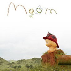
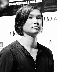
That’s certainly what happened with former Pixar artists Robert Kondo and Dice Tsutsumi who precisely define themselves as “two artists capable of a singular look” in creating The Dam Keeper.
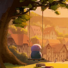
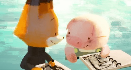
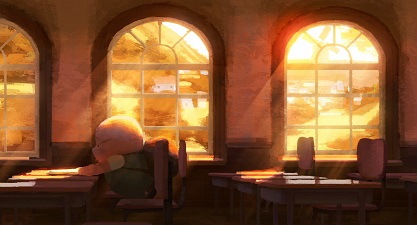
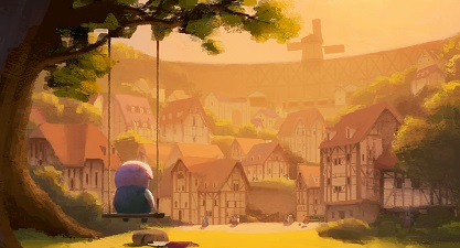
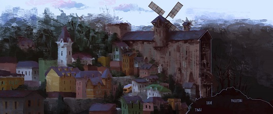
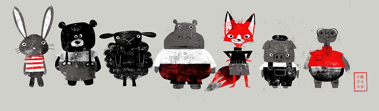
The animated short tells the tale of a young pig encumbered with an important job, and the meeting of a new classmate who changes everything. Set in a desolate future, one small town’s survival is solely due to a large windmill dam that acts as a fan to keep out poisonous clouds. Despite bullying from classmates and an indifferent public, the dam’s operator, Pig, works tirelessly to keep the sails spinning in order to protect the town. When a new student, Fox, joins Pig’s class, everything begins to change.
The Dam Keeper made its world premiere as an official selection at the 2014 Berlin International Film Festival and is slated to make it’s US premiere at The New York International Children’s Film Festival this spring.
We talked with its two directors, who, obviously, spoke as one…
 AnimatedViews: In Dam Keeper, it seemed to me that there were kind of nods at movies by Hayao Miyazaki: the pig (Porco Rosso), the windmill blowing the dirt (Nausicaä), the miner in your first story development (Castle In The Sky), the medieval influence in the design of the city (Howl’s Moving Castle). Can you tell me about the importance of Mr. Miyazaki’s work in your inspiration?
Robert Kondo & Dice Tsutsumi: Both of us grew up watching Miyazaki’s films, and the influence of his work on our first film is undeniable. We never sat down and intentionally created a world influenced by Miyazaki’s films, but the believability of the fantastic worlds he creates is always a high benchmark we strive for in our own work. Dice grew up in 80’s Japan, watching Studio Ghibli films and Miyazaki’s early televisions series, like Future Boy Conan. Miyazaki heavily influenced his sensibility for story and image making during an impressionable part of his life.
The Dam Keeper is really a product of many things we love from our childhood and our development as artists, from children’s book artists like Richard Scarry, to cinematographer Conrad Hall, as well as artists we’ve worked with during our time at Pixar to the amazing work of Hayao Miyazaki.
AV: Can you tell me about the mix of Japanese and American culture in your work, globally as an artist, and more specifically in Dam Keeper?
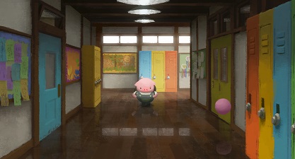
RK & DT: Dice grew up in Tokyo, Japan and Robert grew up in the suburbs of Los Angeles. When we collaborate on our projects, there is a clear mix of cultural upbringing that we talk about indirectly. While writing, we share stories from our personal experience as children to convey a sense of authenticity for the story or our characters. While creating The Dam Keeper, we both reached into our memory banks to recall what it was like to attend school at a young age. The result of the cultural push and pull can be seen in the design of the classroom, sliding doors reminiscent of Japanese classrooms from Dice’s upbringing, and the classic American school bell that signals the beginning and end of class is specific to Robert’s memories of elementary school in Southern California. It is a unique classroom invented from our personal stories.
Again, we don’t necessarily talk too much about it specifically but it is probably embedded in our work without knowing. The Dam Keeper design was very European to convey the fable like quality of the story but there are lots of Japanese elements such as the way the class room is designed.
AV: Your story evolved from a story about a human miner to a city peopled by animals. How did you come to that choice?
RK & DT: As writers, we sought to tell a story with themes we deal with as adults. As we were developing our story and the themes began getting heavier, the change from humans to animals somehow made these heavier themes more acceptable to early audiences we shared our developing story with. We felt simple animal characters would also help to create a fable-like quality to the world we sought to create for our film.
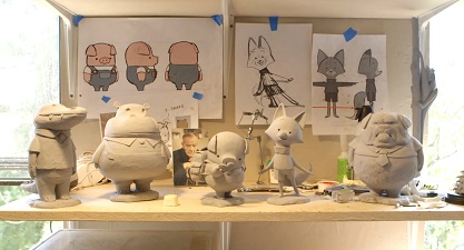
The choice to include a pig and fox as our main characters related to the personalities we created for them. The pig seemed a good candidate for being ‘dirty’ and it was easy to find ways for the town to pick on him, while maintaining a quiet strength. While the fox seemed an animal the audience could believe was witty and full of energy, and a contrast to the pig.
Initially, our early versions of the story were with human characters. We ended up switching to animal characters as our story theme got a little heavy. We thought these simple animal characters allowed us to keep the fable-like quality visually and to soften some of the tones we needed to convey in our story.
AV: Regarding the design of the city, can you tell me about that mix of medieval (the overall town) and modern, present-day elements (like the school)?
RK & DT: The story of The Little Dutch Boy is a story we reread as we were developing our film. It helped us discover the responsibility of our Pig, to save the town everyday by maintaining the dam. When developing our world, we wanted to create an environment that could coexist alongside stories from our own childhood, specifically European fables like The Little Dutch Boy. The set-up of our world dictated the town be nestled in a high mountain valley, with a dam holding back dark clouds at one end. We looked at towns set high in the Alps as inspiration for the look of the town. More specific set pieces, such as the school, we built based on our own nostalgic memories of school blended with the town’s aesthetics. For us it was most important to create an authenticity for the experience of our characters attending the school and to create that believability using our memories supported by period and place for the architecture. We hoped to be non-specific about where our story takes place in time.
AV: Regarding the color script, how did you use color to express the different moments of your story?
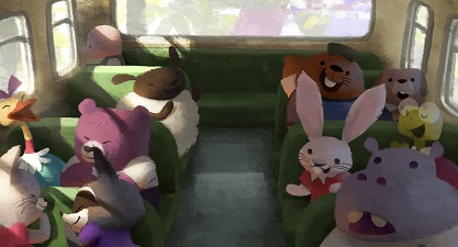
RK & DT: We were very conscious of the polluted fog, the “darkness,” in The Dam Keeper. It was a symbol for our Pig’s internal, emotional darkness. The light is used to convey Pig’s emotional state throughout the film. Every decision in creating the color script was in service to this idea, from the dam holding back the darkness to the ray of light breaking through the darkness in the end.
AV: How did you come to choose pastels to express your story?
 RK & DT: The specific look of The Dam Keeper was really a result of digital paintings we were creating for film work we had been doing for the last decade. The two of us worked together in the art departments at Pixar on both Toy Story 3 and Monsters University. During that experience we influenced each other’s work, and many people within the department sometimes had difficulty deciphering whose work was whose. When we decided to make our film, it seemed a unique opportunity that we were two artists capable of a singular look that we should take advantage of.
There are no actual pastels in the film. We created a brush in Adobe Photoshop we shared with our team of painters to replicate the look of real media. Each frame was painted digitally and comped together in After Effects.
AV: There’s a kind of limited animation in Dam Keeper. Can you tell me about that artistic choice?
RK & DT: Our supervising animator Erick Oh did a fantastic job conveying the subtle emotions of these simply designed characters through very limited animation (average 8 frames/sec) we enforced in this film. Because we had to paint every frame in this film, we asked our animators to use as few frames as possible without sacrificing the performance. In the end, we actually loved the style of limited animation, which worked well with the painterly style. We were so impressed with Erick and his team, to be able to convey the subtlety even with so few frames.
AV: The character design and the animation being very simple and pure, without dialogue— would you explain how you managed to make your characters so expressive and emotional?
RK & DT: Chris Sasaki (character designer) and Andrea Blasich (character sculptor) did a tremendous job creating simple and appealing characters. Erick Oh and his animators added so much to the emotional expression of these characters, really embracing the limitations a simple design could present. We feel they maximized the tools available to convey emotion. The pig is such a restrained character, whose emotions are “dammed up”, that so much is in the timing of subtle actions and moments where he is moving very little or not at all.
AV: Speaking of expressivity, can you tell me about your approach of the score?
RK & DT: Zach Johnston and Matteo Roberts made the score for the film. We have heard it enough to hate it, but we don’t hate it at all. As a matter of fact, we still listen to it while we work, we love it so much! They happen to belong to a popular indie band, coincidentally titled Phox (really, a total coincidence).
When it comes to music, we both have our opinions and sensibilities, but come much more from the visual world of storytelling. We were lucky to find Zach and Matteo, who were incredible collaborators who spoke the language of filmmaking. Since our characters had no dialogue, music became the voices of our characters. They understood this completely, and we are so grateful to have them as the voices of our characters!
Be sure to watch the Making-of featurette for The Dam Keeper here
to order now from Amazon.com
![]()
Very special thanks to Robert Kondo, Dice Tsutsumi and Fumi Kitahara. Artwork: all rights reserved