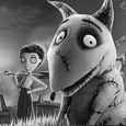
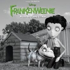
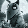
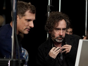
 When Tim Burton originally conceived the idea for Frankenweenie, he envisioned it as a full-length, stop-motion animated film. Due to budget constraints, he instead directed it as a live-action short, released in 1984.
Now, the creative genius comes back to the subject, with a different technique, but with the same visual approach, as this brand-new, stop-motion version of Frankenweenie is filmed in black and white and rendered in 3D, which elevates the classic style to a whole new experience.
To help him render the unique ambiance of Frankenweenie, Burton sought out cinematographer Peter Sorg, with whom he had already worked on Corpse Bride.
Peter Sorg was introduced to photography and black and white darkroom techniques at a very early age by his father. After completing his “Abitur” in Germany in 1991 he went traveling and settled in Bristol, UK the following year. There he enrolled in the Photography foundation course at Filton College.
Whilst studying he was also working evenings at an arts cinema which meant watching a lot of movies. Some of them over and over again. This experience, although not well paid, was an invaluable visual training. He quickly found film to be an ideal combination for his interests in music and photography.
In need of a job after college he found work as a runner in a production company where he became particularly interested in the challenges and inspirations of committing visual stories to film. After absolving a few years as a clapper loader, camera assistant and motion control operator he got his first break in 1998 as a lighting cameraman on a chocolate commercial. Luckily lots more followed and soon after he joined Aardman Animations to shoot a few commercials and a live-action short film.
After this long episode in Bristol he moved to London in 2003 and carried on shooting commercials, short films and promos, some of them award winners. A year after his relocation to London he was also invited to join Tim Burton’s Corpse Bride as a lighting cameraman. This successful collaboration prompted DoP Pete Kozachik ASC (James And The Giant Peach, Nightmare Before Christmas) to invite him to Portland, Oregon to be involved in shooting the Henry Selick directed stop motion feature Coraline again as a lighting cameraman. Spending 18 months shooting in 3D was an enormous undertaking in all areas and his biggest challenge so far.
Now, Peter Sorg shares with us his newest animated adventure, again on a Tim Burton production.
Animated Views: How do you approach a whole, brand-new film in black and white like Frankenweenie nowadays ?
Peter Sorg: At my first meeting with Tim Burton, he explained to me that the lighting and atmosphere really should express and enhance the emotions within the movie. My palette was going to be black and white and all shades of grey in between.
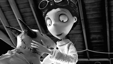
Very early on in production I shot a 30 second test with Trey Thomas, the animation director animating Victor and Sparky in the attic. I also shot tests of different interiors and exteriors to establish and find a look for different locations and times of day. Tim was very happy with the results, so these lighting, set and puppet tests served as a reference of how we wanted the movie to look and feel.
AV: What was your crew like?
PS: Due to the size of the production and tight schedule I had six camera crews, including myself, working on different scenes of the movie simultaneously. Each crew is headed by a lighting camera person, namely Malcolm Hadley, Graham Pettit, Simon Jacobs and two camera assistants who where later promoted to lighting camera, Drew Fortier and Christophe Leignel. Each team has a gaffer/spark and camera assistant/motion control operator. The lighting camera person is dedicated to one or more specific sequences with 4 to 5 animators. The challenge shooting this way is to keep coherence but also allow each scene to have its own distinct character to help tell the story and keep the visuals interesting.
AV: Where was the animation produced?
PS: Frankenweenie was shot at Three Mills Studios in East London in a big warehouse over three stages divided into 36 shooting units. It is situated in an old industrial estate next to the Olympic Park. Corpse Bride and Fantastic Mr. Fox were shot at the same location so it has a bit of a stop motion history. The units are draped with huge black curtains and become a temporary home to the animators and stage crew.
AV: How was the process like?
PS: Sequences are usually prepped and broken down into shots with the help of storyboards before they hit the stages ready for shooting. All the heads of the different departments came together and discussed the approach on a shot by shot basis. As new sets came from the work shop into the shooting stages Trey Thomas, the animation director, Rick Heinrichs and myself would get together to discuss everyone’s shooting needs as well as textures, animation, set and lighting questions would be discussed and worked out, before meeting and presenting something to Tim Burton.
After that I would allocate a given sequence to a lighting camera person. Most of the time it was possible for a lighting camera person to stay with a sequence and with one or more animators shooting for the duration of that sequence. It really helps to have coherence and it makes it flow better. The animation director would brief the animator before blocking a shot and discuss lighting and camera with myself and the lighting camera person present after the block is finished. Another brief usually follows and then may be go on to do a rehearsal and/or after that shoot for real.This collaboration is very extensive and involved until a sequence is well running and shooting for a while and everyone is on the same page.
Tim Burton would then look at rehearsals and finished shots and give his notes accordingly. Having had some time and reviews with Tim at the beginning of production and after light and camera testing a bunch of different set pieces, he seemed to trust us enough to let us run with it. He watched the rushes every morning and if needed would leave comments and/or request changes. These notes were mainly always really positive. We had quite a lot of Tim’s time during production on Frankenweenie which was really helpful and meant that there was no time wasted during photography with re-shoots.
AV: In avoiding color, your approach to shape, light and shadows is different. Can you tell me about that aspect?
PS: With black and white you are only using light, shadows, textures and depth of field as well as lens choice as your tools to create separation, depth and mood. In a way it’s a more pure way of lighting. You only concentrate on your contrast and lighting direction and modelling. The way you handle the fill light becomes also more important.
The black and white helps to enhance textures and therefore creates more of a connection between the viewer and the sets and puppets. You can almost touch them. This is what Tim Burton had envisioned, adding to the emotional content of the story by shooting in black and white, making it more tactile.
AV: However, some elements of the sets were kept colored.
PS: Some set elements were kept in color out of practical reasons, for example it’s hard to find artificial grass (astro turf) in any other color than green. Some materials with certain textures only came in a particular color and it was unnecessary and impractical to change it. We also shot a color chard for the art department with our LUT (Looking-Up Table) applied to it, so they could see each color in its particular shade of grey once converted into black and white. The puppets however were all painted in black and white. I also shot a few tests at the beginning of production of different foliage and flowers painted in color to find out the best possible combination to work with our black and white LUT.
AV: How did you use photography as a storytelling tool?
PS: The photography in Frankenweenie is crucial in underlining and expressing what’s going on within the story line and it also has to express and shape the character of a sequence. In the beginning of the movie when Victor’s dog Sparky is still alive the lighting is brighter and there’s more detail in the shadows. It’s generally a happier sunnier place.
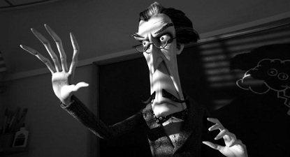
In the classroom sequence however with the science teacher Rzykruski in front of the children the shadows are more pronounced and deeper, the blinds are drawn which gives it a more mysterious and slightly eerie look. Shadow lines crossing over everything. However, later on in the movie as the gym teacher takes over the science class because Ryzkruski got fired after his misunderstood speech, the whole room is flooded with more bland looking soft light to make the scene feel more drab and “colorless” to underline the change from engaging and exciting science class to normal boring routine classroom drill.
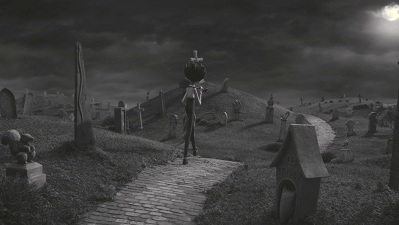
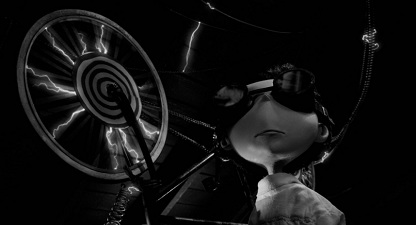
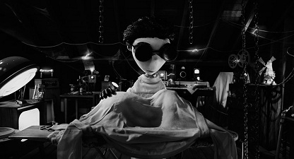
Another example would be Victor in his attic as he stitches his dog back together. I used a lot of under light to make him appear more possessed, like a mad professor, trying to bring his dead dog back to life. Lighting cameraman Graham Pettit’s various graveyard sequences within the movie are also a nice example of different lighting scenarios to help tell the story, starting from an overcast look with soft shadows but deep blacks as the Frankenstein’s bury Sparky. When Sparky returns to his grave the lighting becomes darker and more mysterious with only a little detail showing in the shadows and then changes to a more dramatic monster style lighting as the kids dig up their dead pets to try and bring them back to life.
Another scenario is one of lighting cameraman Malcolm Hadley’s sequences as Victor lies in bed grieving. The room around him is very dark, it makes Victor seem isolated and there is rain running down the window, in the style of In Cold Blood projected onto Victor, giving the impression that he and the whole bed is covered in tears. The list could go on. Generally each sequence comes to its own from a lighting and camera point of view and the tools like creeping camera moves, dutch angles, minimal shadow detail, monster light, hard directional light, lightning strikes and electrical flicker are all there to help giving the movie more of an emotional impact.
AV: In Frankenweenie, black and white is an homage. How did you pay tribute to classic horror films?
PS: I spend a lot of time researching and watching old and new black and white movies like Frankenstein and Dracula but also film noir and German expressionism like Faust and The Cabinet of Dr. Caligari. There are some very amazing images to be found in these old silent films and they were very inspiring to me. But also more recent films such as The Man Who Wasn’t There as well as one of my Tim Burton favorites, Ed Wood.
I also researched a lot of black and white stills photography to look at the way they handled contrast, like Bill Brandt, Edward Weston, Walker Evans, Alfred Stieglitz to name a few. Whilst there are visual elements in Frankenweenie and references to old monster movies like monster up light, dutch camera angles, vignetting etc, we were striving to give the movie its own visual identity based on Tim Burton’s 1984 version.
AV: Yes, how else did you hark back to the original 1984 featurette, like with specific shots that were supposed to remind us of that film, or even the kind of lighting?
PS: Some of the shots are set up similarly to the 1984 version, like the classroom has these streaks of lights through blinds, Sparky’s funeral on top of the hill in the pet cemetery and the car park scene at the end etc. The live action version was definitely a guide but using stop motion as Tim Burton had originally envisioned, gives you so much more control over different elements, especially the dog. You can really push it and give it more magic and make it more fantastical.
AV: What was the most challenging scene for you?
PS: One of the longest and most challenging scenes was the reanimation sequence, when Victor brings his dead dog Sparky back to life. It all takes place in his attic which is a relatively big set yet claustrophobic with very few openings which makes it very challenging to hide and place lights. There is a thunder storm going on outside as well as electric sparks jumping and moving all around him. I had to find a way to show this play of electricity and lightning within the room. It’s effects should spill over and flicker all around the attic. To sell this idea my gaffer Toby Farrar ran lots of little MR11 lights through DMX and programmed a flicker pattern for each shot that had electrical sparks.
Countless lights were placed outside of frame and hidden behind props to highlight different areas to give an interactive flicker. The actual sparks were put in later by the VFX department. Once the lightning and electricity stops the sequence changes to a different tone and things become more delicate and sensitive as Victor discovers Sparky has not immediately woken up and come back to life after his reanimation efforts. This sequence was one of the first we started shooting and it was still running after nine months into production.
AV: Frankenweenie is presented in 3D. Did that perception of depth change things in your approach to photography and your treatment of lighting?
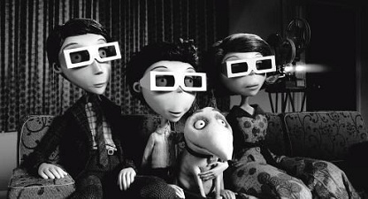
PS: The 3D aspect was always in our mind when setting up shots as it was going to be rendered and converted into 3D afterwards. This meant choosing certain camera angles and lenses to help give shots a more rounded feel and more volume in 3D. I also find it helps 3D to simplify the image through lighting and dressing to make it easier to focus on what’s important in a shot. However, storytelling and the pace of the movie was always more important than serving the 3D aspect.
AV: Finally, how was it going back to the black and white techniques that your father introduced you to?
PS: It was really liberating and rewarding being able to work on a black and white monster movie, not having to worry about color instead just concentrating on light and shadows and how to shape your sets and subjects to give it depth and volume. It’s very much about what’s suggested in the shadows and what you don’t show. It gives the movie a stronger more emotional feel. It is extremely rare to be asked to collaborate on a project like this where you are allowed and encouraged to let things fall into darkness and be a bit more moody and spooky with your lighting. I really have to thank Tim Burton for that.
Another important aspect of course is your crew and each one’s personality and how they are able to adapt to ever changing challenges especially at a very short notice. It is so important to get that mix of people right otherwise it can be a real struggle and I’m happy to say we got that right on Frankenweenie.
Our thanks to Peter Sorg for his time and kindness!


