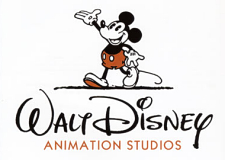
It seems Disney’s advertisement announcing a name change for their Feature Animation department at this year’s Annecy Festival, as reported by the Cartoon Brew page, is now doing the rounds and gaining all sorts of praise.
Is this “new” logo that new, though? The animated version ran on the front of Disney’s big hope Meet The Robinsons over two months ago, and I made some disparaging notes on that somewhere around our Animated News & Views Forum which argued the intro was too cute, mirrored the Pixar Luxo Lamp too much (why is it always about the “firsts”?) and above all, too quaint. Now we have some new comments in the Forum that endorse the name switch to Walt Disney Animation Studios and agree that the logo looks just swell.

Frankly, I don’t like it. The scribble itself looks too much like some off-model approximation of the traditional Walt signature, but done with a black marker effect that looks rushed, lazy in spots and messy in others. Points of irritation: the weak right swish on the W (which looks worse than my own childhood attempts), the flat and somewhat sad looking big D (once a proud emblem), and the splodge of ink at the end of the Y (for “Yuk”).
And going with “Animation Studios” doesn’t have the distinction that “Walt Disney Feature Animation” brought to things. It only cheapens the name and places it even more into the Pixar (Animation Studios) shadow. If they needed a logo, why not dream up something based around the more stately WDFA moniker?
The only happy spot is the use of Mickey Mouse – the same image as adorned the Walt Disney Productions sign in the 1930s – but even this looks like it’s been reprinted out of an old, two-strip color comic book as opposed to looking as solid and vibrant as it did back then. What happened to the bright yellow boots? And what’s he walking in…mud? That about says it all.
Ho-hum. Pixar rules. Yay.
– Ben.

