DisneyToon Studios/Walt Disney Home Entertainment (November 9 2004), single disc, 68 mins plus supplements, 1.78:1 anamorphic widescreen, Dolby Digital and DTS 5.1 Surround, Rated G, Retail: $29.99
Storyboard:
In this review from November 2004, we look back on Mickey’s first foray as a digital character into an animated CGI seasonal offering that’s possibly more “uncanny valley” than The Polar Express…
The Sweatbox Review:
And so the last taboo of Disney Animation has been broken. Recently we’ve said goodbye to animated musicals, and even the traditionally drawn 2D feature itself, replaced with “high-tech toons” rendered in the “lifelike” computer animation process. Now, with Mickey’s Twice Upon A Christmas, the last remaining bastion of old-school Walt – Mickey himself and the gang – has fallen prey to the new house style. From early sneak peeks, things didn’t look good, and the term “Mickeybots” quickly made the web. In the “flesh” things unfortunately don’t turn out much better!
Split, as with the original made-for-TV Mickey’s Once Upon A Christmas, into five sections, the new film starts off with Belles on Ice, a story about Minnie and Daisy’s rivalry on the ice-skating rink. What immediately strikes is the plasticky look of our usually beloved characters. They don’t look like the Mickey and Minnie we know, being more like Disney Store shop window displays come to life, complete with shiny eyes (and since when was Mickey made of vinyl?) and ears that no longer remain rounded from any angle, instead going for the failed perspective look of the late 1940s and 1950s shorts. Better has come with the debut of the Mickey Mouse Clubhouse series in recent years, but this is a less than auspicious start to Mickey and co’s digital career.
The story itself isn’t much either: Minnie and Daisy skate to outdo each other before agreeing that they work better when working as a team. Aaaahhh… The animation, especially given its ice-ballet theme, reminded me of the Barbie video feature visuals, though on a much grander scale. Oddly enough, it was the background characters – references to Fantasia – that works best, with the rest of the sequence trying to make up for the lack of emotion or real personality in the two leads. The music is over the top – and not in a self-mocking, knowing way – and camera moves (as with a lot of low budget CGI work) were either very flat or moving all the time. By the time we’d gotten to the final “Peace On Earth” shot (which also seemed a rather randomly throw in), I felt I’d witnessed an empty, soulless approximation of a bad Disney short. Anyway, moving on…
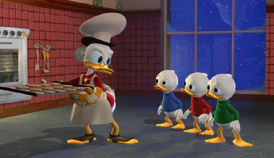
Next up is Scrooge’s story, Christmas: Impossible. Displaying much more directorial imaginativeness, this sequence is consequently much more fun, centering on Huey, Dewey And Louie’s transformation from selfish cookie chompers to yuletide do-gooders. Animation is more fluid, and the characters are a lot more on model than Mickey and Minnie, though those plastic eyes remain and the ducks don’t look so much made of feathers than they do of rubber. The early promise of the sequence is hampered by the lower budget again: Santa’s Workshop never has the grandness or depth really required (though the overly-bombastic music again strives to fill in the gaps), and is glimpsed at in the disc’s supplements. Pretty good is Santa, who comes off much better here as a CG character than in the Steve Oedekerk Imax special Santa Vs The Snowmen. Walk cycles seem to be a problem however, whenever anyone isn’t running, but this segment is probably the disc’s highpoint, if it could be said to have one.
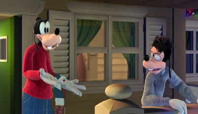
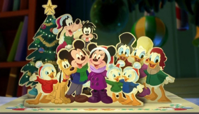
Christmas Maximus has Goofy’s son Max, now all grown up, bringing his girlfriend Mona home for Christmas (begging the question that things with Roxanne just didn’t work out, then?). The new, older Max with his “what the?” hairstyle, takes time to get used to, especially in CG, but it’s hearing Bill Farmer’s warm Goofy tones coming from a character who here has scary, staring eyes behind which there is no life, that is most hard to take. Furthermore, The Goof’s face looks as if it has been pulled forward somehow and resembles more those Goofy hats that are sold at the Disney theme parks (as sported by Genie in the last scene in Aladdin) rather than Art Babbit’s classic creation. The story – the shortest here – also has little to recommend it, and the lack of being on character model is only accentuated by the 2D drawings that are used in the interstitial “pop-up book” sections.
Next up is Donald’s Gift. Of all the character transitions from 2D to 3D, perhaps the Ducks work best and Donald especially comes over well enough. A new, heavier set brow helps his expressions survive the change, something that most of the other characters lack completely. As with the Goofy episode, the story could be described as minimal at best – Donald finds Christmas – and I’d be surprised if the We Wish You A Merry Christmas song doesn’t drive you as mad as it does Donald. Finally, Mickey’s Dog-Gone Christmas does exactly what it says on the tin: Pluto disappears for the holidays. It’s okay however, since Mickey’s pup has wound up at the North Pole as Santa’s reindeer’s pet and is soon on his way home.
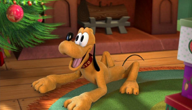
Once again, though, I can see where the Mickeybot criticism can be levelled. The CG animators seem to fail to realise that Mickey’s whole body is usually used to convey his thoughts and feelings in the traditional shorts, but here it’s just the front of his abnormally large head that has to carry the character. There’s no squash and stretch in the animation, leading to a very staid and static approach. Indeed, Mickey isn’t even made up of his usual three body circles here, with a lean, human-like body standing in instead, looking quite odd. It looks as if the modellers have countered this by elongating Mickey’s head upwards a little further, pushing the character even more off model – and what’s with those oversized hands? In a way, Mickey takes on the persona of a middle-aged man rather than the sprightly young-at-heart fellow we love. Much better is Pluto, who – although looking a little more rounded and youthful than usual – actually does resemble his original self more than anyone else in the whole film.
The real problems with Mickey’s Twice Upon A Christmas aren’t just the off-kilter appearance and animation, however, but also the totally lacklustre storylines, all overly simplistic and not long enough to warrant any real engagement of the audience’s emotions. It would have been better to interlink all the story threads as one inter-connecting story, allowing for longer set ups, deeper mid-sections and bigger pay offs, but alas such is the pitfalls of breaking up these programs between differing animation companies. Going back to the animation – and I will dwell on this since it’s a big step to take with such an iconic set of characters – and I can’t say I’m impressed. These are knock-off, carbon copy remnants of Walt Disney’s cherished creations, and come across just as such (I’m surprised that an artist of Andreas Deja’s calibre agreed to even have his name on this).
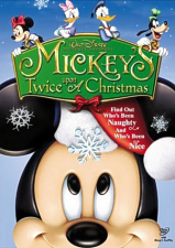
There’s nothing inherently wrong with a CGI Mouse: the theme parks’ Mickey’s Philharmagic showed that an exceptional computer rendering of the company mascot can be achieved and the more recent Clubhouse proves the characters can appear more rounded and in keeping with their traditional selves, especially pleasing to younger eyes. The big question is, why didn’t they go for those kinds of models here? The Philharmagic and Clubhouse Mickeys certainly bear closer hallmarks than the oddly stiff rodent prancing about this time around. As mentioned above, Donald and Pluto probably come out of the whole thing best, though one only has to compare the lifeless 3D with the 2D linking segment art to see that, while the faces are there, the souls are gone and there’s precious little magic left. Interesting too that Disney can’t quite get away from the legacy – both the end credits and the title’s cover box art feature hand-drawn versions of the characters – why oh why couldn’t the rest of the film go this way as well?

A very odd excursion for Mickey and company, the much better release in Mickey’s 75th year was The Three Musketeers, which will come as no surprise as being a traditionally animated feature in the grand style. In this instance, Twice Upon A Christmas seems very un-animated to me, and a clearer indication than any that Disney had lost its roots at the time of original release and needed a firm new direction. Pass on this, and have a merrier Christmas.
Is This Thing Loaded?
For such a “landmark” title, one would have thought that Disney would have pushed the boat out and given this vehicle a shot in the arm with decent supplements, akin to the treatment that Lion King 1½ received. No such luck here, and the disc feels amazingly light on anything substantial, much like the film itself.
The menus are as fake as the film, being synthesized samples of music, and I can only at least praise Disney for using a real orchestra in the main feature over going with more of this. Pushing the “Lights” option will alternate a pattern of Christmas light displays around Goofy’s house in the menu, which is a nice idea. The disc comes with Disney’s now standard FastPlay and EasyFind menus, with Fast Play leading to a selection of Sneak Peeks for Bambi, Pooh’s Heffalump Movie and Mulan II. After the feature, and via their own menu selection, there are additional previews for Eloise At Christmastime, Mary Poppins and the Aladdin sequels.
All Things Deleted are a group of featurettes with the principal production team explaining what went and was replaced during production. Rather than see any scenes themselves, we get a fast-paced montage of quick storyboard snapshots, a lot of talk, and only a few seconds of truly deleted animation. What IS most apparent was the much larger scale that was being attempted before the film switched to 3D production – check out the Elf-packed and expansive Santa’s Workshop storyboard (for the film’s original traditional approach) against the smaller, almost empty “back-room” depicted in the finished film.
A Play All option runs the clips together as a twelve-minute piece – the closest the disc comes to any behind-the-scenes “making of” material – and there are some ideas in here that are clearly more in keeping with the classic Disney characters, and much better than wound up in the movie – just who was making the decisions over there anyway?! Inspirations On Ice has skater Michelle Kwan describing how she was the live-action reference for the Minnie and Daisy sequence. At just over three minutes, it does its job, but I’d have much preferred something on the production itself and its journey from concept to CGI.
A few Games And Activities round things out. Santa’s Workshop Challenge is a selection pastime that’s pretty basic and only rewards by adding your name to Santa’s List (though be aware that you’ll need a printer to print out the certificate, less one ends up with wailing children afraid they didn’t make the cut)! There’s also Santa’s Sort, which I found pointless and made little sense. Lastly, Guess What Donald Is Singing (with an unneeded question mark in the title) has the irascible duck warbling his merry heart out and the player challenged with making out the words (the tunes are a bit of a giveaway though). As with the recent selection of Mouse House titles, the Buena Vista gang seem to have returned to adding extra DVD-ROM content to their discs and apart from the usual Disney interface and option to register the disc, the activities conclude by way of some Mickey Christmas Printables, including multiple-design Christmas Cards and the Santa’s List certificate.
Case Study:
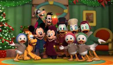
Housed in a non-fold-out but glossy embossed cardboard slip, I found it fun to notice that Minnie, Daisy, Donald and Goofy across the top of the cover were the old-school, classically hand drawn characters given a heavy airbrushed appearance. Talk about false advertising! Even Mickey doesn’t look tremendously CGI here. On the back, we get a couple of screen caps, which should warn you to the terror within. A chapter card and money-off coupons complete the package. Speaking of the differences between the “life” of the 2D vs 3D approach, check out the screen-capture of the final shot and see which one you prefer… An insert lists the five stories and bonus feature overview on the reverse side, with a booklet of 2004 savings and ads found in the original pressing.
Ink And Paint:
Overall, I found Mickey’s Twice Upon A Christmas to have a surprisingly soft image throughout. Everything’s been given a “Christmas glow”, and whereas the official line might well be that the producers of this title were trying to lend it “atmosphere”, it seemed like a smoke and mirrors way of hiding some of the animation and characters’ rougher edges. Presented in 1.78:1 anamorphic video, there are no obvious compression artefacts (mainly down to the fact that the “feature” lasts little more than an hour – and less if you don’t count the long credit scroll), but – animation medium choice aside – this isn’t the best Mickey and Co have looked and certainly not worth the full $30 list price.
Scratch Tracks:
In an attempt to fill the soundtrack with the Christmas spirit the film simply doesn’t have, Stephen James Taylor’s score is one on overdrive. Despite being fully orchestrated, it actually ends up being too in your face, and Taylor is certainly no Stalling – or Broughton – for that matter. As such, the score and dialogue are rendered as they should be, though without the highs and lows a proper feature would have given in dynamics. The track is mainly front-placed, with surprisingly rare directional effects coming from the rear apart from the heavy-handed music. The DTS track doesn’t add much either, sounding very much like the same track, with no added directional effects enhancement. French and Spanish dubs have also been included.
Final Cut:
While some people might have taken the view that I am dead against a CGI Mickey, I can only say that it is not the case. The Philharmagic show at the theme parks is a doozey, the younger-skewed Clubhouse proved to work with the characters well and be engaging, while even the Mickey we saw presenting the Academy Award for Best Animation with Jennifer Garner those few short years ago didn’t seem as bad as this. Off model, strangely lit, and devoid of all personality apart from the recognizable voices coming from these strangely familiar but not quite right shop mannequins, Mickey’s Twice Upon A Christmas plays as some kind of curious B-picture, made only with money – and certainly not Christmas spirit – in mind. If the company is truly bent on continuing with this line, could I suggest an equally terrifying follow up for Mickey’s gang? How about “Mouse Of Wax”, anyone?
 | ||
 |


