
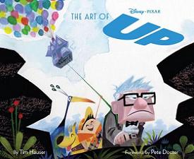
The Art of Up
By Tim Hauser
Foreward by Pete Docter
Chronicle Books
May 27, 2009
Hardcover, 160 Pages
$40.00
“Simplexity” – have you ever heard of such a thing?
It could be some kind of a technocratic concept or – perhaps more likely – some new, magical word invented by the Sherman Brothers in the same vein as “Fortuosity” and “Supercalifragilisticexpialidocious”… In fact, it’s not so far from that: this nelogism was invented by the creators of Up (most notably designer Ricky Nierva) to characterize the visual style of the movie.
After multiple and impressive efforts to get closer to reality, like in the fantastic and lush visuals in Ratatouille and WALL-E, Up goes back to the roots of animation that is more about believability and caricature than realism, always at the service of story and emotion; the signature of one vision. “It’s not that this was a simple story by any means. It dealt with a lot of complex real-life feelings. But Pete [Docter] wanted to express the essence – take away all the noise to leave you with just the heartfelt issues”, says designer Daniel Lopez Munoz.
Hence that visual “simplexity” which the film is about, as production designer Ricky Nierva notes: “That is the art of simplifying an image down to its essence. But the complexity that you layer on top of it – in texture, design, or detail – is masked by how simple the form is”. That is the reason why an art book has rarely been so accurate in presenting the very origins, the very essence of the final product that can be seen on screen.
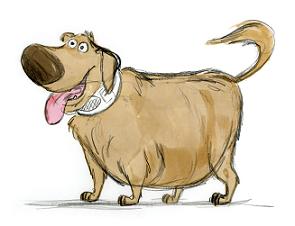
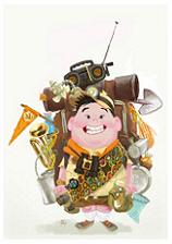
Simplexity can be seen through the design of the characters based on elementary shapes that immediately communicate the personality, while textures and “expressivity” added in the movie bring an elaborate complement to that simplicity. That spirit can thus be retrieved through the fine and touching concept arts by David Lopez Munoz, and is mostly the subject of Chapter One of the book.
Chapter Two considers the simplexity seen through Carl’s house, basically a cube, but filled with so many details in matter of architecture and decoration by Don Shank that it pretty much became a character of its own; a witness of Carl and Ellie’s married life, and even a kind of an avatar of Ellie.

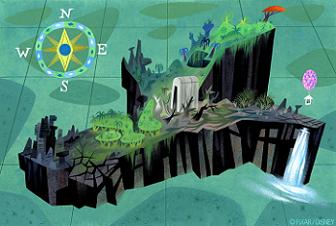
Simplexity is also expressed through the wild, South American environment Carl and Russel soon discover, made of plain, modern-art-like shapes. But it took the crew a whole expedition to get the feeling of the Tepui and enrich it to make it a believable kind of a lost world where time has stopped. Indeed, dozens of photos were taken there by Pete Docter and friends to help them capture and bring back home the right feeling, and Chapter Three explores this aspect of the film.

Finally, simplexicity is in the constant references of the crew to the great animation artists of the past, like Jim Henson, to whom simple is always the best way to go – but demands the most work. That (supposed) simpleness is a powerful vehicle of the greatest things and greatest ideas and at the same time a most valuable cultural device, echoing the work of such artists like Mary Blair (who was of tremendous influence on Lou Romano’s art) in terms of visuals, and Joe Grant in terms of story. And the book is pervaded with such references, be it through the excellent text by Tim Hauser or the smart choice of the artwork.
“If I have seen further it is only by standing on the shoulders of giants”, once wrote Isaac Newton. That couldn’t be more true with Up, which stands as another significant step forward for Pixar, but at the same time provides a moving homage to those who made animation history.
And that’s also what this book is about…
is available to buy now
from Amazon.com
![]()
With special thanks to April Whitney.