
 What makes Yzma so unforgettable? What makes that you immediately connect with a character like Pacha? The answer can be, at first thought, good story and good animation. But when you think about it, the first contact you have with an animated character is obviously its design.
Character design is an art in itself. On it depend the appeal and the unforgettable nature of a character – so, an essential part of the success of a movie. A delicate art, indeed, that aims at building a convincing bridge between believability and caricature (which is what animation is all about), realism and fantasy. A daring task that is to translate a story and a personality into physical shapes while making the result interesting.
That’s what makes the choice of a character designer critical when you build your crew. But with Joe Moshier, there’s no chance of having made the wrong choice: he perfectly knows how to draw a convincing yet daring design.
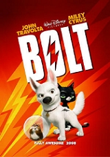
An expertise he improved on each in of his contributions to the House of Mouse, from The Hunchback of Notre Dame to The Emperor’s New Groove, Home of the Range, Chicken Little, Meet the Robinsons, and currently the Studio’s new animated feature Bolt, in theaters now.
We had the pleasure to meet such a rare and kind artist and talk with him about his one-of-a-kind artistic journey.
 Animated Views: How did you become a Disney artist?
Joe Moshier: I’m from San Diego, originally. I guess I became interested in drawing pretty early, in seventh or eighth grade. I thought I’d be like a comic strip artist. I didn’t really think about animation, career-wise or as an option. Interestingly enough, I went to school called Bell Junior High and a friend of mine – his name is Ricky Nierva – and I used to join each other for the math drills we had in the morning! Now, he’s a pretty amazing designer at Pixar and it is quite interesting that he went Pixar and that I ended up going to Disney eventually! In High School, I furthered my studies in Art and a friend of mine mentioned Cal Arts. By the time I was in High School, I wanted to work in animation. I actually thought I’d be working at Don Bluth’s. Disney wasn’t as important at the time as I think Don Bluth’s studio was. So, my goal was to work there. But that friend of mine told me about Cal Arts. He said it’s Disney’s art school. I said: “What?!!” So, I researched it. I didn’t immediately go there.
I graduated in 1990 from High School and for about a year and a half, I worked in a studio in San Diego called American Film Technology. They primarily were a film colorization company, you know, when you take old black and white films and colorize them. But they had an animation division and I ended up becoming an animator on Attack of the Killer Tomatoes, a Saturday morning cartoon. After that ended, they laid most people off. They kept a few and I was lucky one of the few. We animated on an animated short. It was a spooky horror-type of story written by famous Playboy cartoonist Gahan Wilson called Dinah. Then I went to Cal Arts from 1992 to ’94. After the second year, I felt ready to try to go out and see if I can get a job.
I applied to Chuck Jones internship. I worked at Chuck Jones’ studio for about four months, right after Cal Arts. Chuck Jones wasn’t around as much as you would think. He was there maybe once a week or once every two weeks. Maurice Noble was there and I got to meet him. He’s an amazing person! It was really good for me to have someone like him! I feel bad about it but I think that I committed to them to stay there as an animator for about a year and the next day Disney called me and asked me to take a test to be a rough inbetweener. They offered me the job, that was in September ’94, and so, I kind of broke my promise to Chuck Jones’ studio. I feel bad about that, but I think my ultimate goal was to work at Disney. And I’ve been at Disney ever since!
AV: How did you go from rough inbetweener to character designer?
JM: I guess, my ultimate goal, going to Disney, wasn’t to be a character designer at all. I wanted to be a supervising animator one day. At school, and even at Chuck Jones’, I put pretty a lot of emphasis on character design. I just always wanted to try to push myself and learn how to draw my characters better and better. I just always assumed that animators design their own characters. So, I thought that was a skill that every animator had and that I had to sharpen. I guess I was wrong!
When I arrived at Disney as a rough inbetweener, I literally had a Kathy Zielinski Frollo scene in my hands before I even had a desk! It was crazy! I guess I was a rough inbetweener at Disney for maybe two weeks or so. At the time, Tony Fucile and James Baxter were designing all the characters. They were kind of running out of time doing that because there’s a lot more characters to design and they had to animated their own characters. They were gonna have John Ripa do some rough designs of some of the background characters but he was gonna go to Pocahontas and animated with Glen [Keane]. So, I guess they remembered my portfolio. Also, I had been just looking at the model sheets and kind of drawing my own expressions of some of characters they had already designed and later, they told me that they were snooping around my desk when I was gone and they saw a bunch of my own model sheet-type of expressions and poses. Funny story!
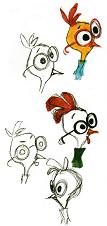
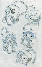
So, the next day, they offered me chance to design… a pigeon! They called me into Tony’s room. James was there and they were like: “hey! How do you feel like designing a character?” I said: “What?!!” Tony and James asking me to design a character? Of course! “yeah, you want to design this pigeon?” “Yes, what’s the personality?” “He just kind of likes flying!” I was so excited. I went to the park and drew pigeons and stuff. I think I did 50 poses of a pigeon on this tiny model sheets the first time. I was kind of overdoing it, just because I got excited! So, it started out with a pigeon, really! Then, on Hunchback, I spent about a year or so designing a lot of the background characters, gypsies, children and stuff…
AV: Then you went on The Emperor’s New Groove. At what stage of the production did you come on?
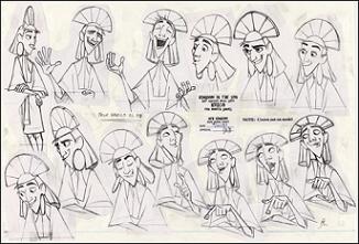
JM: I was actually there pretty much from the beginning, on Kingdom in the Sun. At that point, Roger Allers was the director, and there was pretty large crew of artists, including character designers. I remember Buck Lewis had done a pass on a character I was involved in, a couple of people they brought from Disney TV Animation. Gosh, it just seemed to be like any time we showed work it was like ten or fifteen people in the room showing stuff. That was hectic time! Roger was trying to decide where to go with the characters. Then, by the time we got to Emperor’s New Groove, Mark Dindal, who was brought on as a director, had become familiar with my work and he decided that he wanted me to be the main character designer for his original story. I created 35-page style guides for Emperor’s New Groove and Kingdom in the Sun that told how to draw the characters and keep their consistency.
AV: How different were the new designs from the original ones?
JM: I would say that Kingdom in the Sun had a more traditional look because the tone of the story was a little more serious. It was about the impending doom of the universe, darkness was gonna come and take over this mythical character that would gonna block out the sun and people were gonna die. So, it had this sort of massive, Armageddon-like storyline. Visually, Roger wanted something more believable for that storyline. Then, Mark Dindal came in and he had this wacky new idea. He’s a big fan of Warner Brothers shorts and he knew that I was a big fan of Milt Kahl and Ward Kimball. So, when he asked me to do it, he said: ” just go for it”. He was exciting about changing the look.
AV: Are you used to working in collaboration with the supervising animators of the characters you’re creating?
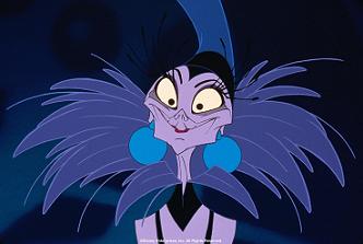
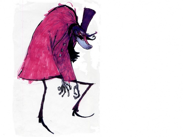
JM: Yes, and I worked pretty closely on that film especially with the animators. Once we got a rough design established, they would hand off the designs to the supervising animators and they would work on the characters, the main poses and expressions. Once in a while, they would throw a character back to me to make some changes. On top of it, Mark was really conscious about having all the characters look like they were drawn from the same hand, basically, like they belong to the same universe. So, I got to work with Dale Baer on Yzma. He did such an amazing job. Bruce Smith, Pacha’s supervisor, also, really locked on to the style early on.
AV: Didn’t you take part in the sequel of that movie, Kronk’s New Groove?
JM: Yes, as a favor. Mark Dindal asked me to develop that film. So, I did some new designs for Yzma, Kronk and Kuzco. That was fun because, stylistically, I think I was still developing my sensibility and pushing myself. So, I pushed the characters more than I had for the film, and that was fun! The advantage of already being familiar with the characters, you know!
AV: You also designed the characters of the latest Disney hand-drawn animated film to date, that is Home on the Range. Can you explain this very unusual, angular design, especially for the cows?
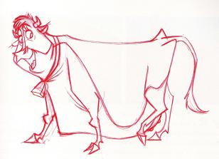
JM: The two directors, at the time when I first started, were Mike Gabriel and Mike Giamo. They really liked the animation of the 50s and early 60s. Their art director was Dave Cutler and he really pushed me to pull from that influence. There is a lot of references to the old Disney films in that movie. It’s almost like an homage-type of situation for us designers. We wanted to sort of celebrate what they were doing in the 50s and 60s. In terms of the cow, I remember a sketch of the three cows: really simple, but the basic shapes really laid out the foundation for the design. It was done by Chris Ure, story artist, who is also a great designer. They were basically boxes and rectangles. That became a big springboard to starting building a believable design for the cows. But there was a lot of corners and edges that, I think, if I were to draw it today, I’d have a little more balance. So, when I look at that, I feel like I’ve learned a lot since that.
 AV: Then you got into the realm of CG animation with Chicken Little. Is the process different in matters of character designing when working in CG?
JM: Yes. Chicken Little was definitely a learning experience, a different type of film. There was certainly a lot of tension in the building. I didn’t feel as involved with everything because I had my little room, my little corner and just did my things. I didn’t see the technical folks that much.
CG didn’t have any effect on my in designing the characters. But once we established the designs and started the building on that, I realized how different the process really was. As an animator and a designer, you want every drawing of the character to be expressive, with interesting gestures, lines of action and posing. Once you’ve finalized your designs, you have to do the ortho-drawings on which the character is completely dead.
It was very difficult for me to understand why, after struggling so long to put life in this character, they wanted to kill it immediately. It was so difficult to really see the specific personality your going for on the model sheets in that pose: arms just spread out, legs just spread out, eyes wide open.
Then, it wouldn’t be for maybe four or five months after the model was built that you’d start seeing poses, and at that point, you would see things that you’d want changed design-wise, and it’s too late. It’s kind of a frustrating learning experience, to be honest.
AV: Maquettes are instrumental to the creation of the characters. Can you tell me about your working relationship with sculptor Raffaello Vecchione, with whom you’ve been collaborating for several years?
JM: Absolutely. He and I first met on Emperor’s New Groove. He’s absolutely amazing. He did sculpts of every main character on Emperor’s New Groove and they’re amazing! I have an Yzma sculpture. I look at it everyday and I’m still blown away by it. He used to be an animator. So, it’s rare that you find a modeler or a sculptor that has the same influences and get excited about the same things as me as a designer and an animator. He thinks like a designer and an animator and his work is very complementary to mine. When he translates my designs in 3D, I really believe he plusses the design. He did that on Emperor’s New Groove and on Home on the Range.
So, on Chicken Little, he already knew my work and knew how to translate my ideas. So, we felt that Raffaelo was an intricate part of getting the characters up on the screen, in 3D. We wanted to use him to problem-solve the designs, basically, before we’re committed to building it into the computer. So, he came in and did sculpts of all the main characters and busts of some of the secondary characters as well. And as we brought the sculpts to the scan and that helped them build the models quicker, using the information from the scan as a virtual orthographic.
AV: Meet the Robinsons was based on William Joyce’s book. How did you deal with that heritage?
JM: Visually, I think that Steve Anderson, the director, thought that, as interesting as they were, the characters from the book were not designed for animation. For example, the eyes really are the soul of the characters, and in the book, the eyes were too small. You want them to be expressive, unless you need small eyes for a specific kind of character. So, you have to be careful if you’re translating one of his designs in 3D. So, Steve asked me to caricature what William Joyce was doing with some of the characters. Which was fun, because usually I start with a white canvas. I just have storyboards from the storyboard artists, and ideas. So, it was kind of fun taking what William Joyce had already done and doing my spin on what he already established in matter of characters.
AV: What about Bowler Hat Guy?
JM: As far as the Bowler Hat Guy, he’s not a character that was in the book. So, we got a lot more creative license with this guy. Originally, his name was Morpheus Pink. For me, there was so much importance on Bowler Hat’s eyes. And the cape offers a nice balance and contrasts with the skinny legs. He’s a very fun character.
 AV: How can the design of a character evolve during the process?
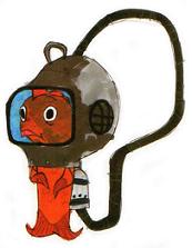
JM: For example, Fish Out-of-the-Water. He’s a character that Mark Dindal always saw very clearly and I extended it, I played around. He wanted him to have a diver bell helmet. But I wanted him to have a goldfish bowl. He was a shy, introverted character, first. So, he had potential to hide in the fish bowl and we started to go into that direction before his personality changed. But that was definitely an idea that had the potential to influence the character.
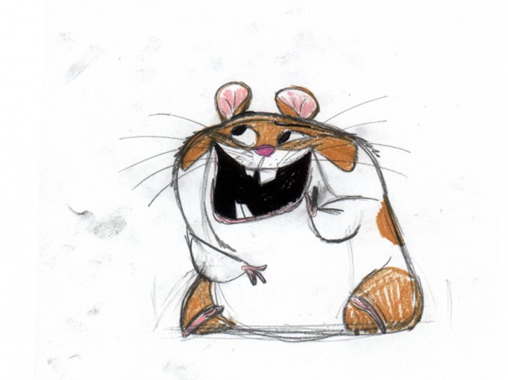
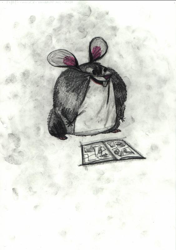
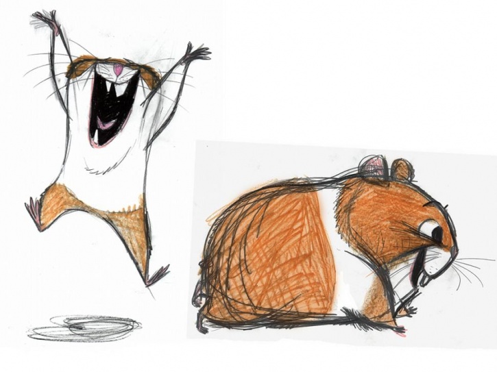
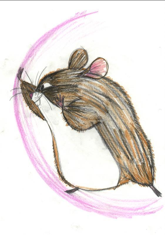
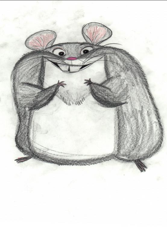
On Bolt, Rhino wasn’t always this big potato-shaped character. It was my idea to make him that round and large simply because, when I was researching hamsters, I found that they like to pack their food, store it in the back of the mouth. They push it out there in their cheeks and they’re so cute that way. So, I had the idea to caricature that and make him have this feeling continuously. And Chris [Williams, the director] really responded well to that idea. It’s so funny to have that round, furry thing in this ball. It seemed more comical than the typical, basically shaped hamster. As I was designing Rhino, I guess I just sort of remembered back, as a kid, going to Disneyland and seeing Baloo. Remembering that feeling of what it was like to really meet this character in person, I wanted kids to have similar memories when meeting Rhino at the park: this big, furry, hopefully lovable and hugable, appealing character. I don’t want kids to turn around and run away. I want them to want to approach him and maybe give him a hug!
I got to work with Clay Katis, the supervising animator of Rhino. It was a joy to work with one of my best friends that closely. He’s an amazingly talented animator. For me, when I think about working on Bolt, I can’t forget about working with him establishing Rhino, on his shapes. He’s my next door neighbor. So, I saw him everyday working on the design. He had quite a big influence on me on that film.
AV: Speaking of Bolt, at what stage of the production did you come on board?
JM: I was actually brought on on the second phase. I had been working on Joe Jump and Meet the Robinsons. At that time, Chen-Yi Chang was already working on the film. He had done a lot of background characters for American Dog. He and I teamed for the first time ever, which was pretty interesting.
AV: You mentioned Joe Jump. Can you tell me about that?
JM: It was a project by Sam Levine, who was a story artist. I worked on that for about a year. Unfortunately, it was shut down by John Lasseter.

AV: With Bolt, how did you create a new Disney dog?
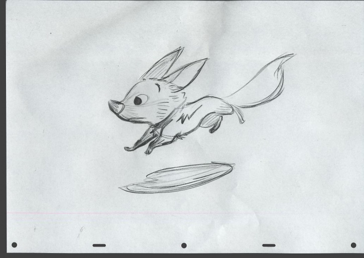
JM: Early, early on, Chris Williams said he wanted Bolt to be a white American shepherd. He didn’t want him to be Pongo with different ears. So, Chen-Yi and I were given that assignment to design Bolt. Originally, he was an adult American shepherd. The storyline was very similar. He was still a TV hero dog, but, the way we were designing it, he was an adult dog. Proportionally, he looked stronger, with a stronger chest, much longer legs. He just looked like he would be successful and accomplish any goal he wanted to achieve. Storywise, his physicality didn’t lend itself to much pathos and doubt. He was really like this guy would succeed no matter what. So, we decided to make Bolt look slightly more adolescent. That’s why he’s short, now, for a white American shepherd. He looks like his task would be a little more challenging at his size.
In terms of creating a new design for a dog, one of the things that I was really drawn is really long and pointy ears. That felt like a good anchor to pull the design of off. Then, it was nice to get the animators on board early because they had some influence and knew exactly what to do with the eyes, expression-wise. They were playing with the model early on. So, we found poses and expressions that were appealing early on. We did have to wait too long and there was a continuity between design and animation this time.
AV: How did you find the right balance between realism and caricature?
JM: We certainly didn’t want to do a realistic dog. For me, I like caricatured shapes. I like a lot of contrast. I don’t want to loose the believability factor but I also don’t want a character to look like he’s coming from the reality into the movie screen. Every character has to have a sense of whimsy. With Bolt, we had issues that, in the beginning, we were loosing believability because, originally, his design had much longer ears and his paws were smaller. It was something that I liked but it wasn’t believable, and people were consciously asking why his ears were so long and why his paws were so small. So, that was sort of a design compromise. We actually brought a white American shepherd to the studio and myself and the animators were drawing it. I guess we used the basic shapes and contours of the body, head and tail, but I definitely caricatured the proportions of all the other things.
AV: How did your design of Bolt fit within the painterly environment created by art director Paul Felix?
JM: I didn’t have a whole lot of collaboration with him when I was designing the characters. But once the designs were established, Paul would do paintings of the characters in an attempt to sort of marry the look of the backgrounds and the characters. He was the bridge for the characters and the backgrounds. In the backgrounds, there wasn’t a lot of pushed shapes and whimsical asymmetry going on. It had more of a realistic believability as for the shapes. I just established, hopefully, appealing and interesting proportions and shapes and it was up to Paul Felix to try to marry the look of the characters, and that using textures. So, it has more to do with the technical side.
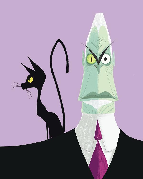
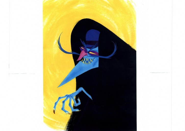
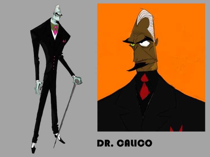
AV: You also designed Dr. Calico. How did you approach such a villain?
JM: He was a very fun character to work on. From the beginning Chris Williams wanted to the character to be somewhat of a classic James Bond type of villain. Physically he wanted Dr. Calico to be tall and slender but with wide shoulders. He has one normal eye and the other is a cat eye. To help echo the cat theme I did several designs in which his hair emulated cat ears in the silhouette but the design seemed to be getting too self conscious at that point. He’s also got cat-like canine teeth. I’m not sure if it’s noticeable in the film though.
My approach to villain design is the same as my approach with any character. I need to identify shapes and physical traits that will help support and reflect the personality of the character.
AV: Did you work on the other main characters?
JM: Actually, early on, I was given Bolt and Rhino to design and Chen-Yi was given Penny and Mittens. He had already really established designs for Penny and Mittens early on. By the time we started building the characters in 3D, Chen-Yi had decided he was gonna leave the company and pursue his own personal goals. So, that’s when I kind of took over as the lead character designer. I just took what he had done for Penny and used it as a springboard to give Chris was looking for. I really didn’t change what Chen-Yi did much at all.
AV: Another important part of the team was visual development artist Jin Kim. Can you tell me about him?
JM: He’s an amazing artist. He’s a former animator. He was taking my designs and he would explore the characters, putting them in different poses, experimenting the expression. He would do the orthos, or orthographic poses, for the modelers. We were on such a tight timeline that I really didn’t have to do orthos and too many poses for the characters because once we established a design, it was time to move on to another character. So Jin came in and he saved my life! He’s so fast and good. The modelers would use a lot of his information to help build the models. He was a huge help for me and the whole production!
AV: Your Waffle World Map, used in the movie, is irresistible. How did you work that?
JM: Aside from Rhino, that was my favorite assignment on this movie! That was a fun collaboration. Early on, Mac George had done a take on the entire map design. Chris William wanted this children’s map to have an old Little Golden Books feel. You know, Mary Blair had painted a few of them, and also Martin Provensen, who is one of my favorite artists. Chris knew that I was a big fan of that collection. So, I was given the assignment to do most of the character icons. Mac George did a lot of the background elements, like the buildings and things like that. From a design standpoint, it was like eating dessert at the end of a big meal, you know. There was a lot of whipped cream on this and I didn’t have to feel guilty!
AV: That design reminded me of your designs for Conduct Happiness!
JM: I guess that’s my shape language! It influences everything I do. Indeed, that design sensibility really looks like what myself and my partner Chris Sonnenburg had established in our own personal company.
AV: Can you tell me about that?
JM: Sure! Myself and three other partners, Chris Sonnenburg, his wife and my fiancee, Robyn, established Conduct Happiness about five years ago. It sort came out of a basic need and desire to control your own art and ideas. It’s just fun to come up with ideas and not have to run them through someone else’s decision-making machine.
AV: Why “Conduct Happiness”?
JM: I designed this conductor bear, dressed up like a train conductor. My idea was that this bear sort rides into different towns on his little train and brings happiness to the kids, just like Santa Claus. So, he “conducts happiness”. So, it came from an actual T-Shirt design. It was an homage to Ollie Johnson. In fact, we gave Ollie a little pin with that bear character and he wore it. So, that was really fun and really nice!
AV: Now that Bolt has finished, what are the other projects you’re working on?
JM: Presently, I’m moving on from Disney and I’m going to DreamWorks. But, for Disney, I’ve just finished working on Prep and Landing. It’s a Christmas short that will be coming up next year about Santa and elves. Prior to that, I did some work on Rapunzel. I got to work with Glen Keane, who was of huge, huge influence on me. I’m a huge fan. He’s been an inspiration to me since I was in high school. So, yes, I was very lucky to be able to work with Glen. That was really exciting. The story changed so much, but I worked on Rapunzel’s stepmother, Gothel, on this sort of evil thief character Griffol, on Rapunzel’s love interest Bastion and his dog, a basset hound, which was really fun do! But I don’t think the characters and designs will remain for the new version of the story. I think there will be a Mother Gothel character but I sincerely doubt that there will be a Griffol character in the new story.
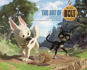
is available to buy now from Amazon.com
![]()
With all our appreciation for Joe’s talent and kindness.
Concept art by Joe Moshier. All rights reserved. Used by permission. ©Disney.