
 Don Shank is a versatile artist. He attended the animation program at the California Institute of the Arts. He went on to work at a variety of animation studios on many projects, including Ren & Stimpy, Dexter’s Lab and Samurai Jack. He has done design and art direction for feature and shorts animation, including The Incredibles, Up, Inside Out, Finding Dory and Bao. Don was also the Production Designer of the Pixar short film Day & Night as well as The Powerpuff Girls TV show for seasons 2 through 4. Don has earned an Annie and 2 Emmy awards for his work in animation. We approached him as the Production Designer on Pixar’s Elemental, now in theaters.
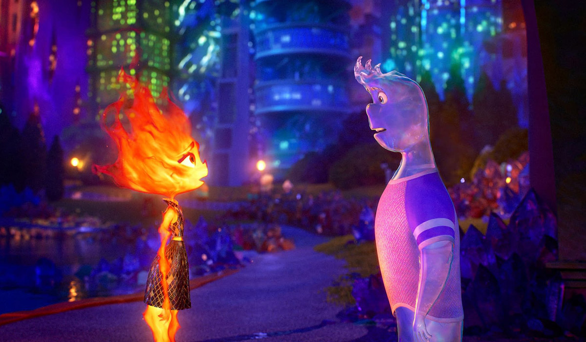
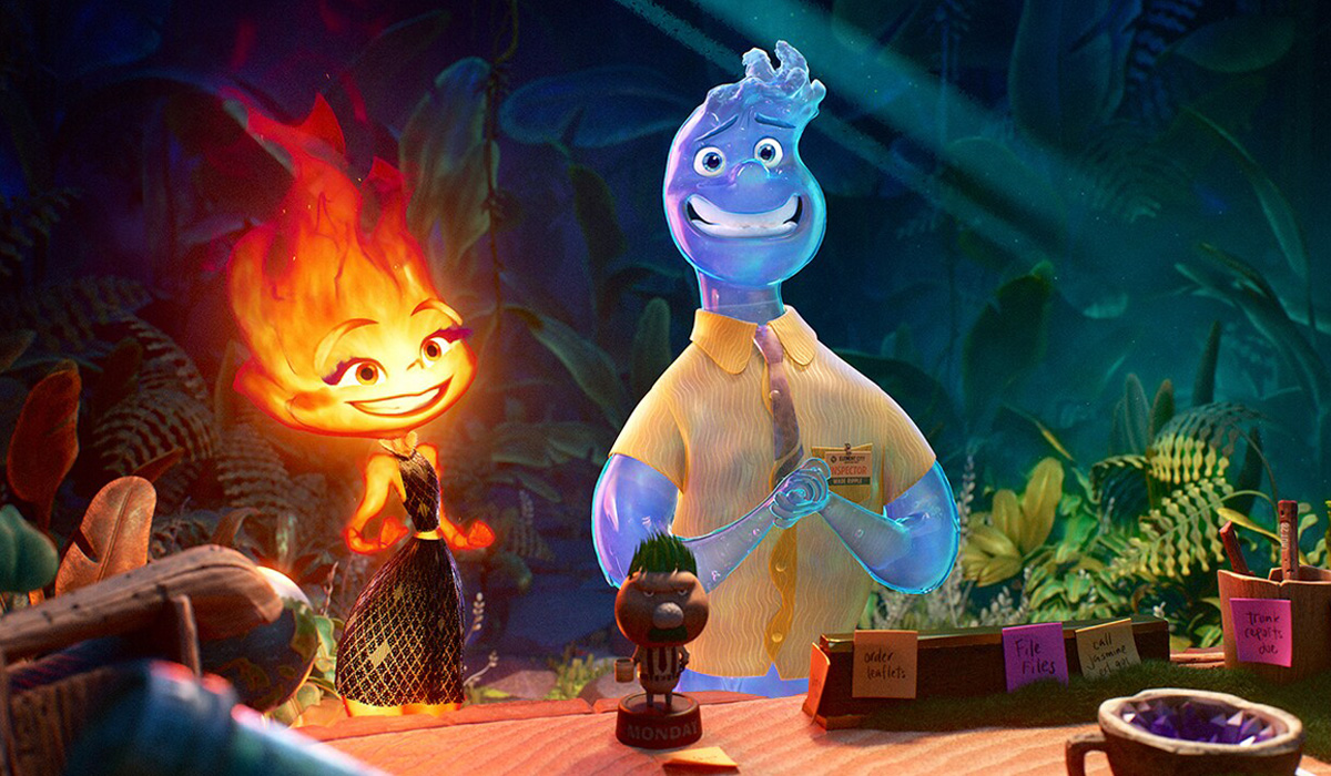
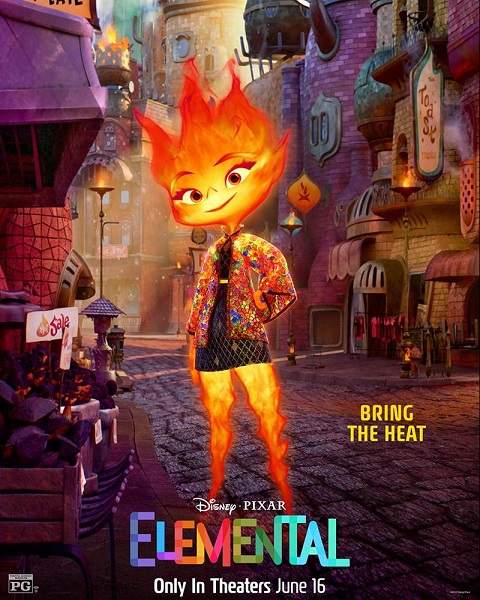
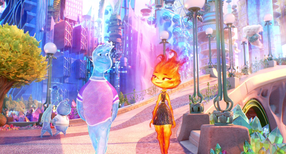
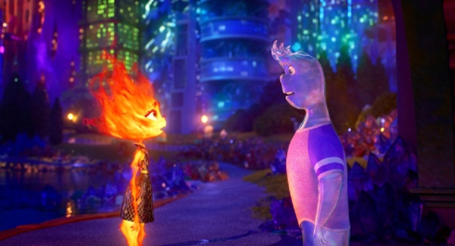
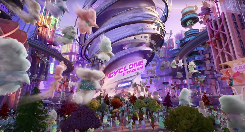
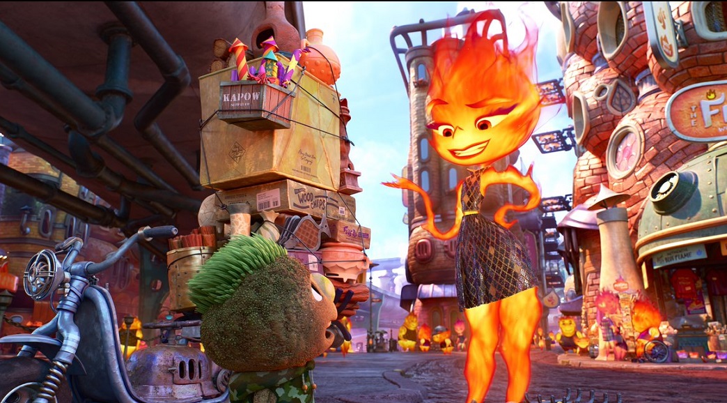
Set in Element City, where Fire-, Water-, Earth- and Air-residents live together, Elemental introduces Ember – a tough, quick-witted, and fiery young woman – whose friendship with a fun, sappy, go-with-the-flow guy named Wade challenges her beliefs about the world they live in.
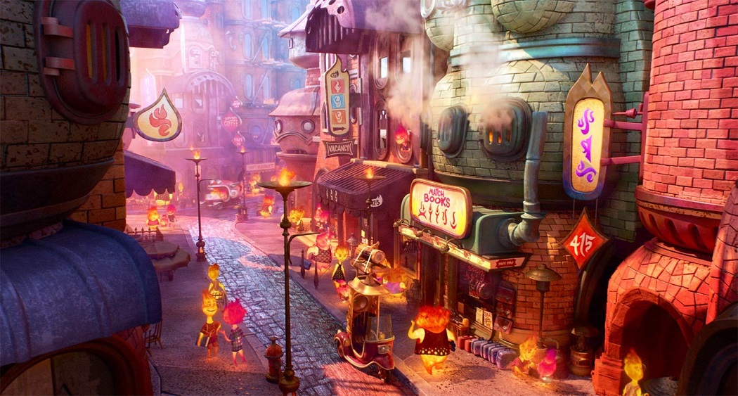
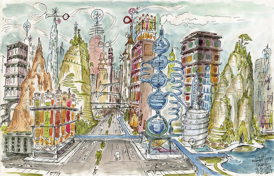
Don was tasked with extracting whatever was in director Peter Sohn’s imagination to create the world of this unlikely love story. Element City, like a lot of large cities, is made up of districts. Firetown, which was the last to be established, is home to Ember, her family and many Fire characters. The rest of the city has dedicated districts for Water, Air and Earth—though since those elements have been there for generations, the areas are more diversified. Since the city itself was founded by Water elements, a canal system serves as the central mode of transportation — aptly called the Wetro—though each element has introduced their own methods of moving about the city over the years. Contrary to a melting pot, the city is no homogenous world. The Pixar artists wanted to celebrate all these different cultures and characters living and working together instead.
Here’s how they did it…

Animated Views: How did you get acquainted with the daring concept of Elemental?
Don Shank: I ended up having almost like two beginnings on the movie. The first one was six years ago, when the director was just developing the movie – it was even before Luca. He brought me in just to do a few weeks of work to help himself and a couple of other people understand what some of the neighborhoods might look like. I’ve known Peter Sohn for 20 years, and we’re really good friends. Artistically, we’re really connected. I think we have the same sense of humor and thinking about how to transform the universe. So, there’s really an immediate connection between us, but that first assignment was almost easier because I didn’t feel the pressure of solving anything.
When you’re designing something, you’re really trying to hit a bullseye, to figure out what truth needs to be for an idea, and do something that perfectly supports the story. At the very beginning, you’re just having fun and it doesn’t matter if you’re wrong. And ironically, more often you’re right, because you’re not overly worrying about everything. You’re just tapping into feelings and ideas. Pete is such a great artist himself and a great designer. He had trouble getting help from the art department, so he had been working alone. When I walked into the room where he was gonna pitch me his ideas, I saw he had filled it with drawings. So, I just said ‘What do you need me for? You’ve done so much’. Frankly, he could have probably done everything himself. But he needed my help. It was a little bit daunting because when someone shows you something good, your brain immediately thinks of that new idea as, ‘That’s it! You just showed me what that is.” So, it was a little bit difficult for me to get into this and find the freedom to bring just something new.
So, that was the first time. And the second time, that was when I came on as the Production Designer. It took me a minute to get there because I knew what the movie was about and what we’re gonna try to solve, and I knew what the technical challenges ahead of us were gonna be. If you would have it hand-drawn, it would have been easier, you could get away with a lot more; but to do it in CG, I wasn’t sure, because the solution didn’t exist yet so you’re against the unknown. And then I had seen a screening of it, to present what was going to happen. This was an earlier version, but similar things were happening. First, I thought, whoever had to do that movie, I felt sorry for them because of everything they would have to try to achieve. But underneath it all, I knew it was a movie I felt connected with, and as far as the subject matter, this is everything I’m about. So, I just thought that was gonna be scary and super difficult with so many unknowns, but I would have to do it. I was afraid, but in a way that’s kind of what drove me into it as well.
I had enjoyed working on a bunch of movies at Pixar, and I was never really afraid they could achieve it because what we were trying to do was sort of within the wheelhouse. It was just a question of how do we push the richness or the look or the caricature even higher, what new ideas could we get in there. But for this movie, it was just, ‘Can we just make a fire or a water character in a way that they can do what we need them to do, and be as expressive as we need? Can we then stage cinematographic compositions that aren’t impossible? Can a fireperson be in the foreground?’ All these challenges.
And then it was also a question of trying to make everything fit together. We tried to put the characters we had on top of more traditional looking sets that weren’t caricatured, and it was shocking how bad it looked because they didn’t belong together. And that was scary, too! The less realistic you go, the easier things can be, but the director wanted his cake and eating it twice! He didn’t want to give up – he wanted all the richness of the old Pixar movies, but stylized. That demanded a lot of concepts in order to keep the richness of everything. In the end, you don’t feel the characters don’t belong. It’s a huge success because that was a lot of work to create this character that glows and doesn’t really cast shadows, and this water character who is also really noisy. They really fit the world. You’re not aware how unrealistic it is just to make it feel like they all belong together. It seems normal, because we’re giving all the bells and whistles of any typical Pixar movie.
AV: How did you envision Element City?
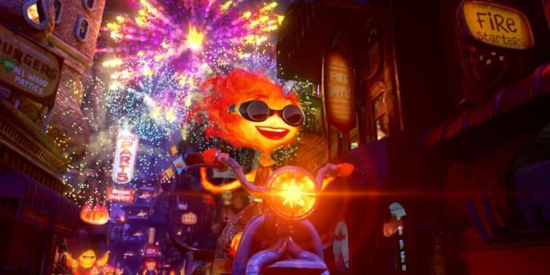
SH: We had a fairly middle-size art team so I didn’t have a lot of resources or people who could do the type of translation where you’re translating something into an Elemental version. And we didn’t want to do it like, say, Cars, where we took a singular object like a cone and turned it into a hotel. There were so many other subtle differences that we didn’t want to do, and we tried so many different things that felt too thematic like a theme park or a mall. So, it took us a while to build up certain philosophies to work with, but then resource-wise, Fire Town got most of our time because most of the film would take place there.
These are the type of things I just love. I grew up watching things like The Flintstones with, say, that vacuum cleaner for cave people. I’ve seen that little bit of wit and humor and sort of silliness. So, take, for example, Fern, who is in his office and is blown up by Ember. His desk looks like it was made out of a slab of wood, and then when I went to the phone, I was kind of channeling my Flintstones philosophy and made the handle like a branch of any piece of wood. The director loved that angle and that was something we’ve always wanted to add, but it wasn’t always as easy for every element. We do this on a Pixar movie where you have maybe an alien race or another culture, and you want every little detail to be harmonious and speak to its history and its culture. But we had to do that four times over on this movie. If you had a trash can, you had to do it for fire, water, earth, and air. If you’re working on water for instance, it’s not even as easy as fire for some reason because you don’t want to have just waterfalls for everything.
So, what else can we do that makes the water flow or shimmer or just thematic things related to water? In the end, air was the most difficult one for us because you have fans, you have some air filters but there wasn’t as many things to get inspired from as, say, fire, where you have cooking objects, heating objects, fire places and things that burn, so many things you can utilize and recombine. And also fire and water, you can put elements on, dress the buildings themselves with things that really help communicate on their own. But air is invisible essentially. So, you have to use objects and effects that show the flow. You show it through papers or flapping flags. This wasn’t just architectural elements.
And then, just to put the cherry on top, what we wanted to do from the beginning was, if you’re an immigrant coming, say, to New York back in the day, any kind of living accommodation works for any human. Human is human, no matter what your culture is. If you have a kitchen, a bedroom, and a bathroom, it works for any human. But early ideas for elements were, well, this fire apartment is funny but it would kill a water person or vice-versa. So, the sets art director created a bunch of drawings for apartments that looked like any element could live there, like a bit of a patchwork, and it seemed to relate to Pete, the director. So, all the elements were living next to each other.
However, in the story, there wasn’t really an opportunity for that kind of concept to be in the forefront. Because what was needed for the shot was, if we’re in Firetown, we have to say Firetown visually. Or in Water District. But in the city, we have everyone living together. So, you have to be able to tell an audience very quickly the elemental sort of idea, otherwise we would have generic buildings. So, we had to go back to, well, that building would be water and this building would be earth without feeling they’re all separate. We scrambled them all together. At nighttime, it became a little easier for us. We did it a little bit in the daytime, but in nighttime we could put different color lights in the buildings so that when you saw a building, you saw the rainbow, you saw the mix of colors because each element sort of has a color code to it. It was a little bit of working backwards, a bit of a concession that we had to communicate to the audience. We didn’t want to say that elements were separate; we wanted to say that Element City was a place where elements could live together. That was the very challenge of creating that place.
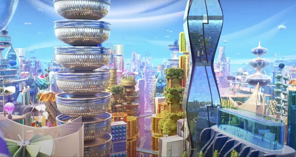
AV: Did you draw any inspiration from actual architects like, say, Gaudi?
SH: We had very few direct references like the Chrysler Building or San Francisco. Here, we had rather elemental references. But there were a few occasions and yes, Gaudi was one that we went to almost immediately because one thing that we learned early on was that, any time we did something that was a straight edge or a rectilinear, it felt human, like a boxy building with rectangular windows. So, we were looking for something that was not ‘normal human’, but also not alien. Gaudi, with these flowing forms, was an immediate connection. However, there was one more reason we went to Gaudi: there was an early inspiration that was paper sculpture. This was very early on and we were searching how the whole movie would look. We were very ‘out of the box’, ‘blue sky,’ and we loved this inspiration of paper sculptures because the focus was on the form and the way the light and shadow would work across it. And you could do interesting things with color. Ember is a light source, so that was particularly interesting. The more you added textures and other features and elements, the more it became realistic. So, we were looking at paper sculptures. And eventually, we found a balance where paper sculpture still was influential but there wasn’t a full part of it.
Gaudi had done a series of chimneys and stuff on rooftops of the buildings that had that kind of sandstone color and those really beautiful shapes and interlocking sort of forms, flowing kind of curvy surfaces with sharp crease edges that could sort of show the shift between light and shadow. Those bits of Gaudi, connected with paper sculpture, sort of felt like they were cousins, and we associated them in what we were trying to do. If you have the Art Of book, you can actually see the work of one of the artists of the sets team, Krista Goll, who early on was given the assignment to look at paper sculptures that had been collected and see what we could take from them in terms of a modeling philosophy. So, she did a bunch of buildings she designed, based on the inspirations and directions she got. I didn’t personally sit down with her and give her a lot of direction, it was just stuff we had around and she found this stuff on her own and did this whole series of buildings, and they’re just fantastic. That was kept with the modeling philosophy as it really brought something new in the shaping of our models.
AV: Such rich environments, so full of details and textures, and at the same time, the characters and the animation are still clear and easy to read. How did you achieve that?
SH: It was a lot of effort to bring the simplicity of being able to focus on what you’re supposed to see back into it because, as a designer and artist, you are aware that you need to have a focal point, you need to have a contrast with an area of detail and noise, and make sure you drive the attention of the viewer to what’s important to look at. This movie was a challenge because the director is a story person as well as a great artist and each building has to tell us an idea, it has to tell us it’s water, or humor, or a joke, or a gag. What you’re trying to do is to communicate the concept and that requires a certain amount of noise and information.
And then, three of our elements have a flow to it – you know, water flowing down, fire flowing up, and air flowing all around. So, you think about just one building and it’s gonna be very busy and at the same time, you have to populate the whole city. At some point, the director wanted the buildings to be generic buildings so that we’re not overwhelmed with noise everywhere, as there would be so much movement on top of that. But it was very difficult for us to be generic. We needed to communicate to the audience. It was just like having a stage where every actor is a mega-star and wants to get the attention. It was difficult to sort of pinpoint on where you’re supposed to look.
Ultimately, I gave in to the needs of making something feel elemental and just putting all the detail in there that was being asked for, hoping that we would resolve it other ways, which we did. So, a lot of our other looks development was: How do we reduce the noise and detail and information without making it seem foggy or smoky or blurry? So, we had some technology that we could dial in that would keep sharper edges on bigger shapes but remove certain finer details and we ultimately used that more for, like, depth, so that we can reduce information as you look down the street, for example.
But one of the other philosophies we had from the very earliest times, because the director wanted something stylized and graphic, but he also wanted every richness of shading or reflection or refraction – everything. So, I found this idea of blast radius or spotlight – this is where you’re gonna look and this is an area where we can put all our richness and detail and focus on it, and as we move away from that, we can mute contrast, mute detail, and information. We had some bolder ideas to address that, but in the end, we used a few technologies and ideas we had to reduce contrast and colors, so that where you were supposed to be looking would be clear and that the noise elsewhere could be reduced.
The lighting team was really the final spot where all those ideas were folded together. It was about getting these philosophies across to the director of photography (DP). Once he was onboard, he helped develop a lot of these ideas, too. So, he was really sort of the co-inventor of that stuff. It was really so important because, in the past, the art team could invent certain ideas, but later if you had a lighting DP who had a different philosophy on how things should be in order to look good; they would just do as they wanted. So, from the earliest times, that was important to be in sync with the lighting DP and be after the same look and feel.
You know, a lot of the lighting team at Pixar have always been tasked with a little bit more realism than the way we needed it on this movie. The way the rendering engine works is based on light physics. It looks bad if light is doing some things that aren’t physically motivated or justified. So, a lot of them have that way of thinking for a good reason. So, they came on this movie and they were, like, ‘What’s motivating this light shape?’ – and I was, like… ‘Nothing’. You know, I grew up watching Bugs Bunny cartoons that had all these funky shadows. So, it took them a minute but then they would get behind that idea. It was an amazing thing to see. Part of the look for the world was the shaping and the architecture and communicating an elemental style that felt like it belongs with the characters, but the other side was lighting and other effects and looks, techniques working all together. So, going into the lighting reveals was a magical time because you would just see how they would take all the elements and stitch them together to achieve this amazing and beautiful look in the end.
AV: Of course, Elemental is a love story. But not only. The film has so many messages to share, on difference, on immigrants, on family… What is your personal connection to the movie?
SH: Pretty much anything I do, I always try to find a personal connection. Early on, it was obvious that the main subject would be an immigrant story. My family weren’t immigrants, so I wasn’t directly connected to it, although I could emotionally sympathize with the characters.
But it was when I understood that one of the other themes of the movie was parents’ sacrifices for their children to allow them to have the type of life that is right for them, and that they want, that it really resonated for me. As a child, as soon as I could draw, I was connected to animation – Warner Bros, Disney, and all these things that just spoke to me so deeply. Animation and cartoons, that’s my life or bust. My father in particular was concerned that this was not a way you could make a living. But my family never discouraged me and always supported me. My father actually built me an animation desk like the one presented in Preston Blair’s book on animation. So, the film is kind of a ‘thank you’ to parents, which I feel connected to most strongly. My father passed away in the making of this movie so he didn’t really get a chance to see it, but that was where there was a lot of emotional meaning for me in making this movie, and I hope that comes through.
The Art of Elemental is available to order from Amazon.com!

With our thanks to Don Shank and Chris Wiggum at Pixar.