
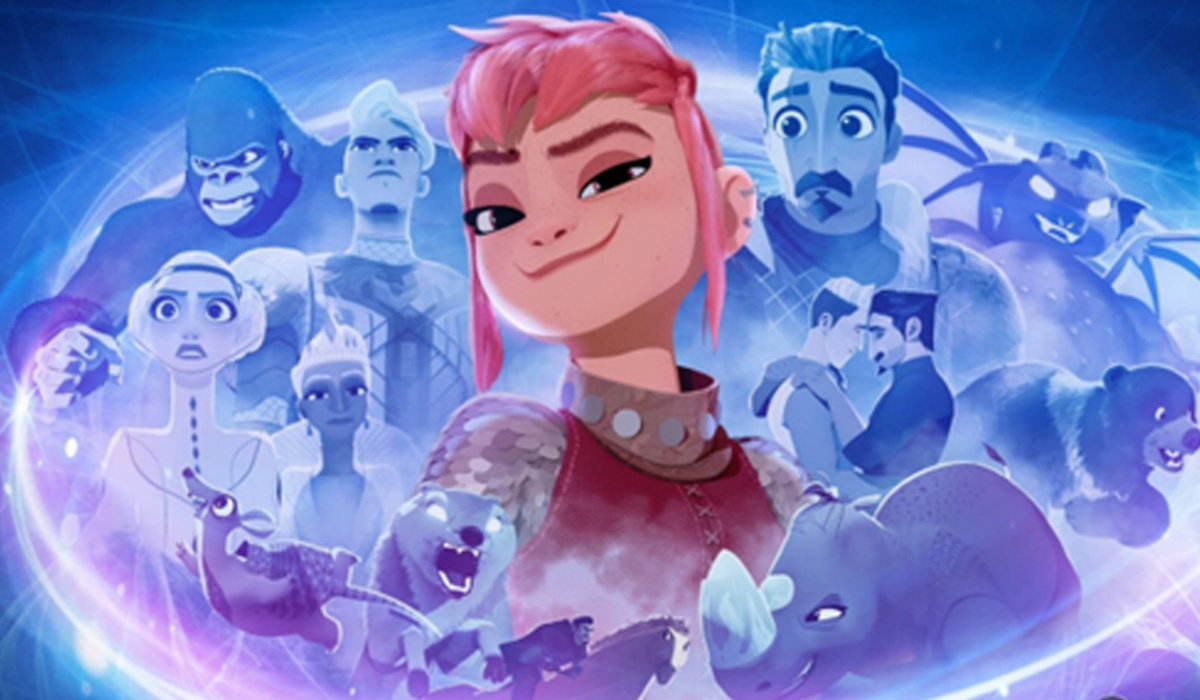
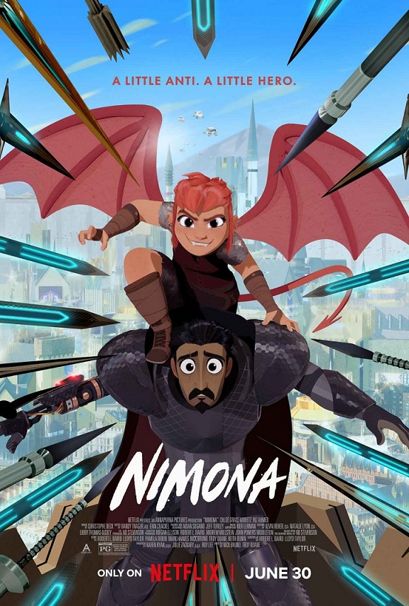
 When Ballister Boldheart, a knight in a futuristic medieval world, is framed for a crime he didn’t commit, the only one who can help him prove his innocence is Nimona, a mischievous teen with a taste for mayhem — who also happens to be a shapeshifting creature Ballister has been trained to destroy. But with the entire kingdom out to get him, Nimona’s the best (or technically the only) sidekick Ballister can hope for. And as the lines between heroes, villains, and monsters start to blur, the two of them set out to wreak serious havoc — for Ballister to clear his name once and for all, and for Nimona to… just wreak serious havoc.
Directed by Nick Bruno and Troy Quane, Nimona is an epic tale about finding friendship in the most surprising situations and accepting yourself and others for who they are, based on the National Book Award-nominated and New York Times best-selling graphic novel by ND Stevenson.
We were fortunate to be invited by Netflix to a special presentation of the film with its creators, among whom was Production Designer Aidan Sugano, who already worked with the Nimona directors on Spies In Disguise (2019). He kindly explained to us how every visual choice was done in service of the story and the way it explodes archetypal norms.

Presentation interviewer: How did Nimona start for you?
Aidan Sugano: For us, the first step was really to dive into that amazing graphic novel and find its spirit. That spirit for us spoke most through its theme. Every visual choice on this movie has been done to reinforce that theme. It’s about perception and acceptance and expectation. And we specifically chose a look that allowed us to play with the conventions of 2D fantasy animation in order to hold up a mirror to that medieval thinking that exists in our world so that we could shatter it and destroy it and remake it into something that was completely and utterly itself.
PI: Absolutely. Nevertheless, did you have any specific references in the matter of art direction?
AS: Our visuals are all about juxtaposition and contrast. It’s classic princess fairy tale versus futuristic dystopia. It’s truth versus expectation, light versus dark. And first, in order to find these conventions, we needed to look for the artists that defined the golden age of hand-drawn fantasy animation. And two artists emerged. It was Eyvind Earle who gave us Sleeping Beauty; and Charley Harper, who was behind a lot of the kinda classic Golden Book illustration look that defined that era.
PI: You managed a very successful synthesis of 2D and 3D.
AS: We took their tenets from that 2D world, and had to then translate them into this big, cinematic 3D universe – one that obviously had to perform and emote. And the biggest expression of these, and reflection of our theme, was how we handled and maintained the simplicity. Because for our theme, we really wanted to avoid designing caricatures. We wanted a clear expression of the kind of core spirit of every single thing in the film.
So, we stripped away anything that was unnecessary. Curves became simple. Straight lines became straighter. And all the planes were designed with lighting in mind to make sure that even when they moved and emoted, they would be appealing and maintain that kind of visual simplicity. It drove our approach to distance. In order to maintain that visual metaphor, we really wanted to make sure that the closer you got to something, the more that you saw and you understood of that thing.
And the reverse of that is, as you moved away, it became the icon of the thing, and the expectation of what that thing is. We also organized our materials with a purposeful hierarchy so that the details disappeared or unified to maintain this very simple look and replaced the geometric detail that we’re taking out. For example, it made us think how we could do something like design a very specific wood pattern with the fewest possible elements. Or how you could simplify metal and glass. So, it felt like itself, but didn’t get overly complex. It drove our approach to lighting. We simplified all of our lights down to their most fundamental expression. And then we really wanted to make sure that we could bring back the kind of nuance and complexity using things like light leak and bokeh and lens flares and all those classic camera effects to add that depth back into the scene.
PI: How did you apply that philosophy to character design?
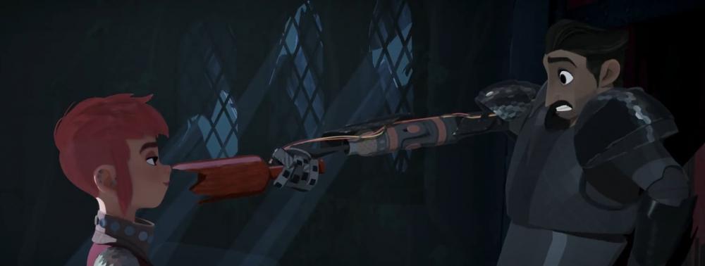
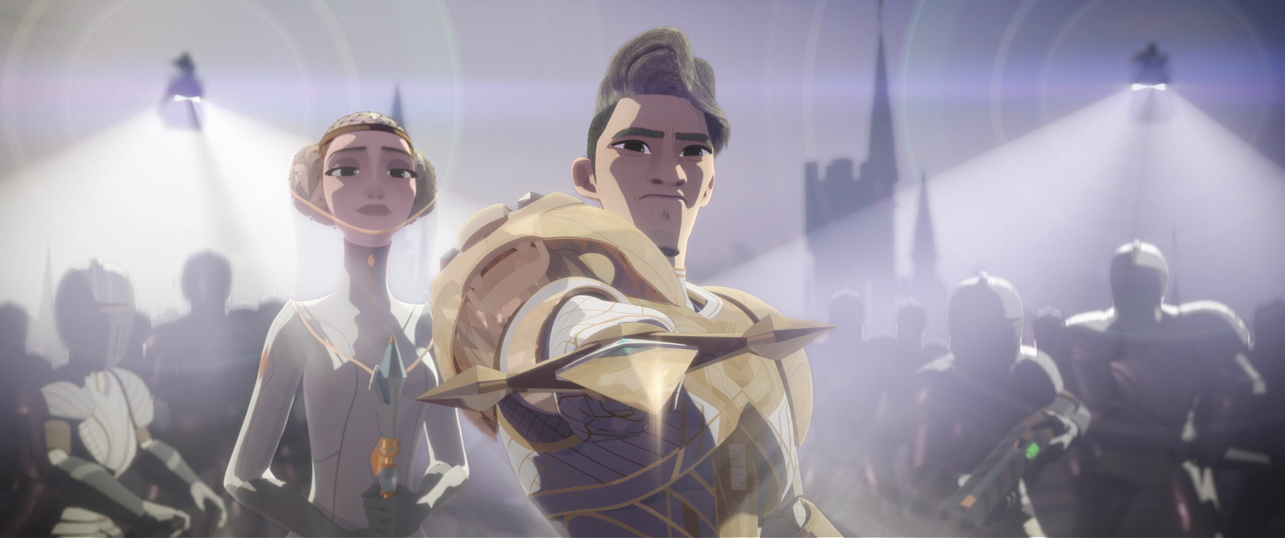
AS: We wanted to retain as much from ND’s amazing graphic novel as we possibly could, you know, as fans, and then filter it through the lens of our style. So, we played off the perceptions of the kinda classic hero and villain tropes, and then constructed a very simple shape language out of it. So, Ballister became the shield. His language is super-solid and grounded. He’s, you know, he’s very stalwart and no-nonsense in his character. And so we wanted to go after a very rectangular and kind of firmly anchored to a square grid as much as possible. Because through his journey with Nimona, you know, her influence then visually changes his, and so we wanted to reflect that in his design.
Nimona is the flame. She’s freedom. She’s all about change and spontaneity and focusing on those kind of free, chaotic shapes, and a huge emphasis in movement and rhythm. She embraces the kind of charmingly imperfect, and we wanted to really make sure that that movement was there through all of her forms. Because her shapeshifts are actually designed to kind of go after the specific emotional release of each expression.
Goldenloin, on the other hand, is the sword. He’s supposed to be the classic hero, that white knight, the golden savior, the one that has the privilege and expectation of an entire kingdom on his shoulders. And so his language is very structured. And we want this, and very much convey the fact, that he’s a triangle balanced on that precarious point between strength and power.
Meanwhile, the director is the arch. And her language is all about verticality. It’s architectural. It’s rigid. And for her specifically, we wanted to go after a very clean and contemporary execution of the iconic medieval ability. Because she is supposed to be this benign representation of the Institute’s ideals.
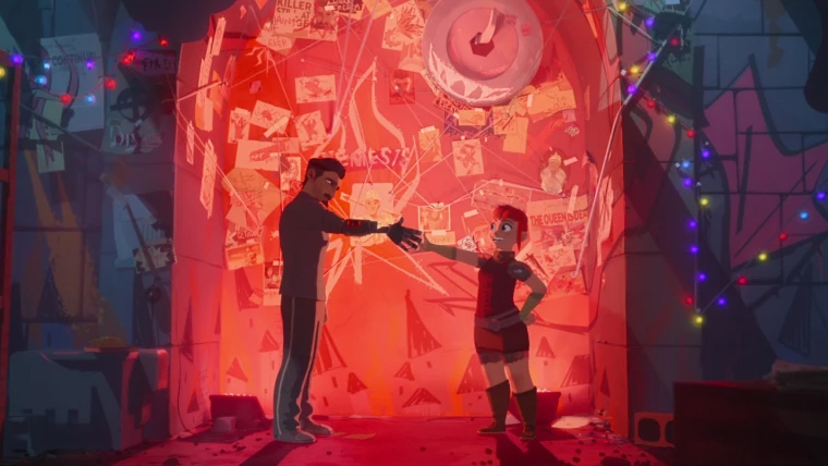
These characters were all representations of the two opposing ideologies in the film. So, we structured everything off that shape language. And that was instilled in the costume design, and in the form of color through our lighting, where based on the level of influence that ideology had in that shot, those colors were more or less prevalent. So, salmon pink, which represented Nimona and acceptance and freedom and change, could take over an entire scene. And gold and white and blue, kind of the classic hero colors, represented the opposite: non-acceptance, social rules, and that Institute mentality.
PI: It also shows in the overall design of the kingdom, people, and places alike.
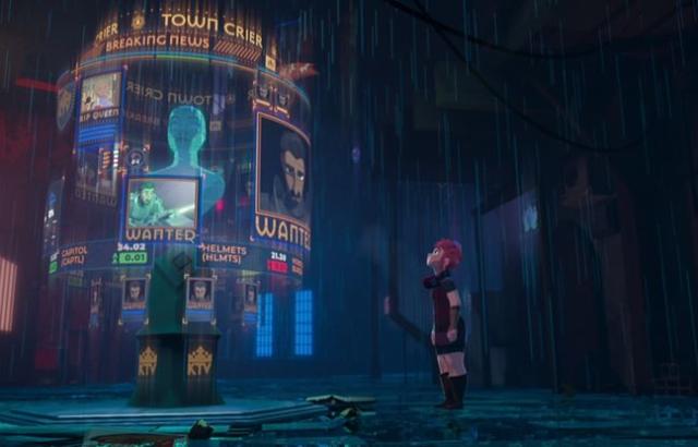
AS: We had an opportunity to reinforce this theme through our background characters. Society is a perfect way of putting people in the classes to define them, which speaks to our theme. So, we leveraged off things like medieval sumptuary laws and social rules to create this very visually distinct social class in our kingdom that could be felt. ND gave us the most amazing playground to play with. Selfishly, as an artist, this is the project and the world that you dream to get handed, because you just want to design everything in there. And it’s also a beautiful visual metaphor for the theme and the real world. It’s both advanced and backwards. Technology has progressed. Culture has stagnated.
At the same time, you really want to make sure that you’re designing a real place. So, we designed a place that could continue on without our characters, that is a genuinely nice place to live for some, but also is a world that’s mired in bias and tradition and classism. And hanging over everything is that kind of ever-present fear that was very important for us to convey through the story. You know, that fear and culture of where monsters are a constant threat and the knights who kill them are glorious. Gloreth is our savior and the Institute is our protector.
The limitations of this society also allowed us to play with how we evolved this medieval feature, which was such a fun task. Because it’s this cloistered place, we designed the world to reflect those medieval city rules and structure. And we also needed to make it feel like it had grown organically during these thousands of years. Space was super-limited, and so, we know we could have fun having things overhang the streets and feel dense and claustrophobic. Or because we have flying cars, you know, cut tunnels through skyscrapers and buildings. And to show time, which is very important in this concept in this film, we wanted to make sure that there are multiple styles of art and architecture and sculpture and even graffiti that could live together in this balance of new, old, modern, and classic, so that everything felt like it was built on, or as a reaction to what came before it. So, we made, you know, skyscrapers out of glass and half-timber, and kept revival architecture, like, super-strong.
PI: In such a graphic environment, light seems an essential part of the expression.
AS: By far the biggest visual metaphor in our film was our use of light and shadow. We meticulously designed both our lighting and cinematography to reinforce the emotional and psychological purpose of the shot. So, the way it interacts with our characters, its intensity, the amounts, the quality, all of that was used to control and illustrate what was being said about the character’s relationship with acceptance at that specific moment. And each kind of had a dichotomy of function. So, for example, light represented acceptance. It could embrace a character. It could surround a character. It could hug a character. But it could also expose. Because when you’re in the light, that’s also when you’re at your most visible and most vulnerable. We used it to divide our characters and keep them separated. And we also used it to give them a moment of connection and bring them together. We could also, at the same time, use it to keep our characters just on the threshold of acceptance and use it to reinforce that vulnerability, and that fear and hesitation of them sharing themselves.
Shadow, on the other hand, represented the opposite. It was non-acceptance. It was concealment. And we used it to drive our characters into hiding and force them to suppress their true selves to the point where we could even use it literally to keep them imprisoned by it. So even if the door is opened to Ballister’s cell, he is still trapped within that visual metaphor.
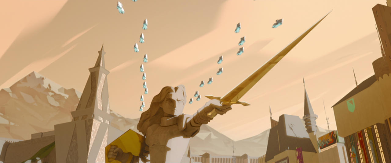
At the same time, you know, we also want to make sure that it felt like there was safety sometimes in this concealment. So, we could use it to wrap our characters in a moment of connection. And like in ND’s amazing graphic novel, this idea culminates in the third act when Nimona literally becomes a visual representation of this concept. In her moment of deepest pain and isolation, when she feels like there is no hope, she becomes an actual creature of shadow. She becomes a creature whose very essence consumes light… Until she’s finally seen and she becomes the opposite. She becomes light. She becomes acceptance. And she becomes a literal sun that turns night into day.
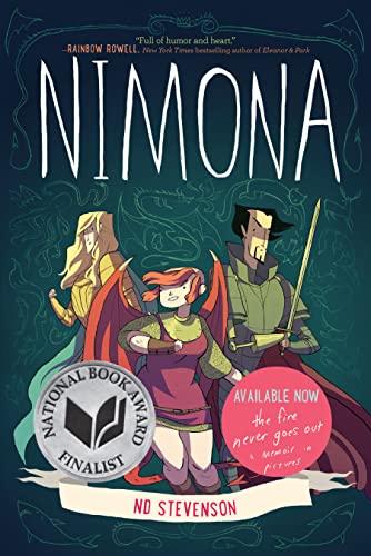
The original Nimona graphic novel by ND Stevenson is available to order from Amazon.com!

With our thanks to Olivier Mouroux, Lamarco McClendon and the whole Nimona team at Netflix.