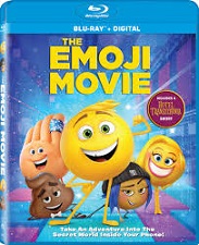
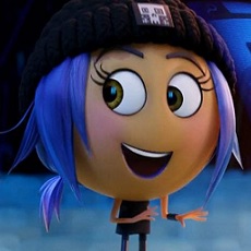
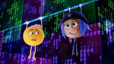
 Sony Pictures Animation’s The Emoji Movie is an adventure in Textopolis, the secret world inside your smartphone, a bustling city where all your favorite emojis live. In this world, each emoji has only one facial expression – except for Gene (T.J. Miller), who is bursting with multiple expressions. Determined to become “normal”, Gene enlists the help of his handy best friend Hi-5 (James Corden) and the notorious code breaker emoji Jailbreak (Anna Faris). Together, these unlikely heroes embark on an epic “app-venture” through the apps on the phone, each its own wild and fun world, to find the code that will fix Gene!
Directed by Tony Leondis (Lilo & Stitch 2), the movie’s production design was conceived by Carlos Zaragoza, a hybrid artist who works both in animation and live action movies. His wide experience includes art directing for over 18 years in feature live action, animation, musical theater, commercials, TV drama & shows. He was awarded by the Art Director’s Guild with the ADG Excellence in Production Design Award for his work in Pan’s Labyrinth, directed by Guillermo del Toro; that same film also won the Oscar and Satellite Awards for Best Production Design. Other credits include the animated The Tale of Despereaux, Gnomeo & Juliet, Madagascar 3, Mr. Peabody & Sherman and the canceled project Puss in Boots 2: Nine Lives & 40 Thieves.
Originally from Spain, he graduated with a Bachelor in Painting at the Fine Arts School at the Complutense University, in Madrid, and an Art Direction for Film & TV Degree at ECAM ( Madrid Film School ). His circus life took him to London, Toronto, San Francisco and Los Angeles, California, where he lives now.
We were glad to talk with him as the movie has just been released on video.
AnimatedViews: To you as a Production Designer, what main challenge did The Emoji Movie represent?
Carlos Zaragoza: The main challenge was to create a digital world that nobody has seen before, that exits only inside your phone, and is populated with characters based on pictograms. It was a big challenge, but also a rare opportunity to have a lot of fun. Our director Tony Leondis wanted the characters to be able to convey a whole range of complex emotions while keeping a graphic and simple look. They are also digital, made of software, but we wanted them to be appealing and relatable to the audience.

AV: The film takes places in two worlds: the “real” one and the one within the Smartphone. They’re obviously different, but at the same time, the Emojis are kind of a reflection of the humans. So, how did you translate visually that particular relation between the two worlds?
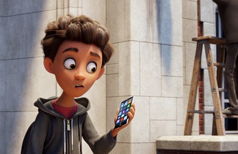
CZ: The stories of the main characters, Gene (the emoji) and Alex (the human), run in parallel. They are influencing each other and at the same time they belong to very different worlds. We wanted to show that contrast of real vs digital in the design. Both dimensions had to look authentic and believable. Alex’s school, in the real world, is an old gothic revival style building, made from bricks and stone; grass and trees are everywhere. It is richer in texture and small details, it looks more organic, imperfect, historical. The worlds inside the phone are digital, and the look should reflect that digital nature. They look like new, perfect. Some of them are made of binary codes, other are made from basic geometric shapes. Sony Pictures Imageworks did an incredible job at making them believable without losing their simplicity.
AV: If you could compare your work as a Production Designer for live action and for animation, how would you present it? How do both domains enrich each other, especially in the case of The Emoji Movie?
CZ: I see animation as a technique, not a genre. The most important differences among movies are in the stories and the tone. I have worked in comedies in live action and animation: Asterix at The Olympic Games, Emoji, Madagascar 3. I have also done dark fantasy with both techniques: Pan’s Labyrinth, and La Noria. There are a lot of differences in the way we develop the projects and the fact that in animation everything is created from scratch (including the actors). It would be great for real actors to be able to stretch and squash like cartoon characters, right? Well, you can do it now creating realistic digital versions of them.
I tend to approach live action and animation projects with an open mind and try to avoid conceptual limitations. I would like to see more studio projects breaking those boundaries.
AV: Textopolis is a reflection of Los Angeles (Tinseltown), with its appearances… and also its reality – an aspect that the character of Smiler embodies. How did you translate visually those two faces of that place that isn’t always what it looks like?
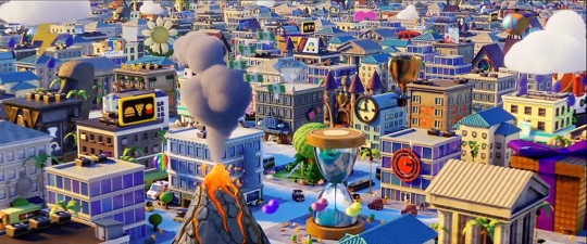
CZ: The design of city where the emojis live reflects what is happening in the story. It is like a golden cage. It looks like a beautiful and fun place to live, full of colorful objects that look like emojis. At the same time, it is laid out on a flat and regular grid that extends to the infinite. We see many of the buildings and objects repeating as we move. Every element is there to serve a specific purpose. That is terrible for our main hero, Gene, who does not fit in that dystopian society. We made the city look different as things turn darker in the story: from vibrant colors we went to dark, dimly lit and run-down streets. Los Angeles was a great inspiration for the design of the city; it has both faces of the same reality.
AV: How did you transform 2D emojis into 3D characters?
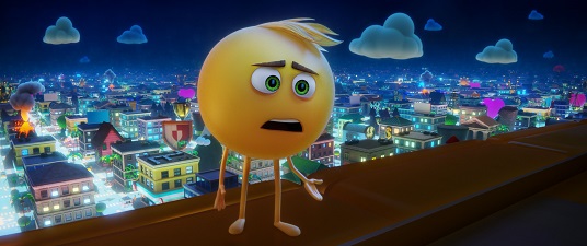
CZ: We designed 250 unique emoji characters for one single scene in the interior of the Company amphitheater. That was a huge challenge for the character designers: how to make them look like icons in your phone while making them expressive and relatable to the audience. We keep their graphic look by simplifying and avoiding small details. The best way to test their graphic appeal was to make them very small and see if they looked like an emoji you could use in your chats. Coffee Mug, Rocket, Peace Sign – they all look like cute little pictograms. The most sophisticated character design was Gene. His shape looks very simple, a ball with sticky legs and arms. He is one of those yellow expression emojis without nose, ears or even body. We needed to keep that graphic simplicity but make it unique. We were also looking for a digital look. Instead of using textures on the surface to create that look, we used a multi-layer treatment to achieve that. Gene has an inner core that is made of voxels; a second internal layer of light particles that we dialed up and down to show emotions; on top of that, a smooth translucent skin. The iris in his eyes does not look human, it has a digital, pixelated texture. We used all these components to add to the expressions and show his emotions.
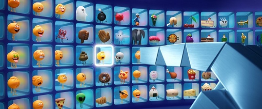
AV: Can you tell me about the influence of cartoons of the 1930’s on your work on the characters?
CZ: Some of my favorite animation short films are the Silly Symphony series, from Walt Disney. Those movies were used by Disney to experiment with techniques and stories. I like how open- minded and surreal they were, compared with the movies we make now. I love the “cartoon animism”: any object could be a character and, mostly of the times, dance.
AV: As a production designer, you supervised the look of both the environments and the characters. How do you connect the two?
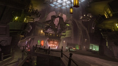
CZ: Everything you see in the screen is designed to support the story: characters, sets, props, lighting, camera, etc. The characters are the most important vehicle to tell the story, but the environments are also a big component of it and have their own voice. For example, we can use them to create tension in the scene, like when Gene enters the Piracy App; the set is designed to make Gene completely out of place. It is dingy, chaotic, unbalanced, dark. The shape language is the opposite of Textopolis: pointy, sharp edges, wonky shapes. We can also use the environments to emphasize the personality of a character, like what we did with High Five’s Vanity set. Every object in that room is adding to his description as a narcissist, an egomaniac, who is longing for the old times.
AV: What was the most challenging world/app to create?
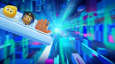
CZ: The conduits under the Wallpaper were challenging. In that sequence, our heroes are hiding from the security bots on the phone, and trying to reach a distant app, so they must go underground. Our initial ideas were more conventional, setting that in a practical set, in the real inner parts of the phone. Somehow, the digital characters stepping on cables was not the right concept. We wanted to keep the real world and the digital separated. Our characters should be moving in the deepest level of the phone, but into the software, not the hardware. We designed an underground and infinite space that looks like a soup of binary codes. The tunnels are created as our characters move. The codes move and reshape as vaults, slides and steps.
AV: Does the fact that the film takes places in a pixel world make things easier to render in a CG movie… or not?
CZ: That would be fantastic, but the complexity on the look of the materials and lighting made it harder to render, even with simpler shapes. We had a lot of unusual translucent sets and glowy characters with inner layers of particles in motion. That is the worst nightmare in terms of render times.
AV: Can you tell me about the treatment of color in the film?
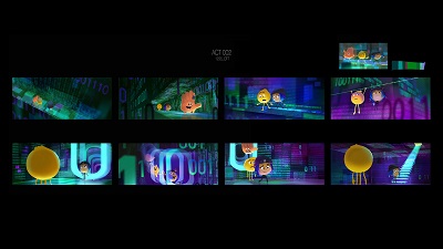
CZ: We used the color to set the tone required for every scene. Art director Ryan Carlson established a color theory for the whole film, and a color script that served to orchestrate the color and light in the movie. The color coding of the main characters enriched the storytelling and helped to simplify a complex visual structure. We used the yellows and gold tones for anything related with happiness, and to show when Gene’s feeling great about himself; the royal blues for anything related with Jailbreak –it is her hair’s color- and The Cloud, the place she thinks she belongs to; greens for tension and distress, and the characters in the Piracy App; reds for danger, and the Bots that are chasing our heroes. There is a progression in the tone of the light that we use to link both worlds, the Real and the Digital, towards the end of the story, when Gene and Alex see each other face to face for the first time.
AV: Was the movie TRON of some inspiration for you in one way or another?
CZ: No, but it is a great example of how to represent a digital world with real characters in a movie.
The inspiration came from multiple angles. When I do research, I like to look to other places that are not movies, like theatre, contemporary art, science, literature. I tend to get inspiration from the real world, and extrapolate from that. For example: towards the end of the movie, our heroes arrive to The Cloud, a mythical city for the emojis. For the humans it is a place where we store data. I started thinking on the actual nature of memory chips, made from minerals, and visited the Science Museum in LA. I found a lot of inspiration in their collection: beautiful shapes of mineral crystals. Those were the shapes I was looking for, something different from the rest of the sets. On my way back home, I thought that LA roads at night, if you imagine then in a time-lapse animation, look like streams of light, and that was a great look for the data freeways in the Cloud. Yes, I got a lot of inspiration from the long hours stuck in traffic in LA.
AV: Can you tell me about the collaborative aspect of your work – notably your collaboration with Aurora Jimenez, your “tale twin”.
CZ: Making movies require a great deal of collaborating. I was lucky to have a great team of very talented artists, led by art directors Ryan Carlson and Dean Gordon, and lead character designer Tony Siruno. Part of my job is to bring the best talent to work with me, including my wife, Aurora, who had worked at Sony Animation in many other movies. She is one of the most creative artists I know (‘heart eyes’ emoji here) and we inspire each other both in the studio and personal work. Every artist in the art department contributed in a great way to the visual storytelling of the movie. I recommend you to explore the Art of Emoji website ( artoftheemojimovie.com ), were you can find samples of their work in the movie.
With very special thanks to Carlos Zaragoza and Olivier Mouroux at Sony Animation.


