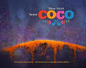
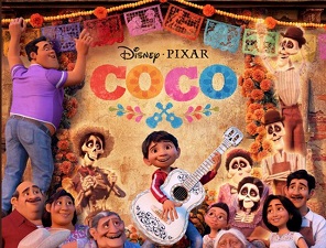
 Young Miguel dreams of becoming a musician like his idol Ernesto De la Cruz. There’s just one problem: his family’s generation-old ban on music. With his heart set on changing his family’s tune, Miguel accidentally crosses over into the mesmerizing Land of the Dead on the night of Dia de los Muertos.
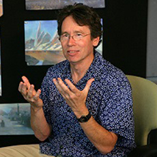
From lively Mexico to stunning underworld, it was up to Production Designer Harley Jessup to imagine with his crew the look of both worlds.
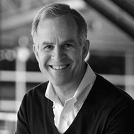
Mr. Jessup joined Pixar Animation Studios in May 1996 as production designer for the studio’s 2001 feature, Monsters, Inc. He continued in this role for the Academy Award®-winning feature Ratatouille, and Golden Globe®-nominated Cars 2. More recently he designed the prehistoric world of The Good Dinosaur.
Harley Jessup began his animation career designing The Adventures Of Thelma Thumb for Sesame Street, which served as a training platform for his work as production designer on Twice Upon A Time, an animated feature done in cutout paper. He went on to Lucasfilm to work as art director on several live action projects before joining Industrial light and Magic (ILM) in 1986. As a visual effects art director at ILM, he earned an Academy Award® for his work on Innerspace and an Academy Award® nomination for Hook. After serving as creative director of the art department at ILM, Harley next worked as production designer for Disney’s animated feature James And The Giant Peach before coming to Pixar.
Besides his work in film design, Jessup has written and illustrated three children’s books, What’s Alice Up To? (1997) and Grandma Summer (2000), both published by Viking Children’s Books, and Welcome to Monstropolis (2001) based on Pixar’s Monsters, Inc.
Born in Oregon, Jessup grew up in California’s San Joaquin Valley and the Bay Area. He earned a Bachelor of Fine Arts in graphic design at Oregon State University in 1976 and a Master’s degree in design from Stanford in 1978.
Jessup currently lives in Marin County, California, with his wife, and has three children.
AnimatedViews: How did Coco start for you?
Harley Jessup: I had just finished up Cars 2 and, at Pixar, when a Production Designer finishes a project, we go into sort of visual development, often working on two or three films at the same time. In this case, Coco Director Lee Unkrich was just in the beginning stages of developing several ideas for an animated feature, so I would basically help him put together concept artwork and reference and help pitch ideas that he was planning to present. In the end, they chose the idea of doing a project on Dia de los Muertos and Mexico. It was early October, and the holiday was coming up. So, even before I was assigned on the project, we went to Mexico where I took a million pictures. It was a time when Lee and I could talk a lot about the possibilities of a film like this, and we were very inspired by a trip like this.
AV: I understand that trip was instrumental in your desire to become the Production Designer of the film.
HJ: Yes. You know, at the same time, I’ve always wanted to do a film with Lee. I respect him as a filmmaker. That, in combination with being really inspired by what we saw in Mexico – the cities, the landscapes, and especially the people. We discovered so many possibilities for our story. Our reception was so wonderful. We were kind of invited in families as they were celebrating the holiday. That ended up being a very emotional, inspiring experience.
AV: What do you like in Lee Unkrich’s work and personality?
HJ: We kinda worked together indirectly in a certain way on Monsters, Inc., my first film at Pixar. He was a co-director on that. He helped Pete Docter, especially in the editing and the layout. I had very much respected his very nuanced choices he was making in the screening room, and when he did Toy Story 3, I thought that was a fantastic film, so full of heart, fun and just a beautifully made film. He’s just a great filmmaker. So, I got very excited when I got a chance to work with him.
AV: Can you tell me more specifically about your research trip to Mexico, that happened to be trips, actually?
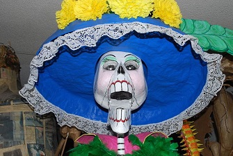
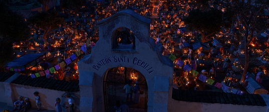
HJ: Right. Our first trip was in 2011. That was with Lee, Darla Anderson our Producer, our Head of Story Jason Katz, and I. We went to Mexico City, Oaxaca and Morelia, actually the whole area around Morelia, especially Janitzio, an island on Lake Patzcuaro which is a key place for the celebration of Dia de los Muertos. It really was just to get our first education in what the holiday is all about. Mexico as a setting was totally new to me. It was very exciting just to experience the colors and the design and the people there. That was in 2011. And then in 2012 – by that time I was assigned as Production Designer -, we went back to Mexico City and visited a great museum called the Dolores Olmedo Museum that had a wonderful display of papier maché skeletons made by the Linares family. It was spectacular! Then we went to Oaxaca, to the cemeteries there. Then we visited a farm family near a town called Hierve el Agua. The visits with the families were really the most important thing that we did. We kinda shadowed them from morning to night throughout the holiday, first as they were decorating their home for the holiday creating the ofrendas, really elaborate altars in their living room, honoring their ancestors, and then to the cemeteries during the day where there was literally all generations working together, usually led by the grandparents decorating the graves. And then finally in cemeteries at night. I had no idea. It was just a spectacular display of candles and marigold. Each grave often had small incense burners, creating a smoky atmosphere that, with all the candles, was just magical. Literally hundreds of candles, even in the most humble cemeteries. It was really inspiring and touching. So, we tried to capture that feeling.
AV:How did you manage to integrate that deep emotional content into the art direction of the movie?
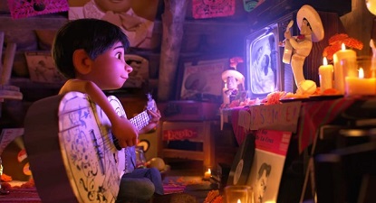
HJ: I appreciate that you recognized that. Everything we do in the art department and for me as a Production Designer is in support of the story and in support of the characters. So, in Coco, we were trying to express and reflect the emotion happening in each sequence. For instance, when we’re in Miguel’s secret hideout, we created an altar to his idol, Ernesto de la Cruz. We wanted it to be inspiring but still have the charm of something that was made by a young boy. So, we did things like having Max, Lee’s son, actually create the graphics, the hand writing and the design of Miguel’s guitar. We tried to be true in every case. The Production Designer is doing it right when you feel honesty in his work, when the real world is caricatured in such a way that you feel the emotions of the people that live in it – when the world is a true reflection of the people.
AV: How do you see the differences between the world of the living and the world of the dead?
HJ: The World of the Living is very simple, with architecture that has evolved over time, and centered around families, with many generations of the same family who are living in the same house. For the hot and dusty world of Santa Cecilia, where Miguel lives, we tried to contrast with the really lush, fantastically colored, multi-layered, vertical settings of the Land of the Dead. The Land of the Living is very flat and based in realism, but always with a touch of caricature, while the world of the dead is full of fantasy, but with its own logic. When we created the towers, what we tried to express is that that world is always growing vertically, as the ancestors are arriving, from the meso-American pyramids at the base to the Victorian/Revolution era, with cranes at the top for the people that are about to come. None of that is mentioned but we tried to really figure out a logic to the place so that it seems authentic and helps the story.
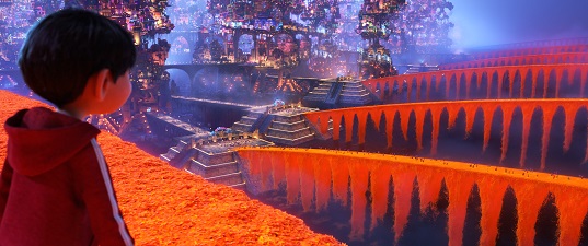
AV: From the incredible Monstropolis in Monsters, Inc. to the magnificent Paris in Ratatouille, and now to the two amazing worlds depicted in Coco, you seem particularly interested in architecture and urban design.
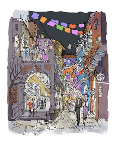
HJ: I am really interested in architecture and it was a real treat getting to study Mexican architecture. It’s a wonderful combination of different influences, European alongside indigenous, Mayans and Aztec. And the Land of the Dead is basically all architectures. There’s no kind of land form; these architectures seem to be rising up just out of water, mysteriously. And I was just coming from The Good Dinosaur , where there wasn’t really any architecture. So, I was very hungry to get into a world with architecture!

AV: Coco is a film about music, too. Can you tell me about the relation you envisioned between music and production design?
HJ: We tried to be true to the different types of music. There’s a whole range of music in the film, so we tried to be accurate, like in the choice of the costumes in the opening night club scene, but very theatrical at the same time. We wanted to be supportive and complement what was happening with the music in the soundtrack. When it’s really working, then the music, the lighting and the set and character design all work together and it’s like one big thing.
AV:You’ve just mentioned light. How did you approach light and color?
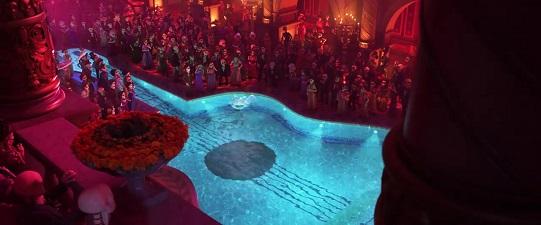
HJ: I established early on a color palette. Very simple, but it was a key element in connecting the scenes in the Land of the Living and the Land of the Dead as well as unifying the whole film. It was really useful. It was inspired by the colors we saw in Mexico, especially in the textiles and the embroidery, but even in the colors that we would see in the interiors like the living rooms, like this brilliant yellow. We tried to include those influences and this color palette. We also knew that orange would be a key color because of marigold, which are flowers that are very symbolic of the holiday. Marigold orange and magenta are at the core of our color palette. Any color would work with that orange or with that magenta, and would work with each other in a way that we have a very multicolored film, so the challenge was not to evolve into a chaotic mass in creating the Land of the Dead. I worked very closely with Danielle Feinberg, who was our Director of Photography for Lighting. The way she used color in the lighting was very important and I really tried to support that with the color palette of the sets.
AV: What would be your most memorable scene in terms of set design?
HJ: I’ll talk about two. One is when Miguel crosses for the first time the marigold bridge and sees the world of the dead. We worked very hard to make that sequence spectacular and thrilling and emotionally satisfying because he sees for the first time where his ancestors are living and the fact that they’re really out there. That was a very satisfying sequence to work on. We did it very early on because we needed kinda a proof of concept for the Land of the Dead, to see if its infinite cityscape of towers would actually work and be inviting.
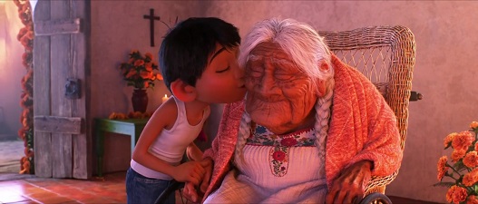
And then, to contrast that, I’d mention the scene in the family compound in Santa Cecilia. It’s a very humble home but very emotional to me. It’s a very warm feeling to see different branches of the family all living together and Miguel watching after his great-grandmother who is almost 100 years old. The architecture here is very simple and it’s a great counterpoint to the complexity of the Land of the Dead. I think those two sequences are really emblematic of what we wanted to do and express through the whole film.
With very special thanks to Harley Jessup, Chris Wiggum, Krissy Bailey at Pixar and April Whitney at Chronicle Books


