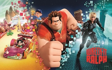
 Wreck-It Ralph has been described as one of Disney’s most innovative animated films to date.
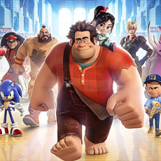
This is the story of Ralph, the destructive villain of an 8-bit arcade game who runs around smashing things as the good-guy, Fix-It Felix, saves the day with his trusty hammer. Tired of being the bad guy, he escapes his 8-bit world in search for an adventure and a purpose, breaking all the established rules of the arcade in the process. Throughout four different universes, the film is an aesthetic journey and a visual treat for video game and animation lovers. And so was its making.
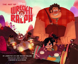
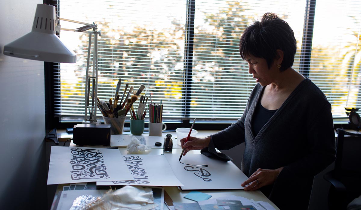
In Wreck-It Ralph, Disney’s team of artists explored the hidden world of video games, from classic 8-bit arcade games to the most modern of the digital age. A journey in itself, about which we talked with Maggie Malone, the co-author of The Art of Wreck-It Ralph, published by Chronicle Books, that offers and invaluable and fascinating glimpse into the creative thinking involved in the making of the film, brimming with concept art.
She’s also the Director of Creative Development at Disney Animation Studios, where she has worked on such films as The Princess and the Frog, Bolt, and the Tinker Bell films. A graduate of Yale, she was Director of Development at Universal on The Tale of Despereaux and Seabiscuit. She has served as Producing Director for the Black Dahlia Theatre in Los Angeles and worked for Manhattan Theatre Club on the original off-Broadway productions of Proof, Fuddy Meers and Tale of the Allergist’s Wife. Her production credits in television include Welcome To New York.
Animated Views: Please, would you explain your job as a Director of Development at Walt Disney Animation Studios?
Maggie Malone: Normally, my day is all about the story of our films. I’m reading feature scripts, looking for writers to hire onto our projects, or I’m in meetings hearing the writers and directors pitch the story of the film they are working on. The environment in the building is playful but intentional, irreverent but deeply respectful. People are having fun even while they are putting in long hours and working very intensely. There is beautiful, inspirational art all over the walls, from past films and the films we are currently working on.
I love the early stage of development on the films, when it’s just a nugget of an idea and there are only three or four of us in the room with the director, and we are researching the world, finding experts to talk to, and trying to make each other laugh with pitches of silly ideas. All the while we know that each film idea has to be robust enough to support the coming creativity of 200+ artists in production. We want to get it right for them, and then for our audience.
AV: For each project, how are the artists selected?
MM: So many of Disney Animation’s visual development artists, like our animators and character technical directors, etc, know from a fairly young age that they want to work in a visual medium and that they want to work at Disney. Most of them go to amazing art schools and submit their portfolio once they’ve graduated. We have a whole department that runs intern and trainee programs specifically to seek out, hire and train exceptionally talented individuals, in collaboration with the directors and senior artists in the building.
AV: Concept artist Lorelay Bove was really providential to Wreck-It Ralph. Thanks to her Spanish background, she was able to find the right tone for Suger Rush through the influence of Gaudi. And so was Cory Loftis on Hero’s Duty. They were just the perfect guys for the film!
MM: Lorelay is a recent graduate of CalArts. Cory came from having been a designer in the video game world. Again, the kudos goes to our Talent Development department for finding the artists and bringing them to the Walt Disney Animation Studios. Once they are in-house, our directors, producers and other production managers get to know each artist and their style. Matchmaking each artist with a film is a bit like alchemy. The art directors, who lead the visual development artists on each film, have an innate sense of the artists they need for specific projects: some artists have an amazing ability with character design, like Bill Schwab. Others have a great sense of scale and scope of worlds, like Cory, and yet others had an uncanny ability with appeal, like Lorelay. Because all of the artists are full-time employees, there is a great opportunity for play. With play comes artistic innovation.
AV: How do you balance “in-house” artists and freelance artists on the different projects?
MM: Walt Disney Animation Studios is great at seeking out artists for their individuality. There is a core group of artists in each department that works on many films, but each film also brings with it the opportunity to try out new people, many of whom join the studio long-term. Our Talent Development department and all the directors and other artists responsible for reviewing portfolios on a regular basis aren’t looking for one particular style. They are looking for depth of skill, range, and above all, the desire to collaborate. Film and especially animation is a collaborative medium. Our artists work alongside each other and sometimes pass back and forth the design for one building or character multiple times. Deep in all of us is the belief that together we can create something better than we could create on our own.
AV: How did you get to Writer Phil Johnston, and how did you come to realize he was the perfect person for the story you needed?
MM: I had Rich Moore read and meet with several writers, but we always knew that Phil was going to be a sensibility match for Rich. I met Phil, as I do all of our writers, through his representation. His manager gave me several spec scripts and TV pilot samples of his writing. One was an unproduced script about a high-school boy who, through some unusual business schemes, raises money to bribe his way onto his school’s basketball team and therefore win the approval of his father. Phil’s creative worlds were full of colorful characters always willing to do desperate, imaginative things in order to prove themselves, and I knew that those were the type of characters with whom Rich wanted to populate the world of Wreck-it Ralph. A world full of characters who sometimes behave badly and yet are always incredibly funny and appealing— something like the Simpsons, where Rich had worked for years, mixed with The Little Foxes, meets It’s a Mad, Mad, Mad, Mad World. And the guys hit it off, right off the bat.
While Phil was working with us during the early days of Ralph, he finished writing the script for Cedar Rapids, which Fox Searchlight produced. The film is great — it stars Ed Helms and John C. Reilly, and gives you an even greater sense of Phil’s writing.
AV: You mentioned Director Rich Moore. From your perspective, what did he bring to Wreck-it-Ralph and more largely to Disney?
MM: Rich Moore has an incredible sense of humor. He just moves through life with an endlessly funny take on current events, people and circumstances. But he also has great depth, forged from his own experiences, and he is willing to look deeply inward. All of our directors are masters of emotion and comedy, but Rich’s brand is exceptionally fast-paced. He always wants to innovate, to try new gags, to make people laugh. He combines his non-stop sense of humor with a great deal of ambition, which explains an animated film set over four different worlds, bursting at the seams with the greatest number of unique, loquacious characters I think Disney’s ever done.
AV: How was it, having a former director like Mike Gabriel as the Art Director of the movie?
MM: Mike Gabriel is a director in his own right, having co-directed The Rescuers Down Under and Pocahontas, along with an amazing short film of his own called Lorenzo. Rich and Mike knew each other from way back, so Rich knew of Mike’s tremendous sense of appeal and design. When Rich asked Mike to be Art Director on the film, Mike was very humble and game to try something new. Mike drew upon his expertise in animation over the years to figure out how to approach certain design problems.
One of the coolest things about the visual development department and Walt Disney Animation Studios in general, is how inter-generational the workflow is. Good art is good art and all artists recognize that. So Mike was leading but also working alongside veterans and recent art school grads, taking the best from incredibly diverse points of view. Because Mike knew the Studio so well and knew how to direct an entire team of his own, he was really able to reach throughout the whole department, challenge people by giving them unusual assignments, try different approaches and lead a team to produce an incredible amount of work very quickly.
Ultimately, the scope of the film was so huge that Mike knew he needed to tap another veteran art director, Ian Gooding, to help him complete the job. Ian brought with him his own sense of design, color and style and the three meshed together extremely well.
AV: That’s what makes Wreck-It Ralph one of the most innovative Disney animated feature to date, I guess.
MM: I actually think that the film Tangled, based on the Rapunzel fairytale, did an incredible job combining a modern, comedic sensibility with Disney’s fairytale legacy. From character voice in the writing, to all the work the animation department did to blend the best of hand-drawn human movement technique with computer animation, Tangled really invigorated our audience as well as all of us at the studio. Rich and the whole studio very consciously wanted to make sure that Wreck-it Ralph picked up where Tangled left off. Hopefully, we’ve achieved that!
Artwork:
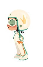
“Helmet” and “Gumdrop to Bakery” by Lorelay Bove / Digital.
Color Script by Mike Gabriel, Helen Chen, Jim Finn, Lorelay Bove, Ran Lang, Dan Cooper, Cory Loftis, Ian Gooding/Digital.
All artwork © Disney.
Our thanks to Maggie Malone and April Whitney!


