Hotel Transylvania Art Director Noëlle Triaureau sheds light on the monsters’ domain
by Jeremie | October 16, 2012 5:04 pm
 Vampires have a special relationship to light. Indeed, it can bring a sense of drama they can’t deny they love…but it can kill them, too.
So, for his lavish five-stake resort where monsters and their families can live it up, free to be the monsters they are without humans to bother them, Dracula could but turn to the greatest specialists in lighting. One of them is Art Director Noëlle Triaureau.
The same as Dracula, Noëlle comes from Europe – he’s from Romania; she’s from France. Her first training was in business and management, but when she came to work in Los Angeles she happened to meet with artists who created art for a living and she realized it was possible make a living from that. As she’s always wanted to become an artist, Noëlle came back to France to study Art for four years at ENSAD in Paris.
Back in L.A., she met people at Sony who liked her work and hired her on Surf’s Up as a Visual Development Artist. When it came to the production, they asked her to go on working on the project as a background and matte painting artist. She then came back to Visual Development on Cloudy with a Chance of Meatballs, until they asked her to join the crew of Hotel Transylvania.
What happened next? She kindly accepted to share it with us…
Animated Views: When did you join the crew of Hotel Transylvania?
Noëlle Triaureau: That was four years ago. At that time, the movie was still being developed. The director was Jill Culton and the Production Designer was Luc Desmarchelier. You know, there always are changes during the production of an animated feature, and that was interesting to follow the movie along all its transformations through story and design, according to the filmmakers.
AV: Was becoming an Art Director a natural progression for you?
NT: Absolutely. That allowed me to combine my artistic skill with my experience in management. I mean the Art Department team to manage, the planning, the deadlines, etc. because timing is essential during the production, when you have all those artists working at the same time on environments, backgrounds, etc. The Production Manager and the Producer also cover that aspect of the production, but it’s also important to be able to communicate openly with the artists so that everyone is in tune. I like the challenge of that position, and seeing the vision of the Production Designer coming to life. That’s very stimulating.
AV: How was your work like on Hotel Transylvania?
NT: I took part in the development of the style and of the artistic dimension of the film, particularly in the backgrounds, the colors and the textures. Also, I was fortunate to be able to work on the color design and the textures of certain characters of the movie. It was a lot of fun to embrace all those different aspects of the making of the film, even if I was concentrating on the backgrounds.
AV: How was working with director Genndy Tartakovski?
NT: That was really fabulous to work with someone who came from TV animation, from the cartoon world. When he came aboard, the main characters had to be re-designed to fit his vision in terms of animation, with pushed expressions. For instance, Dracula and Jonathan were re-designed by Craig Kellman. It added a lot of punch and energy to the overall comedy and animation. Actually, when Genndy arrived, we were right in the middle of production. Not only had the style of the environments been already established but some characters had already been modeled, with the textures and the rigging. So, Genndy inherited all that work and he cleverly integrated it to his own vision. For example, at that time, the Monsterfest sequence had not been treated and he did that his own way, with his own energy, while keeping the continuity with what had been done before.
AV: How do the colors help tell the story?
NT: The colors enhance the emotions of the characters. They also stress the contrast between the city, the human world at daytime, and the castle, during the night. For the monsters world, the colors are vibrant and saturated. There’s a great “panache” of different colors that makes that universe fun and lively. In opposition to that, the colors of the human world are more pastel, calmer.
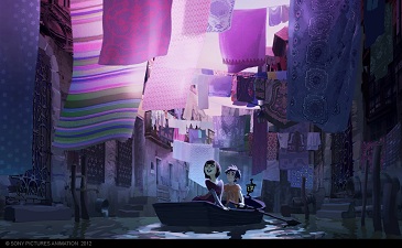
AV: I was stunned by that painting of yours featuring Mavis sailing the canal, surrounded by purple tones, which was very unusual and pretty charming.
NT: I did that painting when Jill Culton was the director of the movie, and her version of the story was different. Mavis was supposed to be half-vampire, half-human, as her mother was human, and she wanted to get to know the human world. It was a more romantic version of the movie as she fell in love with…I think it was Daniel at that time. I wanted to create touches of color that suggest Mavis, to see through her eyes what she finds so intriguing in the human world. As the crew changed and the story evolved, so did the colors that got more into strong pinks. You can pick that out in her room or in subtle touches in her clothes. Usually, she dresses in black but pink is more her color.
AV: Indeed, purple can also been seen as a reference to classic horror movies.
NT: Absolutely. In his color script, the other Art Director of the movie, Ron Lukas, presented the monster world as a funny and colorful place, something very positive, because Genndy, the director, wanted not to insist on colors that are traditionally associated to monsters like green and purple. Of course, these colors are present but we preferred to focus on warm colors for the castle.
AV: Can you tell me about the emotional dimension of the Art Direction of Hotel Transylvania?
NT: The color palette is very emotional. For example, at the beginning of the movie, when Dracula is with his daughter, there’s a blue palette, rather pastel, that makes that scene very intimate. And then, when you get into the bedroom, the colors get warmer. The audience is not necessarily aware of that, but it affect them on a subconscious and emotional level.
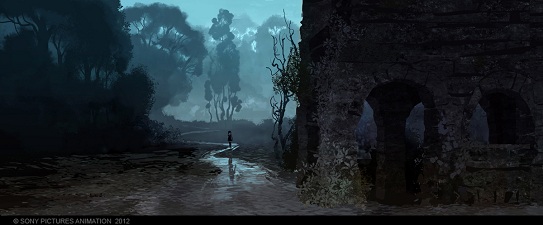
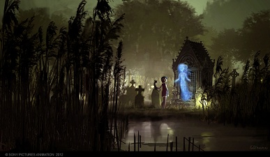
AV: In classic horror movies, light is kind of an expressive or even expressionist tool. How did you translate that in Hotel Transylvania?
NT: Again, in his color script, Ron Lukas took his inspiration for those old horror movies, based on expressive contrasts between light and darkness. That allowed us to focus on action while keeping a part of mystery in darker spaces. That tendency was present from the pre-production, especially in the first concept arts by Neil Ross. In his artwork, you could see massive, dark and mysterious environments contrasting with enlightened spaces featuring plenty of details.
AV: Does stereoscopy have implications for you as an Art Director?
NT: Yes. You have to take into account where the focus is, and at what distance, in order to set the light accordingly. It is actually done afterwards by the 3D Lighting Department, but you have to keep that in mind from the beginning.
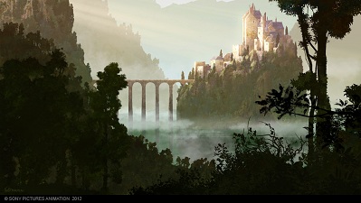
AV: In the backgrounds, certain spaces are much textured and other almost not. Can you tell me about that contrast?
NT: That’s Neil Ross’ signature. Wide open spaces where the eye “breathes”, in a way, in opposition to elements full of details. That’s pretty realistic. From far away, it’s like a photo and as you get closer, you realize it’s very graphic, with a lot of textures. So, we wanted to resume that in our Art Direction. For instance, when you see the castle with the woods and the hills around, the more distant the hills, the more simplified.
On the contrary, the closer, the more detailed and textured. The most challenging element in that regard was the castle. From away, it’s very geometrical, made of basic shapes and big colored areas. And when the camera gets closer, you begin to see the details of the stones. The danger would have been to have too many details everywhere. It would have looked like you’re used to see in videogames. You wouldn’t know where to look at.

AV: Along my different Hotel Transylvania interviews, I feel a very special attachment to the movie among the members of the crew. How could you explain that?
NT: The subject is fresh: presenting Dracula under a different light, as a father, with a daughter, a teenager who wants to see the world and who’s going to fall in love. That’s a unique approach and I think that’ the reason why all those who took part in that movie got deeply involved. Because there’s a lot of heart in it.
AV: In brief, it seems that that adventure was really multifaceted and particularly exciting for you.
NT: It was phenomenal to work with big names like Luc Desmarchelier and Marcelo Vignali, to see how they developed the aesthetic of Hotel Transylvania, without forgetting Neil Ross’ considerable influence on the style of the movie. I feel very fortunate to be able to collaborate with the crew of Hotel Transylvania; they’re such talented artists!
available to order now from Amazon.com
![]()
![]() [1]
[1]
Our thanks to Noëlle Triaureau, Olivier Mouroux and Kyle Rapone at SPA!
- [Image]: http://www.amazon.com/exec/obidos/ASIN/1781164150/animatedviews-20
Source URL: https://animatedviews.com/2012/hotel-transylvania-art-director-noelle-triaureaus-sheds-light-on-the-monsters-domain/